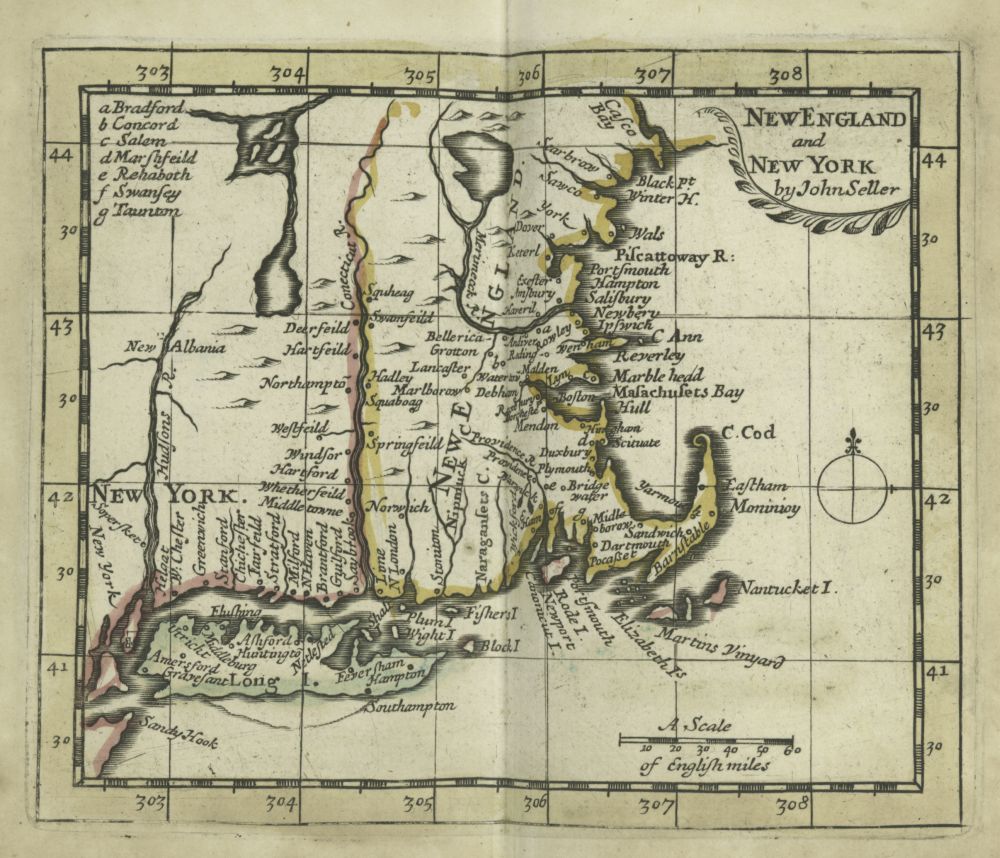
Fig. 1. John Seller, New England & New York. London, 1703. Rare Books Division, The New York Public Library, Astor, Lenox and Tilden Foundations, New York, N.Y.
The “New England” Cartouche: Tablets, Tableaux, and Theatricality in Eighteenth-Century Cartography
MARTIN BRÜCKNER
Introduction
WHAT MAKES A MAP a “New England” map at the turn of the eighteenth century? Looking at maps such as John Seller’s New England & New York (1703; fig. 1), the answer seems to be threefold. A map was a New England map when it showed the territorial outline of British possessions between what are today the states of Maine to the north and New York to the south, with the Connecticut River (some would argue the Hudson River) providing a natural boundary to the west and the Atlantic Ocean to the east. Such a map distinguished itself further from other maps by depicting a specific set of topographic features, in particular the distinctly shaped coastline of Cape Cod. And last but not least, a map became a New England map because it was given the name “New England.”
For maps to represent exclusively the geographic setting of New England was a relatively recent phenomenon in circa 1700.1 The area that we know as New England today had appeared in printed maps in “embryonic form” as early as 1506. But it was not until the early seventeenth century when European mapmakers including John Smith, Willem Blaeu, Jan Janszon, and Nicolas Visscher started designing maps explicitly geared towards showing British, French, and Dutch colonial possessions, which were respectively entitled: “New England,” “Nouvelle France,” “Nieu Nederland.” The “birth” of New England in cartographic terms was more or less completed during the 1670s and 1680s when British-made inexpensive atlas maps, showing New England in its most rudimentary form, entered the marketplace in large numbers. Basic “New England” maps were a staple component in works such as John Speed’s atlas A Prospect of the Most Famous Parts of the World (1675), John Seller’s Atlas Maritimus (1675), and Robert Morden’s textbook, Geography Rectified (1680)2 Through the dissemination in print the cartographic form of New England not only became popularized but a graphic fixture for representing as well as discussing New England in courts, schools, and even private conversation. In a letter from 1676, Nathaniel Mather writes to his brother, Increase: “I much rejoyce in God’s great mercy begun in your son Cotton. I heartily thank him for his map of New England. It helps mee much in understanding your & other narratives.”3
But print culture alone did not make New England maps uniform and instantly recognizable in 1700. Rather, the maps’ basic visual and verbal differentiation reflected recent and profound changes in cartographic design. Much of the maps’ uniformity was the product of a historical process that Leo Bagrow has called the “cartographic reformation.” Roughly between 1670 and 1770, “maps ceased to be works of art, the products of individual minds, and craftsmanship was finally superseded by specialized science and the machine.”4 Theoretical geographers like David Harvey make a similar assessment, noting that eighteenth-century maps were gradually “stripped of all elements of fantasy and religious belief, as well as any sign of the experiences involved in their production,” and instead became “abstract and strictly functional systems for the factual ordering of phenomena in space.”5
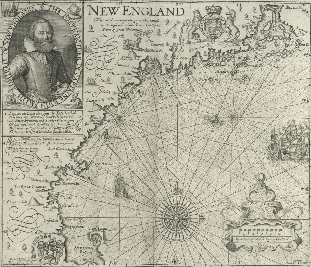
Fig. 2. John Smith, New England. London, 1727. Rare Books Division, The New York Public Library, Astor, Lenox and Tilden Foundations.
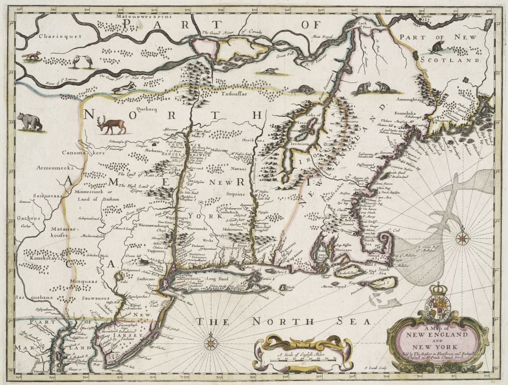
Fig. 3. John Speed, A Map of New England and New York. Engraved by Francis Lamb. London, 1676. The Lionel Pincus and Princess Firyal Map Division, The New York Public Library, Astor, Lenox and Tilden Foundations.
This analysis seems to hold true when looking back in time and across the cartographic archive of the seventeenth century. For example, when comparing Seller’s map to Captain John Smith’s map of New England (1612; fig. 2) or John Speed’s A Map of New England and New York (1676; fig. 3), we witness a general stripping of New England maps. Mapmakers purged the pictorial inventory, removing images of animals and Indians from the surface of the cartographic space. These concrete picture inserts were replaced by abstract map symbols, place names, and a lot of blank spaces when information about the area’s physical and human geography was unavailable. Elaborate picture insets that used to cover large portions of the map, such as the portrait of John Smith or detailed sketches of ships and city views, were omitted. What was left to see on a growing number of late seventeenth-century maps was very similar to what we are used to seeing on modern maps henceforth: an abstract representation of spatial phenomena, delineated in varying graphic density but contained within the invariable contours of the geographic grid.
Looking forward into the eighteenth century, New England maps seemingly adhered to this anti-pictorial trend. For example, Thomas Jefferys’ Map of the most Inhabited part of NEW ENGLAND (1755; fig. 4) documents many of the changes wrought by the cartographic reformation.6 Inside the cartographic space of New England we can no longer find pictorial elements; there are neither iconographic depictions of wild Indians or beasts, nor are there realistically sketched city- or landscapes. However, by the same token that we find the main body of the map to be now devoid of pictures we are also quick to realize that a residue of pictorial energy has survived. It is now relocated in the map’s lower right corner. There we find an enormous picture inset sketching with great detail a foundational scene of British colonial history: here the image shows how the Puritans, after making landfall at Cape Cod and aided by a female figure, made contact with a Native of New England. The picture we are looking at is, of course, part of the map’s cartouche, the widely-used formal device used for publicizing the map’s content in word and image.7
Fig. 4. Thomas Jefferys, Map of the most Inhabited part of NEW ENGLAND. London, 1755. Courtesy of the Library of Congress, Washington, D.C.
It is the presence of a cartouche like Jefferys’ that complicates the narrative of the cartographic reformation and thus also the narrative of what makes a map a New England map. If it was the intention of reformers to be iconoclastic and banish pictures from maps, then the actual reform efforts were applied rather selectively. First, pictorial cartouches, ranging from the elaborate to the plain (depending on map size and price), were a ubiquitous element of mapmaking throughout the long eighteenth century. Second, considering Jefferys’ cartouche—with its attention to print fonts and pictorial detail, not to mention its gesture at baroque picture frames—more than suggests that its design is all about being a work of art, craftsmanship, and individual minds. Even the most cursory glance must admit that the Jefferys cartouche is in equal measure about fantasy and belief, as it is about the practice and experience involved in their production. Indeed, this cartouche invites us to rephrase the opening question: instead of asking what makes a map a New England map, his cartouche is asking us what makes a cartouche a New England cartouche?
Because cartouche designs are spectacularly deviant from the modern abstract map they have received a lot of attention in recent years. There are a number of working definitions describing its form and function, ranging from the theoretical (as in Jacques Derrida’s The Truth in Painting) to the etymological (see the Oxford English Dictionary). For map historians, the standard (and perhaps most neutral) definition is encyclopedic, describing the cartouche as a “feature of a map or chart, often a decorative inset, containing the title, legend, or scale, or all of these items.”8 All others incorporate a version of it but to very different ends. Definitions tend to turn the cartouche into a contested feature for making arguments about the nature of cartography, critical methodologies, and the various critics’ disciplinary allegiances. For example, in the 1950s, when attention focused on the map as a product of empirical science, the cartouche’s affinity with the decorative arts caused its hasty dismissal from analytical discussion. “Fancy borders, ornamental cartouches [and] curvaceous lettering,” are considered to be a “source of pleasure” but as a formal device were not expected to “add to the functional quality of a map.”9 Conversely, during the 1980s and 1990s, when attention had shifted towards discourse analysis and the representation of power, the function of the cartouche became a highly productive source of map analysis. It was now considered to be a “cultural text” whose signs, symbols, and rhetoric not only evoked the “subtle relationship between the scientific and the decorative” but resolved this relationship. By providing “a series of interrelated indexes which bind the map within a series of ideological assumptions as to the way the land is viewed,” the cartouche was now understood as the hermeneutic key to map interpretation.10
In keeping with the “literary turn” of the 1980s, the key to meaningful interpretation turned on the cartouche’s legibility.11 At the same time when the cartouche came under greater scrutiny for being the “visual register in which a map’s cultural meaning is suggested,” maps in general were increasingly assessed for their “visual calligraphy (the lettering, colour, thickness of lines, symbols).”12 On the other hand, as Eileen Reeves has reminded us, thinking of a cartouche as being legible in the first place was a fairly new concept. It was only during the eighteenth century that map viewers made the distinction between the cartouche’s pictorial and verbal features; subsequently, the cartouche became defined as the map’s legend in accordance with the term’s original Latin meaning, as the “legenda” or the “things to be read.”13 Seeking to decipher the cartouche as a readable construct, many studies have now demonstrated how the cartouche functions as a textual device which, when examined in relation to the actual map, can provide stunning insights into any given map’s discursive and ideological agendas, including the way in which, for example, New England maps propagated political disinformation, territorial aggression, and genocidal violence.14
Invaluable and persuasive as these approaches are, they are somewhat tempered by letting the cartouche’s discursive function trump its material form. In the literary approach the meaning of the cartouche tends to be established from within the map. Moreover, the cartouche’s iconography is not only viewed as a map element but its form is often understood to be at once related and subordinate to the map’s unique notational system, indeed to the very telos of cartography: the representation of space and spatial relations. Yet, most cartouches have by design very little in common with a map’s spatial representation, be it in terms of structure (the curvilinear shape of Jefferys’ cartouche frame is not a mimetic redrawing of New England’s coastline) or in terms of iconography (there is no obvious correlation between the landscape and the actual land or the Indian figure’s costume and the clothing worn by indigenous peoples living in New England in 1755).
If the discourse-school’s argument is true that “far from being marginal the cartouche constitutes the map,”15 then the design of and iconography embedded inside the Jefferys cartouche calls for us to engage more concretely with the formal and material constitution of the cartouche per se. In what follows I will reconstruct the morphology of New England cartouches by examining maps made predominantly in England and British America in general, with the goal to explain the meaning of the cartouche in Jefferys’ Map of the most Inhabited part of NEW ENGLAND in specific.16 In particular, I seek to revive the prematurely dismissed “ornamental” understanding of the cartouche. In this approach I take my cues from cartographic handbooks that by calling a cartouche a “decorative inset” implicitly offer two lines of inquiry for framing this essay. The first line of inquiry is to recover the “decorative vocabulary” that informed and shaped New England maps. The second line is to explore the cartouche as an entity that is at least on the surface formally and functionally separate from the map. Ultimately, by considering recent scholarship on the visual and material culture surrounding eighteenth-century British mapping projects, including the understanding of maps as “consumer” goods, this essay seeks to examine the spatial work of the cartouche in both graphic and cartographic media.
Towards a Morphology of the “New England” Cartouche
In order to understand the significance of Jefferys’ cartouche separately from the map we need to identify the basic cartouche forms that were decorating New England maps during the eighteenth century. Two elements stand out: the tablet and the frame. Taking John Speed’s cartouche as a representative example, we can see that the tablet is the cartouche’s largest element (fig. 3). Providing the primary space for either verbal or pictorial inscription it contains here the map’s title line, “A Map of New England and New York” and its commercial by-line, “Sold by Tho. Basset in Fleetstreet and Richard Chiswell in St. Pauls Church Yard.” The frame surrounding the tablet serves as the visual and conceptual border separating the cartouche’s content from its surroundings, that is, the frame separates the cartouche from the map’s cartographic inscriptions (including the map frame bearing the geographic grid numbers, the rhumb lines emanating from the compass rose, and the cartographic image of the land).
In their totality, cartouches like the one by Speed simultaneously imitate and conflate three design traditions taken from architecture, the decorative arts, and early modern communication technologies. First, the curvilinear symmetrical shape of Speed’s tablet closely resembles the architectural feature of the modillion, an ornamental bracket in the form of a scroll used, often in series, under cornices or capitals in Renaissance and Baroque building designs. Second, the cartouche corresponds with decorative devices, ranging from heraldic insignia to pictures. In the case of Speed’s cartouche the insertion of the royal crest into the cartouche’s frame establishes the formal similarity between heraldry and material design of picture frames. Third, when viewed together, tablet and frame frequently resemble writing materials; using various trompe l’oeil effects, map engravers have cartouches create the illusion that they are hard or soft writing surfaces of various degrees of durability, including metal- and stonework, vellum and skins, and a host of paper products.
In this general overview of basic forms, John Speed’s late seventeenth-century example simulates the iconic device of the genealogical seal indicating social rank and political status in Europe’s feudal societies. Its heraldic or emblematic design is here imprinted on the paper of the map instead of being impressed on a piece of wax. In this form, the New England cartouche functions as both a legal and military device: on the one hand, it authenticates the map title and, similar to tokens or symbols appending legal documents, it serves to confirm and secure “New England” for the owner of the seal, here the British Crown. On the other hand, its symbolic effect not only demarcates territorial claims but works similar to a flag and show of colors by which military units marked their presence as a territorial power on the ground.
Indeed, by the end of the seventeenth century it is customary for cartouches in New England maps to operate like the imperial seals that divided North and South America between the various European powers one century before.17 A different map by John Seller, A Chart of the Sea-Coasts of New England (1680; fig. 5), illustrates how a cartouche drawn in the British heraldic tradition makes its proprietary land claims by using a visual model of metonymic substitution. The map’s cartouche in the lower right is drawn to resemble a seal. But it is only the shell of a seal, missing its symbolic content. Instead, the mapmaker transferred the armorial signs of England’s royal household and feudal allies from the cartouche to the mapped space where multiple insignia are now displayed like miniaturized cartouches up and down the Atlantic coast and in series like so many escutcheons in a genealogical handbook or at a medieval jousting tournament. The overall visual effect is similar to the one generated by the Speed cartouche; while each armorial emblem is placed inside specific regional territories, together they provide a visual record documenting British authority over New England and its neighboring territories.
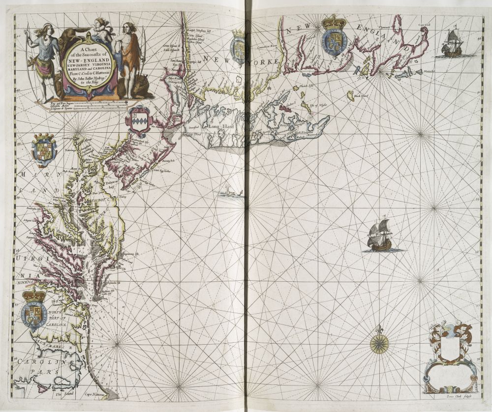
Fig. 5. John Seller, A Chart of the Sea-Coasts of New England. London, 1680. Lawrence H. Slaughter Collection, The Lionel Pincus and Princess Firyal Map Division, The New York Public Library, Astor, Lenox and Tilden Foundations.
But a second look at Seller’s map reveals that the basic morphology of the New England cartouche is undergoing dramatic changes by the end of the seventeenth century. Seller’s heraldic cartouche on the lower right is counterbalanced and even upstaged by the map’s eye-catching title cartouche in the upper left corner. While the heraldic cartouche projects the residual traces of an older pictorial tradition, the title cartouche signals an array of emergent designs. Influenced by continental and especially Dutch artists and engravers, English mapmakers introduced new and more nuanced decorative devices, at once expanding the cartouche’s decorative vocabulary while developing an increasingly baroque style that relied heavily on emblematic designs and symbolic figures.18
Important for the purpose of this discussion is the fact that one of the more prominent features differentiating new from old cartouche designs was the relatively sudden and pervasive addition of the figure of the “Indian” to New England cartouches.19 The territorializing function inherent to the seal continued to inform the general cartouche design. However, with the inclusion of Indian figures the former message of feudal proprietary power morphed into a new message that had less to do with the political representation of New England but more with the representation of maps as such. A survey of New England maps published between the late seventeenth century and the middle of the eighteenth century reveals how two “Indian” designs, the “Indian frieze” and the “Indian tableau,” changed the form of the New England cartouche and thus redefined the relationship of cartouche and map.
The Indian Frieze
As suggested by John Seller’s cartouche in A Chart of the Sea-Coasts of New England, the elementary cartouche is expanded to incorporate discrete Indian bodies next to the shape of animals (beaver, elk) and the map’s scale (the English, French, Dutch, and Spanish measures of distance). Each body is highly articulated, emphasizing posture, costume, and weaponry. A closer look reveals they are copies of existing book illustrations; both cartouches show the influence of Renaissance drawings made by John White and Theodor de Bry.20 In carto-historical terms what they copy is a tradition of Indian representation, which, as Stephanie Pratt has shown, entailed a general shift of Indian figures from the map center to the margins where they became “extra-cartographic material in the decorative borders.” More significantly, whereas early seventeenth-century maps displayed Indian figures to signify regional and ethnic identities in the form of picture galleries, late seventeenth-century maps included merely a “composite image of the American Indian.” As composites their visualized bodies ceased to specify regional or ethnic differences but were instead abstracted into allegorical representations signifying the generic “Indian” as a mere type.21 In the case of Seller’s cartouche the figures are shown to be precisely such composites: each figure is a mixture of inherited forms whose visual frame of reference has been removed from that of particular local originals. In fact, the figures are copies of composites; they are borrowed from cartouches illustrating maps of regional entities like the West Indies or the American continent.22 Being thus unspecific to New England maps (or the region), Seller’s figures practically serve only one purpose: to assert the cartouche’s “Indianness” and thus classify the map inside a Euro-centric reference system in which Indian figures are metaphors indexing the geographic space of America.23
That said, however, the cartouche was selected for a New England map, and since there is nothing about the Indians’ figural form that could establish a link between the cartouche and specific New England tribes, their graphic function is less about locating New England as a territory on the map but more about locating the Indian within the cartouche design itself. Appearing in groups or couples, Seller’s carefully etched bodies push, lean, and lounge with the effect that they seem to be caught in a permanent stasis. By drawing the Indian figures as if it were their purpose to better convey the cartouche’s content by physically supporting its structural form, they recall a well-established tradition of graphic design that depicted Indian figures as neoclassical bodies, proportionate in form and symmetrical in function. Famous examples are book frontispieces, such as the one prefacing travel accounts like Thomas Hariot’s A Briefe and True Report of the New-Found Land Virginia (1590) or geography books and atlases like Johannes Blaeu’s Theatrum Orbis Terrarum (1635; fig. 6). In frontispieces like these the decorative body of the Indian operates both as a narrative and mnemonic device; while the figure provided access to the structure of the material book (or codex) it also reminds the reader about the book’s contents, here that the book is about geographic knowledge that includes America.
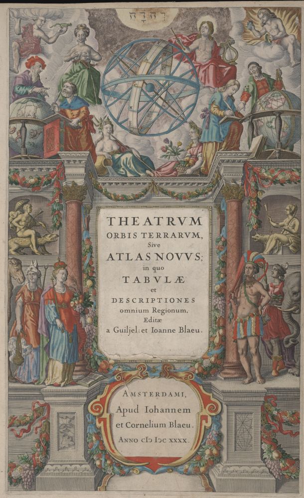
Fig. 6. Johannes Blaeu, Theatrum Orbis Terrarum. 1635. Beinecke Rare Book and Manuscript Library, Yale University, New Haven, Conn.
If we apply the convention of the frontispiece to the Seller cartouche, it is only a short step to associate the figure of the Indian with design patterns taken from the decorative arsenal of architectural handbooks. By the same token that the cartouche operates like a frontispiece that seeks to introduce the text of the map, its sculpted Indian bodies stand out, frieze-like, from the title cartouche like the classical shapes of statues and statuesque ornaments that embellished public and private buildings. The Indian cartouche thus redefines the map as both a material object and architectural space whose meaning hinges perhaps as much on the cartographic representation of American geography as on the way in which Euro-American relations are defined by the structural stability of spatial representation.24
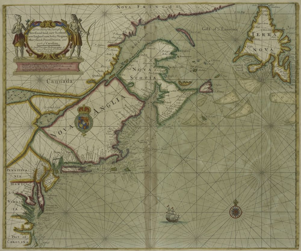
Fig. 7. Samuel Thornton, A New Chart of the Sea Coast of New-Fund Land, New Scotland, New England. 1702. The Lionel Pincus and Princess Firyal Map Division, The New York Public Library, Astor, Lenox and Tilden Foundations.
Yet, the Indian frieze design is never presented as an edifice or structure designed to actually house, that is, provide roof, walls, or for that matter a sheltering framework, for either the cartouche or the map. Instead, architectural elements appear limited to the cartouche’s base, providing a stable foundation for grounding Indian figures. In that sense the Indian frieze patterns resemble at once neoclassical artwork and architectural décor. The link between public architecture and popular sculpture is most visible in cartouches such as Samuel Thornton’s A New Chart of the Sea Coast of New-Fund Land, New Scotland, New England (1702; fig. 7)25 Its core design—consisting of the stone-carved title tablet, the frame’s material heft, and the corporeal solidity of the Indian figures—emphasizes the cartouche’s material substance. Yet, its lack of a broader physical context presents the Indian frieze cartouche as decorative design imitating not architecture but decorative design objects. Indeed, if architecture beckoned initially to provide a referential framework for explaining the Indian cartouche design, its freestanding appearance situates the Indian cartouche inside the broader culture of Restoration masonry and production of sculpture. The Seller cartouche’s overall form—consisting of a horizontal base propping up the vertically attached Indian figures—points to an aesthetic derived from public monuments that were erected in city squares or cathedrals. At the same time, the cartouche’s monumental design also invokes the miniature, the more inexpensive figures sold by masons and image peddlers. Appearing in print instead being made of marble, porcelain, or clay, the image of the cartouche projects a three-dimensional corporeality similar to the seal (or the modern paper weight). But whereas the seal is the official appendix accompanying a document, the Indian frieze design becomes the easily overdetermined object generating visual narratives about the New England map that are informed as much by ekphrastic stasis as by cultural fantasies of the docile Indian body.
The Indian Tableau
A similar visual narrative suggesting corporeal stability informs the second most frequent cartouche design, the “Indian tableau,” found in early New England maps. Whereas the frieze style showed discrete Indian bodies in semiautonomous postures similar to fully-formed sculptures, the alternative pattern depicted Indian figures alone or in groups in situational contexts. It did so by reproducing picturesque or allegorical effects that were conceptually styled in the tradition of the literary and graphic arts (as opposed to masonry and sculpture). As shown in the cartouche for A Map of New England (1676; fig. 8) by Robert Morden and William Berry, we are still confronted by stock types, but get to envision them now in their material setting. This setting consists of a landscape vaguely marked as “American” by palmetto-shaped trees. The cartouche develops a contextual style that postcolonial theory has recently termed “ethnoscapes—landscapes of persons who constitute the shifting world in which modern subjects live and through which they represent one another and to themselves their relationships of identity and difference.”26 The identity and difference evoked by the Morden/Berry cartouche revolves around European fantasies of colonial economic production, here the diligent preparation of animal skins and other natural goods into bulky bundles by an Indian workforce that is steadily going about their daily business of being hunters and gatherers.
Fig. 8. Robert Morden and William Berry, A Map of New England, 1676. Courtesy of the John Carter Brown Library at Brown University, Providence, R.I.
The image of commerce is central to later New England cartouches that apply the “Indian tableau” pattern, and can be found in cartouches introducing maps as different as the Homann Erben map, entitled Nova Anglia (1750; fig. 9) or William Douglass’ Plan of the British Dominions of New England (1753; fig. 10). In both cartouches, Indian bodies appear in relation to European symbols of Atlantic commercial exchange (ships, fishing net) while at the same time representing their value as economic partners. In the case of the Homann cartouche the tableau revolves around the aesthetic principle of balanced symmetry: the Indian figure (still drawn in the de Bry mold) is equal to the European figure in size and pictorial detail; both figures are surrounded by goods that signify economic exchange between Indians (animal furs) and Europeans (rifles, textiles, etc). In contrast, the Douglass cartouche seems to upset this balance: it obliquely references the fur trade by depicting a gallery of animals at the top, but emphasizes New England’s famous fishing harvests in the foreground (including a whale). Significantly, the Douglass cartouche omits the figure of the European trader while rendering the Indian figure ambiguously childlike and of racially indeterminate origins (the color black has replaced Native costumes).27
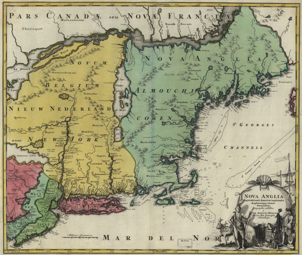
Fig. 9. Homann Erben, Nova Anglia. 1750. Courtesy of the Library of Congress.
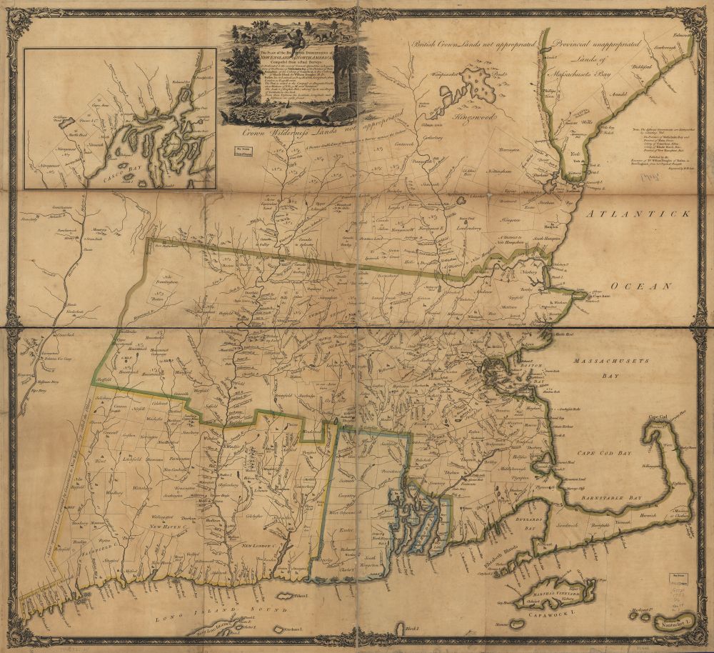
Fig. 10. William Douglass, Plan of the British Dominions of New England. 1753. Courtesy of the Library of Congress.
Both tableaux create images of contained fragmentation: each figure is shown to be part of a larger economic system; even though they seem to represent action—bow and arrow suggest the work of the warrior-hunter which in turn is controlled by the emasculated appearance of the puttee-like hybrid between African slave and Native American in Douglass’s cartouche—they are shown not in situ in a realistic New England space (or time) but as composite elements or personifications of the picture itself. Indeed, cartouches drawn in both the vein of the Indian frieze and the Indian tableau internalized the material logic of the early modern “Indian” curiosity cabinet perhaps best illustrated by Jan Van Kessel’s allegorical painting America (1666; fig. 11). There we see multiple Indian sculptures situated inside the architectural space of a museum-like gallery that is devoted solely to the display of objects representing the people and animals found in the New World. The figures seated in the foreground correspond harmoniously with their stony counterparts who are decorously integrated into the architectural space, be it as classical sculptures or abstract masks looking down from the modillions that adorn the arched window frames. The living occupants of this Wunderkammer—ranging from the supinely reposed to the joyous band of returning hunters—are here hypostatized figures whose meaning hinges as much on projecting a composite American identity as on the assumption that such figures are discretely crafted art objects, even collectibles, and thus commodities intended equally for display and trade in the world of circum-Atlantic aesthetic exchange.28
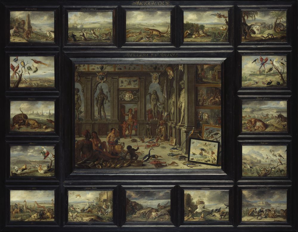
Fig. 11. Jan Van Kessel. America. 1666. Bildarchiv Preussischer Kulturbesitz/Art Resource, NY.
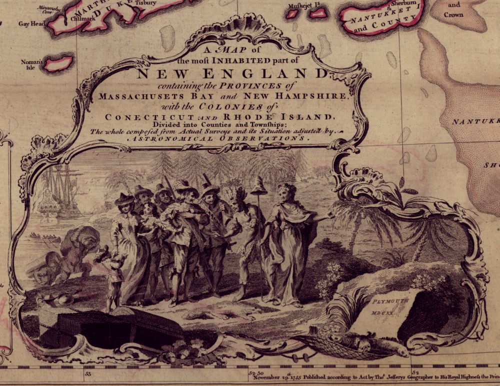
Fig. 12. Detail from Thomas Jefferys, Map of the most Inhabited part of New England. London, 1755. Courtesy of the Library of Congress.
Jefferys’s “Indian Theater”
When addressed in the terms of decorative formalism as delineated above, Jefferys’s 1755 cartouche in the Map of the most Inhabited part of NEW ENGLAND builds on the “Indian frieze” and “Indian tableau” tradition. But with a new twist: it adds the element of theater performance and the material culture of stagecraft to the pictorial content defining eighteenth-century New England maps (fig. 12)29 If we turn to residual patterns first, Jefferys’s use of composite figures squarely grounds his cartouche within frieze and tableau designs. Between the Indian and the English, each figure is a personified type: local characteristics are negated while more generalized attributes become affirmed as the visual character of the group.
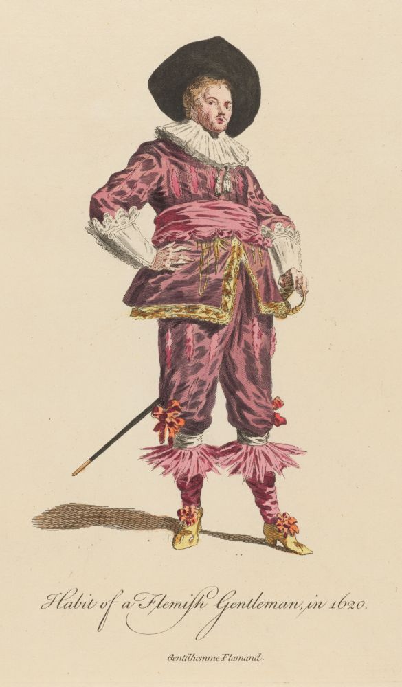
Fig. 13. “Habits of a Flemish Gentleman in 1620,” from Thomas Jefferys, A Collection of Dresses, 1757–1772, Vol. 2, 62. HEW 14.7.6, Harry Elkins Widener Collection, Harvard University, Cambridge, Mass.
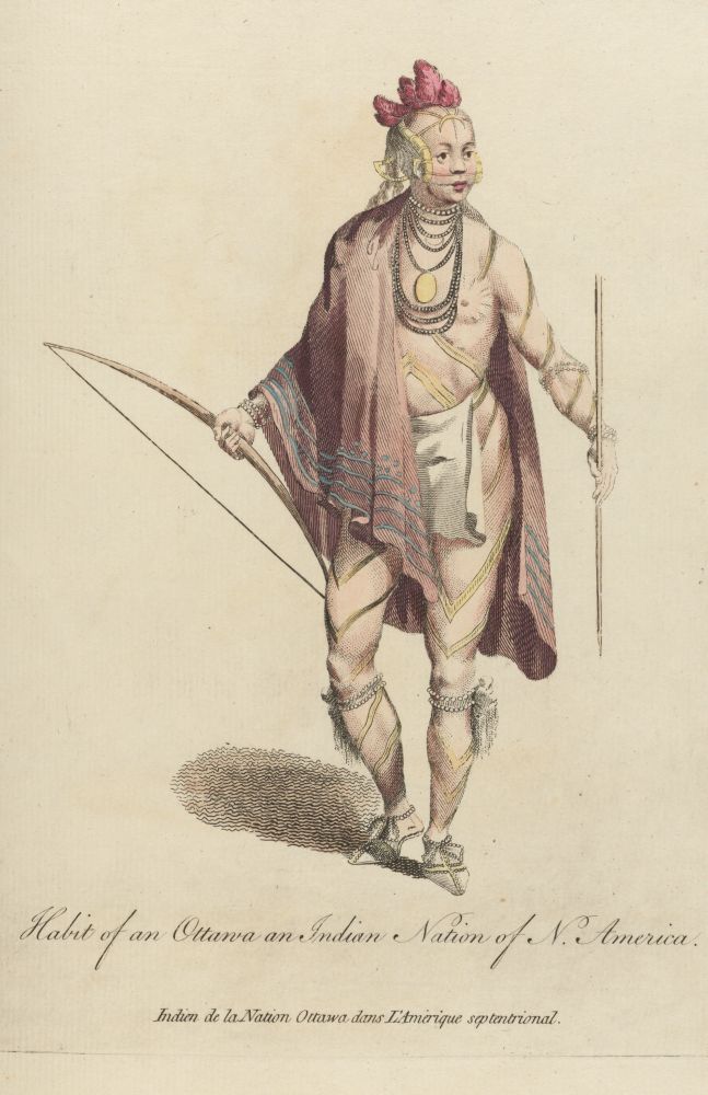
Fig. 14. “Habit of an Ottawa, an Indian Nation of North America,” from Thomas Jefferys, A Collection of Dresses, 1757–1772, Vol. 4, 114. HEW 14.7.6, Harry Elkins Widener Collection, Harvard University.
But unlike past map engravers who modeled their Indian illustrations on Renaissance travel books and ethnographies, Jefferys seems to have developed his figures by tapping into a new visual archive: close-ups reveal that Jefferys’s cartouche figures strongly resemble picture prints entitled “Habits of a Flemish Gentleman in 1620,” “Habit of an Ottowa, an Indian Nation of North America,” or “Liberty”—all of which were published shortly after the map by Jefferys himself as A Collection of the Dresses of Different Nations, Antient and Modern (1757–72; figs. 13–15)30 True to the tableau’s formal logic Jefferys’s figural ensemble becomes an ethnoscape, asserting difference by subordinating particularity to generality: individual differences between Native American tribes (say, the Ottawa versus the Narragansett) or differences between European citizens (the Dutch versus the English) become blurred in order to accentuate the more general differences between Native Americans and Europeans. Drawing this distinction, however, comes at a price. All human subjects become too generalized, and thus the cartouche singles out inanimate objects to impress the stamp of a local identity on this spectacle of difference: the idea that this cartouche is about New England (and not about Surinam or New Amsterdam) is signaled by the strategic insertion of a rock bearing the inscription “Plymouth MDCXX” and the ubiquitous image of the full fishing net below the rock.
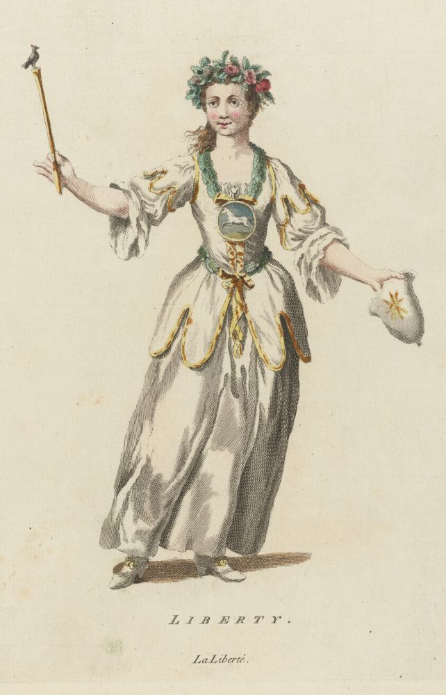
Fig. 15. “Liberty,” from Thomas Jefferys, A Collection of Dresses, 1757–1772, Vol. 4, 156. HEW 14.7.6, Harry Elkins Widener Collection, Harvard University.
In treating the cartouche like a tableau, consisting of a stable picture frame and stock-type figures, we end up with a pictorial construct that generates a predictable narrative whose sum total begins, at the left, with rowboats and English sailors unloading a ship in preparation of a European economic future in America, and that ends, at the right, inside the unpopulated but presumably rich in natural resources (remember the fish) mainland. Much of this narrative is engendered by the female figure representing Liberty; holding a staff on which perches the liberty cap, or the pilleus libertatis, she invitingly gestures at the landscape, addressing the assembly of recent immigrants while at the same time bypassing the half-naked subservient figure of the Indian. In its overall configuration, the cartouche is thus another allegory in which its constitutive elements—be they borrowed from the architectural frieze or the picture tableau tradition—represent the moment when English colonists took possession of New England, while the European personification of “Liberty” predicts the historical process of invasion and succession, in short, the act of colonization and the British dominion over New England.31
Yet, as much as we recognize elements of the frieze or tableau, Jefferys’s cartouche signals a fundamental departure in both the cartouche’s formal design and thus the function of its pictorial content. On the whole, the cartouche resembles a tableau vivant in which human figures are less encoded as static objects but more as active subjects. The modernized and realistically drawn figures invoke, on the one hand, the tableau vivant’s situational techniques, which, informed by eighteenth-century genre painting as well as literature, were devoted to the representation of historical or allegorical motifs. On the other hand, Jefferys’s figural arrangement invokes the graphic representation of theatrical scenes and stage performances. In this context it is perhaps not a coincidence that the same book from which I suggested earlier that Jefferys copied his figural designs also devoted a whole section to allegorical figures in period costumes and “the habits of the principal characters on the English stage.”32
Indeed, just as it could be argued that Jefferys copies from existing ethnographic fashion plates, his Indian figure’s dress imitates the theatrical wardrobe used by stage actors playing “Indian” characters: the feather dress displayed by the cartouche invokes a history of theater costumes dating from Inigo Jones and the early seventeenth-century masques to the tragedies of John Dryden’s The Indian Queen (1664), for which Aphra Behn provided original feather garments from Surinam, which would then reappear later in Dryden’s The Indian Emperour (1667) and Aphra Behn’s own play, The Widow Ranter (1689)33
Jefferys’s cartouche elaborates the theater connection further by placing the Indian figure at exactly the axial center of the picture and thus also at the axiomatic center of the pictorial narrative. Do the experiment: when folding the cartouche in half we find that it is not the vertical line of the liberty staff but the line connecting the Indian’s head, left hand, knee, and foot that creates the optical boundary line separating the Dutch-English characters from “Liberty” and the unpopulated American landscape (fig. 12). As we look at the vertical axis of the Indian from top to bottom, dramaturgical elements such as body posture and specific hand gestures imitate representations that could be found in oratory manuals and acting handbooks, not to mention popular studies specializing in the classification of hand gestures and facial expressions such as John Bulwer, Chirologia; or, Naturall Language of the Hand (1644) and Charles Le Brun Conférences sur l’expression (1698)34
Once considered as a dramaturgical configuration, Jefferys’s Indian figure simulates a character type that was habitually populating the English (and European) theater stage by the mid-eighteenth century.35 The cartouche Indian resonates with a new generation of composite characters developed by what could be called “Indian plays,” ranging from John Dennis’s Liberty Asserted (1704) to Robert Rogers’s Ponteach: or the Savages of America, A Tragedy (1766)36 At the same time, the cartouche Indian also recalls the puppet-like images of the “Four Indian Kings” which in 1710 were used to advertise a puppet show (“a New Opera performed by a Company of Artificial Actors”). Or, in a similar vein, Jefferys’s Indian invokes figures from pantomime shows like Arlequin Sauvage (1721)37 In performances like these the figure of the Indian is cast in terms that suggest quasi-mechanical actions made by quasi-mechanical actors. The form and function of the Indian then is that of a moveable puppet who dances, jumps, or simply moves on command by the hands of a puppeteer. It is also that of an automaton that will jump, laugh, or even sing like a machine that is soulless, not human, just an animated thing.38
If we move from actors and acting to the material terms of stagecraft, then Jefferys’s cartouche resembles a “scenographic stage.” Since the 1660s the central feature of such a stage was its moveable scenery, which, being painted in perspective, was famous for altering the means of representing—and quickly changing—geographical settings.39 Framing this moveable scenery was the proscenium arch. Placed upright between the stage and the audience, the arch functioned similar to the frame of the cartouche: both arch and cartouche frame separate the contents of the staged setting from the world that surrounds it.40 Not to become too technical, it is interesting to note that while pulley systems and other mechanical devices shaped special effects behind the stage, during the Georgian period moveable scenery was increasingly replaced by inexpensive giant transparencies which, like the vertical display of the cartouche tablet, was suspended like a screen in front of the stage in order to imitate set designs through elaborate lighting effects.41
If we follow through the comparison of Jefferys’s cartouche and the theater stage, his Indian figure now occupies a position that changes the meaning of space inside the cartouche. On the one hand, he inhabits the strategic place that on stage would be reserved for solo performances by actors or for stage announcers addressing the audience directly. But because the Indian addresses not us, the viewers, but his fellow actors he not only directs the flow of dialogue sideways but also assumes the figurative place of the proscenium arch, becoming at once the frame and medium for viewing the content of the stage. Thus, on the other hand, the Indian figure’s body becomes the boundary that reorients and subdivides the tableau vivant into both a dramatic representation and a blueprint of an English theater: at the same time as the Indian resembles a cast member of a dramatic performance, it also is the figure addressing the implied theater’s auditorium on the left (the English pilgrims) and the projected stage set on the right (the American landscape). With this adjustment of perspective, Jefferys alters the cartouche’s pictorial narrative. We assume that colonial intent was implicit in the various elements of the tableau design. But in the old reading this intent tends to be interpreted as a historical fact. In contrast, Jefferys’s cartouche changes the horizon of expectation: there still is colonial intent but through its theatrical configuration it becomes a social action; colonization is presented as a dialogic practice using human actors, not as a historical event producing faceless facts and historical dates carved into geological formations.
Conclusions
But since we are discussing decorative arts and not theater plays, cartouches and not Indian figures get to have the final word. I started this essay by observing how the cartographic representation of New England was unambiguous and constant in eighteenth-century maps. Looking over the various cartouches discussed above, only two aspects are constant: the words “New England” and the allegorical narrative celebrating British colonial history. Aside from that, when viewing the New England cartouches separately from the maps’ contents it becomes evident that, in contrast to cartographic representation, the cartouches were anything but unambiguous when defining New England. Cartouches were switching formal and visual codes in what appears to be in rapid succession. This begs the question, did the frequent changes in design patterns change the meaning of New England maps and if so how?
If we look at internal designs first, “New England” is defined by a set iconography that is surprisingly variable. In fact, cartouches seem to struggle in determining a single attribute representative of New England. They tap generic images ranging from fish and fur to trade ships and European-styled figures, but in this they marshal a visual shorthand that is as regionally unspecific as it is universal in its application in cartouches introducing most of the maps about North America. Formal confusion upends the cartouches’ symbolic function further: between the late seventeenth century and the mid-eighteenth century, New England cartouches make their territorial demands by using a multitude of graphic displays instead of one uniform design, invoking shapes from royal insignia to costumed actors, or from architectural monument to natural landscape. Even the Indian figures, though a constant as a composite type, do not generate a stable referent for defining “New Englandness.” They mutate—like movable scenery—from passive object to active hunter, from adult to child, from classical sculpture to modern stage actor. This kind of iconographic flux affected not only the cartouches’ internal but external macro designs. Between the 1670s and the 1750s the cartouches’ basic shapes shifted from resembling escutcheons and architectural structures to pictures and picture frames.
The graphic permutations used for representing roughly the same allegorical theme (namely, that New England belongs to and is a part of the British empire), then, suggest that the changes in cartouche designs have less to do with the maps’ actual content. Rather, as graphic inserts ancillary to maps but not necessary to their meaning (after all, New England is recognizable without the cartouche) they provide an iconographical index that allows us to gauge changing attitudes towards the maps as a material artifact. First, the cartouche’s frame creates a visual faultline effectively isolating the cartouche from the map by segregating its overdetermined pictorial mode of signification from the map’s mode of cartographic writing. Second, the cartouches’ emphasis on material shapes, such as the frieze or the picture frame, aligns the map with a broader material culture of display objects. Subsequently, and third, by aligning the map with material culture objects the cartouche registers different modes of map reception. One mode of reception, and perhaps the central mode, is the map viewing habit; it makes for a very different viewing (or reading) experience if the planar projection of the map’s cartographic image is suddenly thrown into relief by a non-cartographic image such as an asymmetrical cartouche frame, asking us to approach the two-dimensional paper map as if it were a three-dimensional construct made of plaster or marble. With these changing micro and/or macro-shapes comes a fundamental change in how we are to imagine the relationship between cartouche and map: is the cartouche a stamping device, leaving its imprimatur on the map and thus calling attention to the map’s printed state? Is it to be seen as a discrete object that can be placed all over the map, like movable type? Or is it a display object, calling attention to its sheer visuality, from the specific pictorial to the general spectacle?
If we address these findings in the terms of cartography’s material history, the Indian figures inside the New England cartouche transform the map into a spectacular commodity intended for circulation in the marketplace of picture prints and other visual art objects. While internal evidence suggests a visual narrative of Indian containment, once we locate this narrative inside the serial production of flexible cartouche designs, the Indian cartouches become symptomatic of the commercialization of map production. The recurring motif of the static Indian figure can be considered as a print label for classifying map genres (New England cartouches categorize themselves as maps about America) and for determining a map’s market value (maps with elaborate cartouches cost more money). The less static theatricalized Indian of the tableau pattern continues in this vein, presenting the map as a crossover product in which a historical picture print could be viewed as a presentist commentary on a looming political conflict (here the soon to erupt British-French conflict in which New England would figure as a contested battleground). But in the end, the cartouches that are being circulated in New England maps are not neatly styled designs reflecting specific political or commercial attitudes towards New England, be they considered an English repository of natural resources or a staging ground of British history. Rather, what the New England cartouches show—and maps cannot—are competing notions of space, spatial representation, and spatial relations. This is the spatial work of the New England cartouche.