April Meeting, 1955
A STATED Meeting of the Society was held at its House, No. 87 Mount Vernon Street, Boston, on Thursday, 28 April 1955, at half after eight o’clock in the evening, the President, Hon. Robert Walcott, in the chair.
The records of the last Stated Meeting were read and approved.
The President, on behalf of the Corresponding Secretary, reported the receipt of a letter from Mr. Ebenezer Gay, of Hingham, accepting election to Resident Membership in the Society.
The chair appointed the following committees in anticipation of the Annual Meeting:
To nominate candidates for the several offices,—Messrs. Fred Norris Robinson and Elliott Perkins.
To examine the Treasurer’s accounts,—Messrs. Willard Goodrich Cogswell and Arthur Stanwood Pier.
To arrange for the Annual Dinner,—Messrs. Walter Muir Whitehill and David Britton Little.
Mr. Ray Nash, of Hanover, New Hampshire, a Corresponding Member, read a paper236 entitled:
American Writing Masters and Copybooks
THE colonization of America was an incident of the European ferment which had also its movement in handwriting. A paleographer sums up the matter: “The close of the sixteenth century may be referred to as the epoch of the rise of the modern current hand, as distinguished from the more slowly written and more disjointed cursive writing of the middle ages.”237 So a pliant gothic cursive script in several national varieties became the common medium for ordinary affairs. In England and in the Low Countries across the Channel the style, developed out of the medieval charter hand, was called running secretary and commune courante.238
At the same time, with the influx of the New Learning from the south, more and more members of university and court circles took up the clearer, simpler humanistic writing known as italic chancery cursive or cancellaresca corsiva.239 Through the sixteenth century and on into the seventeenth there was consequently nothing unusual in an educated Englishman’s being master of two distinct styles of handwriting—his own native blackletter running secretary and the fashionable innovation from Italy—just as an educated modern German is able to write both gothic and italic scripts.
Queen Elizabeth I was an adept of the new style. Nevertheless, the sturdy national prejudice against such newfangled importations is plainly expressed by the loyal author of Twelfth Night, where Maria imitates her high-toned mistress’s fine Italian hand. Shakespeare, as elder contemporary of some of the first comers over to America, can offer several sidelights on the subject of their handwriting. He himself stuck fast to the running secretary or English style of his Stratford school days—the only compromise possibly being an Italian cursive long s which crops out in writing attributed, not without contest, to his hand. A strong impression of the great, bold gothic letters on the sixteenth-century English schoolboy is registered in Katharine’s riddling “Faire as a text B in a Coppie booke.”240
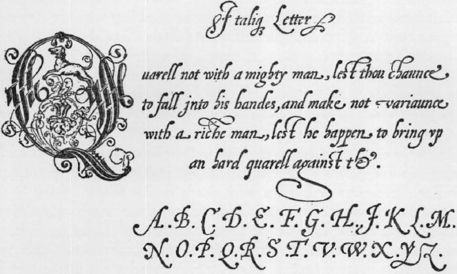
A copybook is a manual of writing instruction which places before the learner models to be copied. The bibliography of British copybooks in all probability begins with this very one remembered by Shakespeare. The title is A Booke Containing Divers Series of hands, as well the English as French secretarie with the Italian, Roman, Chancelry £:? court hands by John de Beauchesne and John Baildon. First printed at London in 1570, it is actually an englished version of the senior author’s Thresor d’ Escrifture which appeared at Lyons twenty years earlier. Leading with the common English cursive, the running secretary, the Booke Containing Divers Sortes of hands gives second place to the narrow, slightly sloped “Italique hande.” All told there are woodcut copies, or examples, showing thirty-seven different varieties of script, including such extravagances as “secretarie” written in reverse so as to be readable only by aid of a looking glass. There were perhaps a dozen more copybooks published during the formative years of the earliest American colonists in their homeland. As for the Pilgrims sojourning abroad, the writing models and methods to be encountered at Amsterdam or Leyden were closely similar to the English.241
The handwriting of the sea dogs and adventurers who plied New World coasts in the time of the first Elizabeth and James left little if any impression on colonial culture and need not, therefore, detain this chronicle. As every schoolboy knows, the inscription cut in the tree at Roanoke was, according to John White (himself an able practitioner of the chancery italic), in “clear Roman letters C R O”; but that was lost, swallowed up like those old English airs played to the wilderness in hope of finding the men who had carved it. The fact that John Rolfe wrote in running secretary when he asked the governor’s permission to marry Pocahontas is only another datum of slight historic moment. However, when William Brewster—after learning his ABCs in gothic as he doubtless did at Scrooby—picked up at Cambridge along with separatist notions a taste for the Italian script, the choice was an important one for American handwriting history. For, as the only member of the Pilgrim band with a university background, Elder Brewster was charged with principal responsibility for overseeing the children’s education. He would still be teaching them at Plymouth, with help from some of the women, to read, write and cipher years after public schools were established and the foundation of Harvard College laid in the Massachusetts Bay Colony. His example was reinforced by William Bradford; the second governor’s account of the Plymouth plantation is in careful, lucid italic script of the rounder sort that the Dutch writing masters were then introducing to the English.242 Another governor, Edward Winslow, nevertheless kept to running secretary.
The colonists of Massachusetts Bay, who numbered many of good estate and university breeding, generally favored the italic style although there are enough (and knotty enough!) examples of gothic among their remains. John Winthrop, their first governor, was capable of a sound italic; in correspondence, however, he has a disconcerting way of switching from one style to another even within a single sentence. His wife Margaret’s handwriting is a studious reflection of Queen Elizabeth’s cancellaresca. John Cotton’s knees were hard to bend but his fingers could form a supple italic. Although Roger Williams, also educated at Cambridge in a later generation, boasted he could perform “what short-hand could doe as well as most in England,” his longhand is a gnarled, laborious italic.
In any collection of seventeenth-century documents, then, the writing of the settlers is seen to alternate indecisively between the gothic and italic hands. But the latter is the more generally and increasingly favored style, whether from Increase Mather’s stubborn fist or flowing easily from William Penn’s nimble hand. Evidently the “round” writing was better suited to reformers turning the back on medieval liturgies and laws. And that goes for other settlers besides the English too. When about thirty members of the South Carolina Huguenot colony sign their names to a pledge of allegiance dated 1685 and set forth in italic script, some use one style, some use the other and some a mixture of the two, but most write the italic.243
Roman letters had, of course, long superseded gothic, or blackletter, as the favorite of the printing fonts. There was sometimes a resultant tug-of-war between seventeenth-century forms as seen in manuscript and those usual in print. This recalls the dilemma of Sis Hopkins, who could read readin’ but couldn’t read writin’. The Sis Hopkinses of that time might make out well with one of Samuel Green’s Boston news sheets, while having trouble with a private letter in cursive gothic. Besides conducting the transition by way of the mixed italic, the writing masters and copybooks had to help their pupils bridge the abrupt gap between the print of their books and the handwriting of their forefathers.
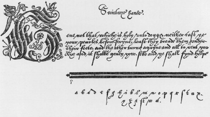
Italic and gothic, side by side in ordinary usage, could not remain pure. In the assimilation process the italic again was dominant. The inevitable hybrid was given a name and touted by old country writing masters as the new mixed current, or speedy Italian writing, or Italtenne bastarde. As modeled by the baroque master Gianfrancesco Cresci, it is a flowing, easy-looking script.244 Through his popular copybooks and those of Lucas Materot the “a la mode” came at last to be spread throughout Britain and her colonies, naturalized largely by means of Edward Cocker’s prolific publishing efforts. Among this compromise hand’s concessions to the old running secretary are the e that is looped at the top like a present-day business college o, and what has been called the upside down r which is easily misread for u by humanistic eyes. The d with back-swept stem and the h formed of a loop terminating in a wiggle below the line are also gothic vestiges that gave up slowly. Nevertheless, as the seventeenth century advanced and certainly after the middle of it the cursive mixed italic is the norm aimed at and more or less approached by the colonial writer for all ordinary purposes.245 The set gothic or “square” hands persist as decorative and professional resources into the nineteenth—come Christmas, even the twentieth—centuries, but the running secretary was practically dead in America before the middle of the eighteenth century, giving way to German scripts in Pennsylvania. In the seventeen seventies down on a Virginia plantation where he was tutor, Philip Vickers Fithian tells about giving a fifteen-year-old pupil “a Copy of Secretary-Hand, at her particular Request”; apparently it was quite a novelty.246 By the nineteenth century the gothic cursive was so far forgotten that the name “secretary” was free for appropriation to signify an Italian-derived backhand.
Instruction in writing was carried on, customarily, by a master who gave lessons either to individuals or to groups. In towns he gathered private pupils and often operated as adjunct to the grammar, i.e., Latin, school. In the country he made periodic professional visits to schools, families or other groups of subscribers.247 After seeing that each pupil was equipped, according to the rhyme,
A Pen-knife Razor Metal, Quills good Store;
Gum Sandrick Powder, to pounce Paper o’er;
Ink, shining black; Paper more white than Snow;
Round and flat Rulers . . .
the writing master was ready to show him how to hold the pen properly between fingers and thumb, how to sit correctly at the desk, where to place the paper or ruled writing book in front of him. Then came the demonstration of the strokes of the letters in due order, of the letters themselves, and eventually of the letters joined into words and the words arranged in improving sentences that are still remembered in the pejorative term “copybook maxims.” The master wrote the model for the lesson at the top of a fresh page in the learner’s writing book—this was called setting the copy.248 It was then the pupil’s business to reproduce the copy as nearly as he could, studying each thick and thin, every curve and join, line after line to the bottom of the page under correction of the master. Much of the master’s time was occupied in the making and mending of pens. A well-selected and nicely cut quill may be the best of all writing instruments but relatively few pupils seem ever to have gained the knack of making and maintaining a good pen.
The old-country tradition was but spottily supported in the new during the seventeenth century. Settlers pushing on to further frontiers were not usually accommodated by writing masters. The chirography in which their deeds and other “writings” are preserved often is as outlandish as the orthography. But around the earliest New England settlements a particular and fairly constant effort was made; here the threat was recognized, not (as the Pilgrim Fathers had feared) that the children might all become little Dutchmen, but that they were heading straight for savagery. Reading was, of course, paramount, for without access to Scripture they were damned. However, writing also claimed a share of the colonists’ anxieties for their children’s welfare. One of the Pilgrim band who stayed behind expressed this concern in a letter to Bradford. “Lastly, I must in-treat you still, to have a care of my son, as of your own; and I shall rest bound to you, I pray you let him sometime practice writing,” wrote Robert Cushman in behalf of the fourteen-year-old boy who was to succeed Brewster as elder. The leaven of college graduates in New England—more than seventy of them are counted before 1640—helped maintain good standards of writing too, for in those days college men were better than average penmen.
In the Boston neighborhood especially there was no lack of opportunity for instruction from writing masters much along old-country lines. Samuel Sewell in the sixties speaks of the master John Sanford as “a pious Skillful and prudent Man,” which takes care of the most important qualifications from the seventeenth-century point of view. In 1666 the town records first make mention of a private schoolmaster, a Mr. Jones, who was being warned out of town—perhaps he was not a writing master.249 The town archives for the year following record the granting to William Howard of “liberty to keep a wrighting schoole, to teach childeren to write and to keep accounts” (plate 1a). In 1680, according to the same source, the writing master William Haynes came to Boston from Hampton. Judge Sewell’s journal tells of putting his son Sam to “Eliezer Moodey to learn to write” in 1688. Thomas Atkins is noticed as a writing master in the records of the same year and during the last decade two more appear as private teachers of writing: Edward Mills in 1691 and Peter Burr250 in 1694 (plate 1b), both of them graduates of Harvard College.
Moreover, the serious-minded town fathers, who in 1635 had engaged the professional scrivener Philemon Pormort as first “free school master of the youth,” made public business of this particular branch of education when in 1666 they hired Daniel Henchman to assist the grammar school master and “teach Childere to wright.”251 By 1684 a tax-supported town school devoted to writing and mathematics was established with its own master in charge. This was known as the Writing School in Queen Street. In 1700 the North Writing School opened; twenty years later the South Writing School or Writing School in the Common was added as the final link in Boston’s colonial public school system consisting of two grammar schools and three writing schools.
The Edward Mills who has already been mentioned as a private teacher of writing in Boston, after he came into town from Dorchester in 1691, taught “children of such indigent Members of the Church of England Gratis, as are not able to pay for the same” under sponsorship of the Society for the Propagation of the Gospel in Foreign Parts. In 1722 he was appointed master of the Writing School in Queen Street, a post which he evidently occupied till about the time of his death ten years later. A petition in his clear and easy though rather wayward cursive round hand (plate 1d), addressed to the “Justices of the General Sessions now Sitting at Boston for the County of Suffolk,” 7 July 1727, is in the collections of the Massachusetts Historical Society. It offers, close up, a rare early instance of the public writing schoolmaster on the upward march, according to standard operating procedures developed so effectually in the following generation. The argument runs:
That Whereas the Great & general! Court or Assembly held at Boston aforesaid on Wednesday Nov. 8. 1710 in Council voted in Concurrence wṭḥ the Representative, viz: In Considerac̄on that Yoṛ Petitioner had for many years kep’t a Considerable Gram̄ar School. Ordered that he be exempted from Publick Taxes in manner as gram̄ar Schoolmasters are by Law, the benefit of wcḥ Act he has enjoyed ever Since untill these two last years, in wcḥ he has been taxed & deprived of Said exemption, notwithstanding he Continues to teach Grammar wṭḥ Writeing & Arithmetick as heretofore, And allthō: it is objected that Yoṛ Petir is now in Quality of an English master, Yet as that does not deprive him of his Gram̄ar Capacity wcḥ he is in the daily practice of in his School, so he hopes that Yṛ Honṛs (who are good Judges) will allow that the knowledge of Gram̄ar is very requisite if not absolutely necessary to Compleat an English mastṛ as well for Instruction to spell, from the Lattin & Greek derivations as to write good English wcḥ few can doe who are ignorant of Syntax.
Moreover Yṛ Petiṛṣ School has an hundred Schollars & some times more yet his Salary is but equal to those who have not half the number.
After all this it is a pleasure to see in the margin “petition granted.”
The good example set by Boston in educational matters was heeded to some extent throughout the Massachusetts settlements. An act of 1642 placed responsibility on the selectmen of each town for supervising the training of children in learning and in labor. An act of five years later further ordered every town of fifty householders to appoint a teacher for “all such children as shall resort to him to read and write,” and every town of one hundred householders to establish a grammar school. Legal prescriptions for public education were also adopted in Connecticut and New Hampshire and Maryland. Nevertheless, there is frequent evidence in the local histories of the struggling provincial towns that, whether from scarcity of qualified teachers or from unwillingness to support them, or perhaps through preoccupation with sheer survival, the frontiersmen’s obligation to find a teacher and build a schoolhouse was at many times and places unfulfilled.252
The colonial American writing school, public or private, ordinarily took boys from about seven years of age. Owing its origins in England to the fact that Latin grammar school teachers were often poor penmen, it provided auxiliary instruction by specialists. Boys whose hand had not been properly formed at their primary or petit school could thus break off classical studies to resort to the writing master for an hour’s tutelage at eleven o’clock in the morning, say, and again at five in the afternoon. Schools at a distance from town were served by itinerant writing masters who, following old-country custom, visited them periodically and left it to the regular teacher to keep up the practice of writing between times.
The ambitious writing master naturally sought to fill his unoccupied periods with pupils who were not pursuing grammar school studies toward the university or the learned professions. By preparing himself to teach other subjects leading to a business career, such as arithmetic and bookkeeping, the writing master gained markedly in stature. When the great era of British empire building opened he was in a position to challenge the classicists—early in the eighteenth century the English writing master William Webster was arguing against bright lads wasting their time on Latin and Greek when their opportunity lay through the mercantile studies he offered.253
This division of purpose was implicit in the separate kinds of colonial schools founded on the seventeenth-century plan and located in the larger centers. However, those established in the following century, and especially in the middle and southern colonies, tended to combine the different interests. More often than not the result was to emphasize practicality. For example, at the free academy of Charleston, South Carolina, the course of studies set up in 1712 included “writing, arithmetic, and merchants’ accounts, and also the art of navigation and surveying and other useful and practical parts of mathematics.” The habit of the southern gentry was to send their scions to England for education. Among these young gentlemen was George Forcenza, the Indian sagamore who under the instruction of the London writing master William Brooks “made such a Progress in Writing and Arithmetick, as is scarce to be parallell’d in so short a space,” according to the teacher’s testimony.254
The combination of writing and mathematics as taught by some of the colonial masters produced highly decorative manuscripts in the eighteenth century. Each new subject, e.g., “Tret and Tare,” “The Rule of Three,” “Alligation” and so on, is introduced by elaborate calligraphic headings. Often they have geometrical or other drawings in color and bold lacing of flourishes. An excellent example of such mathematical manuscripts is one proudly signed by Stacy Beakes, Trenton, New Jersey, 1721, and now in the library of Princeton University. It contains two hundred thirty folio leaves measuring thirty-two by twenty-three centimeters. Books of this character, made up of one or more quires of paper sewn into heavy paper or cardboard covers, often were used for both writing practice and mathematical material together. Those serving the two purposes separately were called by their owners respectively writing books and manuscripts. Occasionally there is some confusion in usage; in a writing book from Philadelphia preserved at the Newberry Library in Chicago, for instance, the former owner wrote “Ioseph Milnor his Coppy Book March yẹ 1sṭ 1732–3”
Benjamin Franklin tells in his autobiography how as a boy of eight he was entered in a Boston grammar school. The next year he was sent to a private school conducted by the writing master George Brownell (plate ic), “employing the mildest and most encouraging methods.” Under this regimen, Franklin continues, “I learned to write a good hand pretty soon. . . .” Neither the accomplishment nor the interest in its performance ever left him. His own clear commonsense round hand was to serve as model for the first copies published in this country (plate iiic) and again for the handsome script type cut many years later for his private press at Passy by S. P. Fournier le jeune.
At the period of Franklin’s early reminiscences, the establishment of newspapers makes possible the tracing of private schoolmasters through their advertising notices. Thus we learn of George Brownell’s migrations from Boston to New York to Philadelphia; of Browne Tymms the shopkeeper who teaches accounting and will write bills, bonds and leases to order; of Samuel Grainger late of London,255 “the learned and ingenious Mr. Granger” who opened an evening school “for writing and accounts and the Mathematics.” In Boston alone there are advertisements or other notices of more than a dozen of these free lances before the year 1720 offering their services to the public. Some like the elder Grainger were newly come over, armed with the authority of the latest London fashions and ready to teach all the usual hands of Great Britain together with mathematics, accounting, and such occasional sidelines as dancing, French, singing, fencing or painting on glass. Whether they settled down and, like Grainger again, had a son to put at Harvard and to succeed them, or whether they went back to the old country after a visit, their influence on the colonial centers must be weighed as considerable. They had the models and methods of the great English writing masters at the tip of pen and tongue: the straightforward round hand as reformed by John Ayres and his colleagues, the quiverfull of decorative and special scripts, the sweeping whole-arm flourishes by command of hand that proved the masterful professor.
One of the immigrants was Peter Pelham, remembered more as mezzotinter than as writing master, and still better as stepfather of John Singleton Copley. He had come from London in 1726 and when portrait possibilities among leading colonial figures grew meager he turned from print-making to teaching a variety of skills. His advertisement is of frequent occurrence in the Boston papers of the late thirties and forties, in this style:
Mr. Pelham’s Writing and Arithmetick School, near the Town House (during the Winter Season) will be open from Candle Light ’till Nine in the Evening, as usual, for the benefit of those employ’d in Business all the day. . . .
Of much interest to the annals of American calligraphy would be—if he could be located—the Abraham Nicholas who kept a writing school and published several works at London. “When he left Clapham, he went somewhere abroad; I am informed to Virginia,” reported William Massey in his Origin and Progress of Letters, 1763, “but in what employ I have not been informed, that I remember, only that he died about the year 1744.” So far he has to remain among our missing men.
The eighteenth-century press reflects other aspects of colonial culture touching education in handwriting. The following advertisement from the Philadelphia Mercury in 1753 describes a candidate whose position contrasts sharply with that of the New England writing master:
To be disposed of, a likely servant man’s time for 4 years who is very well qualified for a clerk or to teach a school, he reads, writes, understands arithmetick, and accompts very well. Enquire of the Printer hereof.
By the middle of the eighteenth century the masters of Boston’s public writing schools attained the peak of colonial development. They had risen with popular education and in the taxpayer had discovered a good patron. The apprenticeship system provided a measure of stability, while there were constantly expanding opportunities to spur ambitious men and a living tradition to guide them. More sophisticated native penmen never worked in this country before or since. This is not to say necessarily that they all were fine calligraphers or brilliant teachers. At least they were dignified by a job holding possibilities of gratifying the “curious” not only of their own time but of future generations as well. They were still capable of responding to the ancient slogan of their profession, Vive la plume!
They enjoyed other and more temporal advantages.256 The pay was very fair though sometimes slow. The salary paid by the town was augmented by a number of perquisites, e.g., fees for “firing” and “entrance money.” Some masters secured the privilege of using their school rooms for lucrative private classes in the evenings or at odd hours. Some were beneficiaries of grants and allowances to cover their home rent, doctor’s bills or extra help. There was always the possibility of getting the town officers in a proper frame of mind to abate individual tax bills. Gifts of money, rum and other valuables from grateful, or perhaps hopefully expectant, parents were welcomed by the schoolmaster. In any case he could cultivate the opportunity of selling paper and writing books, pencils and quills to his pupils, or contract to furnish their ink at so much per annum to be paid by the town.
The Boston public writing school master’s income at mid-century had become on the average quite as good as that of his grammar school colleagues. He was addressed, and spoken of deferentially, as Master. He had long since ceased to be a mere adjunct of the Latin school; he was head of his own establishment and frequently a Harvard man himself. In his full-dress wig, replaced by a cap on less formal occasions, he was a magisterial Jehovah who could dispense either favors or terrible punishment, including such a barbarity as trouncing. As a matter of fact, the esteem in which he was held by the community—the rate at which he was valued by the town officers and the respect with which he was remembered by boys who had been under his rule—seems to have been directly in proportion to his severity in many instances. The hardier public writing school boys gloried in legends of tyrannical masters and despised private teachers who for obvious reasons used gentler methods; Franklin’s grateful recollection of Master Brownell is exceptional testimony by an extraordinary witness.
Nevertheless, the Boston writing master of most lasting fame does not appear to have been especially severe. Abiah Holbrook257 who presided over the South Writing School for more than a quarter century is remembered rather for his manuscript “Writing Master’s Amusement” now in the Houghton Library at Harvard. Also he is the teacher who in colonial times through enthusiastic and devoted pupils exerted a pervasive and continuing influence beyond his own lifetime without ever publishing anything.
Holbrook belonged to the fifth generation of the family in America, his great-great-grandfather having come over in 1635 from Broadway in Somerset. His father, whose name was usually spelled Abia, was a kegmaker by trade though he filled a variety of town offices such as member of the watch, bellringer and grave digger. Abiah Holbrook, Jr., born in 1718, was apprenticed to John Procter, master of the North Writing School and a disciplinarian so formidable that his reputation came down into the following century. Young Holbrook is first heard of professionally in the town records of 1741: “A Petition of mr. Abia Holbrook Junr desiring Liberty to Open a School, to teach Writing and Arithmetick (he being bro’t Up thereto by Mṛ John Proctor and by him Recommended)—Read. Voted, that the said Holbrook be & hereby is Approved of, and has Liberty granted him accordingly, to keep a School within this Town. . . .” In the following year he entered the public school system as usher, or assistant to the master, of the North Writing School, and the next year he became head of the South Writing School.
The new master demonstrated within a few months that he knew something about local politics as well as the business of his profession. In May, 1744, the town voted to enlarge his school and at the next March meeting raised his salary above that of his predecessor, who had given up the position for one at that time better paid. Holbrook was encouraged to make another approach, of which the instrument, dated 26 February 1745/6, is fortunately preserved in the George A. Plimpton library at Columbia University. Although Holbrook was only in his twenties, his presentation has every appearance of a seasoned performance as he humbly sheweth
That as the South Writing School whereof your Petitioner is Master, is daily increasing, and now consists of 220 Scholars, which is near Fifty more than were there last March Meeting, Your Petitioner finding it impossible to tend and Instruct such a number of Scholars himself, was therefore obliged to appoint his Brother to tend one part of the said Scholars, and to pay for his Board with your Petitioner 7 months past, in order to have him timely at the School with your Petitioner, otherwise a great number of Scholars must inevitably have been turn’d off without any Learning.
The masterfully written appeal was successful. As of August, 1745, Samuel Holbrook was officially appointed usher to his elder brother.
Abiah Holbrook’s alertness to minor as well as major opportunities for improving his income is continually reflected by the Boston town records of the period. He petitioned and was given permission in 1744 to keep a private singing school during the summer “to teach youth the Rules of Psalmody”; the advertisement appearing in the Boston Gazette, or Weekly Journal for June 26 makes it clear that the school he proposed in partnership with Edward Macom was to be conducted on public writing school premises. Again there is noted in March, 1753, the town’s favorable action on Holbrook’s application for the privilege of supplying ink to the pupils at the rate of £4 a year; at least thirteen years later this arrangement was still in force, having produced the equivalent of more than a year’s salary up to that time. Another entry under date of 15 May 1754 records the grant of a special allowance to him “for such Usher as he shall Employ in said School.”
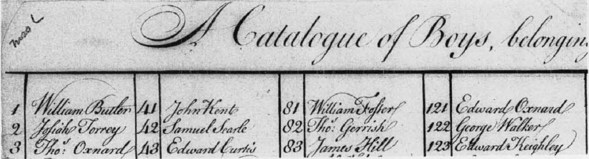
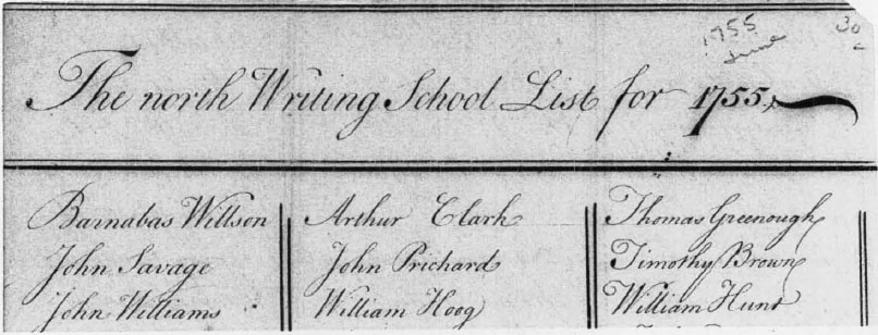
In the collections of the Massachusetts Historical Society is a sheet of paper on which the master has entered in clear, firm round hand the names of two hundred sixteen pupils under the heading “A Catalogue of Boys, belonging to the South Writing School, July 30, 1755” (plate IIa). At the same library is “The north Writing School List for 1755” also fairly set forth and containing two hundred thirty-seven entries (plate IIb). Together these handsome registers of more than four hundred of the Boston youth afford a comprehensive view of the public writing schools’ composition at mid-century. Some names stand out. Number thirty on the Holbrook list, for instance, is Jeremy Belknap, who was to be largely instrumental in founding the institution which preserves this document; then, at eleven years of age, he was just four years deep in the public Latin school curriculum. Half a dozen of his schoolmates have names identified later with the Boston Tea Party. A good number more appear in calligraphic “school pieces” remaining from South Writing School activities.
There is a fine lot of these South Writing School pupils’ exhibition pieces all together at Harvard. Similar manuscripts representing a number of eighteenth-century writing schools both private and public are in the American calligraphy collections at Dartmouth, the Newberry Library and elsewhere. Ordinarily the “school piece” made for display is on a half-sheet of paper, measuring about eight by twelve inches or so; frequently it is smaller and occasionally occupies a full sheet of paper. The pupil’s part was to write, in his very best hand, within a space carefully calculated and ruled, a bit of improving text out of some copybook or the master’s abundance of wise saws. Often colored inks were used, or paint, and sometimes a drawing or painting added pictorial enrichment to pen work. If the copy, i.e., the verse or maxim, was put in round hand or the larger version of the same style called round text, other words—the pupil’s name and title of the piece, perhaps his school, date, place, name of the master—would be in contrasting scripts, such as English or German text. The writing and lettering then was glorified by ruling and flourishing, which tied the overall composition together and kept the beholder from paying too much attention to inexpert wobbles and blots. Some of the pieces have monstrous fish, mythical birds, dragons, tortuous knots and interlacing of the kind especially cherished by old-country masters of the preceding century. Although condemned by soberer authors as vain sprigging, these free-swinging rhythms were properly defended by those gifted with command of hand as necessary exercises to ease tense hands and revive drooping spirits. They stand out exuberantly distinct from much pupil work and are passages obviously contributed by the master or an advanced assistant. For the same purpose, stationers were ready to supply sheets with engraved borders and lively pictures for the pupil to fill in with his select sentences or other matter. The professional encouragement of youth in this way was not, up to a point, considered as cheating. However, a half-century later on when Henry Dean of Salem hired an expensive painter to garnish his pupils’ work for exhibition there was a prompt outcry.
From Abiah Holbrook’s own hand there are extant at least two stylishly written petitions besides the one of 1746 already mentioned. The more modest of them, dated 2 October 1764, asks the selectmen of Boston to furnish him with an usher to take the place of John Vinal who is about to move out of town. The other, on a twelve-and-a-half by sixteen-and-a-half-inch sheet, is addressed to the freeholders and other inhabitants of the town. It recites various complaints in an impressive manner, but apparently to deaf ears since there is no record of any response. Holbrook’s unrivaled masterpiece, however, is, of course, “The Writing Master’s Amusement,” which he described in his will as “the curious Alphabet containing the Ten Commandments, and other Scripture pieces wrote in all the Hands of Great Britain, in several different colours with neat Borders round the same which I did only for my amusement, though seven years in compleating them. . . .”
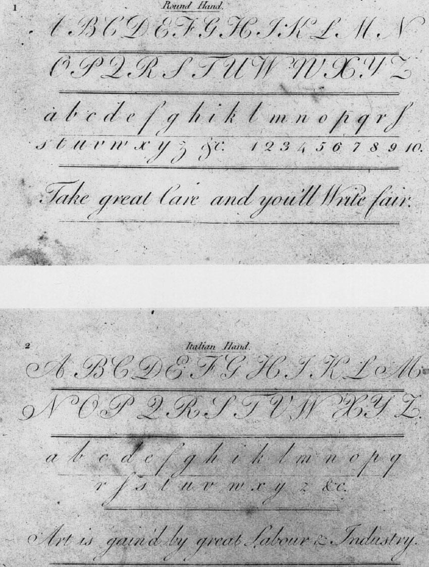
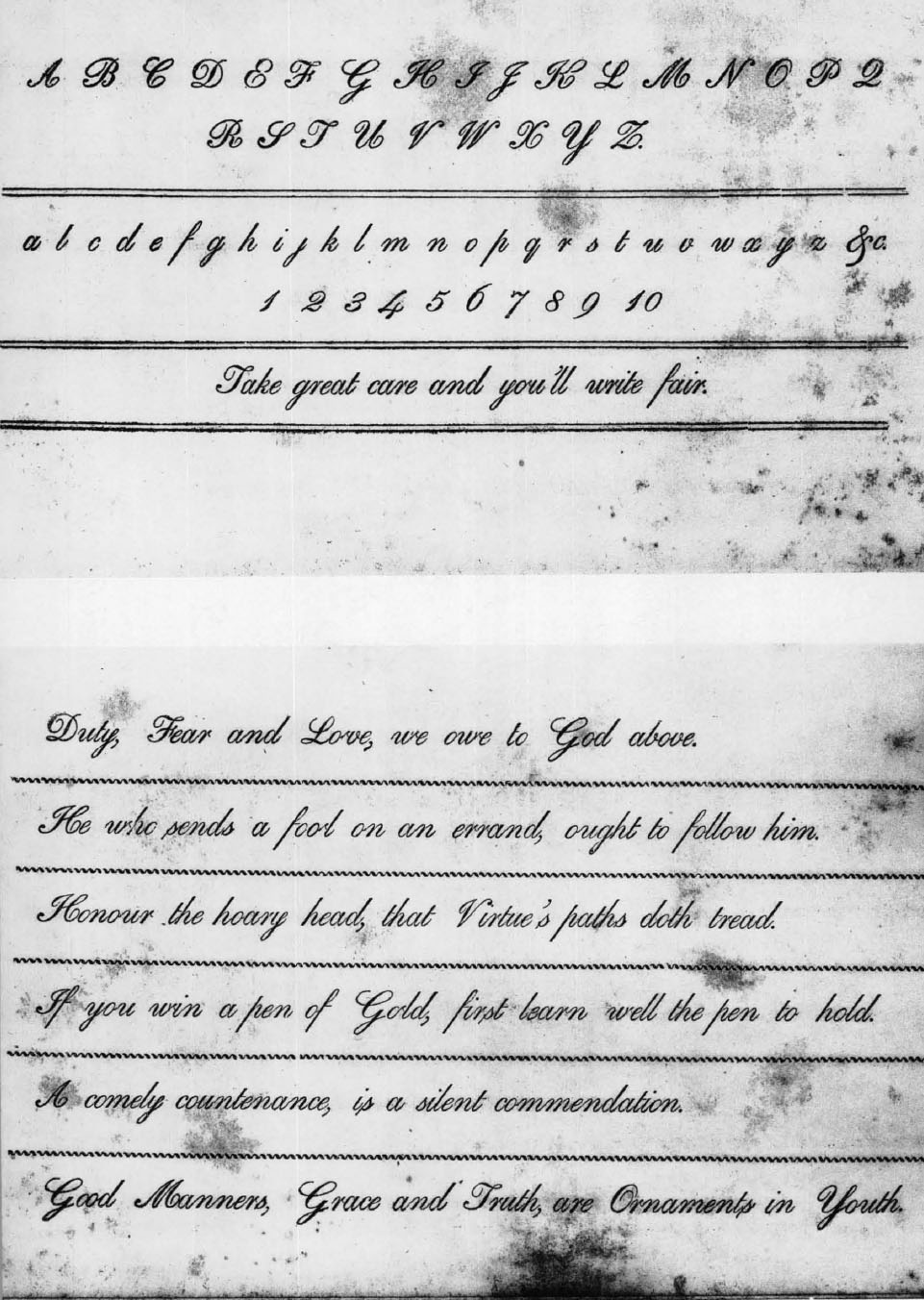
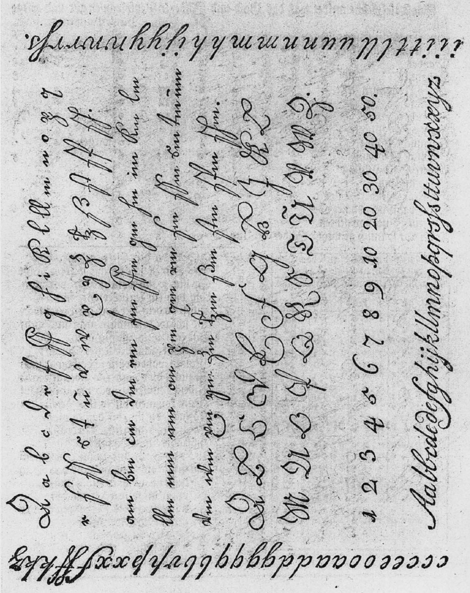
The scripts that Holbrook illustrated in writing out his resounding Old Testament selections on twenty-four leaves included alphabets of mated majuscules and minuscules about equally divided between gothic and Latin-derived hands.258 His medieval “square” styles were actually in little use, holding their place only for limited ceremonial and decorative employment, except for some conservative professional purposes such as legal mystification. The nomenclature of the scripts poses a problem because the writing masters and their copybooks are at wide variance from one another. Authorities of the same generation often disagree in their naming of similar hands. There is a persistent tendency among successive generations to borrow names from outmoded or obsolescent gothic styles and confer them upon the scripts of the day. The Latin-derived scripts exhibited by Holbrook may be catalogued on his own or contemporary authority as Roman print, italic print, round text, round hand, and Italian hand. The first two, of course, are hand-lettered versions of the most familiar forms of printing types. Round text and round hand differ from each other principally in size; the former is the larger, more slowly written variety of the triumphant eighteenth-century commercial script. It was commonly called “school hand” and “coarse hand” because of the introductory use for new writers. The Italian hand in large sizes shows the bulbous ascenders, weighted strokes and lateral compression characteristic of the baroque cancellaresca; in the smaller sizes it becomes a true running hand, rapidly flowing from a slender, springy nib cut with a long slit. In the gothic department Holbrook has German text, English text, secretary hand, chancery hand, and engrossing hand, the last named being a large and formalized gothic secretary.
The dominating feature of this work is the “curious alphabet.” The twenty-four (omitting differentiated J and U) huge capitals, six inches high and broad out of all proportion, grandiloquently tie the pieces together as design and place them in order within it. Their intricate strap-work is painstakingly drawn in pen outline and shaded with fine parallel strokes, the whole series being in black ink. They contrast strangely with the exquisitely worked colored borders which bound and subdivide the pages as though they were well-tended formal gardens.
Holbrook and his “Writing Master’s Amusement” show an acquaintanceship with the work of the English writing masters during the preceding hundred years that is unique in native American calligraphy of the colonial period. For the grand ornamental alphabet he drew directly from Thomas Watson’s A Copy Book Enriched with Great Variety Of the most Usefull fx? Modish Hands Adorned With a whole Alphabet of Great Letters, and so forth, of 1682 or thereabout. For the geometrical bit of showmanship on the F page where ingenious ruling forms a central octagon ringed by eight conjoined octagons, each enclosing a scriptural passage in a different hand, he went straight to George Shelley’s The Second Part of Natural Writing of about 1714, plate 22. In the written portions, however, the Boston master is on his own; they prove him to be a versatile and generally excellent performer as well as a keen student of copybooks from the best authorities. The following British works now in the Harvard collections once actually were in his professional library:
- George Bickham, Penmanship in its Utmost Beauty and Extent, 1731.
- George Bickham, Round Text, 1712.
- George Bickham, Round-Hand.
- William Brooks, A Delightful Recreation, [1717].
- John Clark, Writing Improv’d, 1714.
- Solomon Cook, Modish Round Hand, ca. 1730.
- John Langton, Small Italian Hand, [1727].
- John Langton, A New Copy Book of Round hand.
- Robert More, Jr., The General Penman, ca. 1710.
- Robert More, Jr., A New Copy Book.
- Robert More, Jr., The Writing Master’s Assistant.
- Abraham Nicholas, The Compleat Writing Master, No. 1.
- Abraham Nicholas, The Compleat Writing Master, No. 2.
- John Seddon, The Penman’s Paradise.
- John Seddon, The Penman’s Magazine, 1705.
- George Shelley, Natural Writing.
- George Shelley, Second Part of Natural Writing, [1714].
- George Shelley, Penna Volans, [1710].
- George Shelley, Alphabets in all hands.
- Charles Snell, The Art of Writing, 1712.
- Thomas Weston, Veteris Arithmeticae Elementa, ca. 1725.
A twenty-second copybook known to have been in the possession of Abiah Holbrook is the Watson work cited as source of the ornamental alphabet, now in the author’s collection.259
Such a concentration of writing manuals would have been exceptional even in the homeland. Certainly no comparable collection was formed in eighteenth-century America; the Library Company of Philadelphia apparently rested long content with only a copy of the Bickham work first named in the foregoing list, which was catalogued in 1741. A gathering of manuscript specimens produced by Holbrook and his circle was brought together by one of the group, Joseph Ward, Revolutionary patriot and schoolteacher, in the last years of the master’s lifetime. Some of these pieces show a particular appreciation of George Bickham’s Universal Penman, the splendid work published at London in parts from 1733 to 1741, which is known to have been held up for the inspiration of schoolboys in the Boston neighborhood.260 The originals forming the Ward collection cannot now be located.
A more characteristic figure to represent the colonial writing master in America generally would be Richard Rogers, scrivener and first schoolmaster of Oxford near Worcester in the Province of Massachusetts Bay during the thirties, forties and fifties of the eighteenth century. The difference in status is pointed up by the frontier master’s agreement to keep the school for £60 a year, payable in inflated currency “of the old tenor,” in the same year of 1749 that Abiah Holbrook’s salary was raised to £380, even though the local chronicle has Richard Rogers as “a gentleman of superior education, ‘the best teacher of his time,’ being an excellent scholar in Latin and excelled every one in his time in penmanship.” The narrowness of his circumstances is suggested by the personal accounts—along with voluminous sermon notes—in one of the manuscript booklets among his calligraphic remains on deposit in the Dartmouth library. On a blank page of a tabulation of equivalent sums in old tenor and lawful money which occupies another of these booklets, he has noted:
What Necessaries as Provisions &cṭ I Lay in for my Families Use this Present Year i759—
|
To io Bushḷs of rye |
i2 : 10 : 0 |
|
To 12 Bushḷs of Indian |
9 : i2:0 |
|
To 3 Bushḷs of Wheat |
5 : 5:0 |
|
To 3 Bushḷs of Malt |
3 : i5:0 |
|
To i Bushḷ of beans |
i : i0 : 0 |
|
To i2 Cord of Wood |
i6 : i6 : 0 |
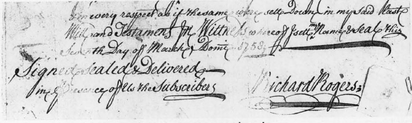
He adds the whole up to make Old Tenṛ 49 : 8 : 0. To the foregoing an item called simply Additional of £57 : 18 : 9 is put, bringing the sum total to £107 : 6 : 9. At the left Rogers has subtracted this total from the sum of £150, showing a credit balance of £42 : i3 : 3. But where that hundred fifty pounds was to come from is not apparent. All these matters are set forth in a sound cursive round hand, also nicely displayed in the will which he has written and signed without witnesses on March 7, 1758 (plate nc). Although not so schooled as that of the virtuoso Holbrook, his script is consistent and without affectation save for the exuberant extra loop at ends of words. The same mannerism is observed in the rounder cursive of Edward Mills, which is full of these adventitious tendril-like false es, and doubtless denotes a rhythmic and fairly rapid hand. Another habit of Rogers’ is the careful dotting of the figure 1, in the fashion of a Boston provincial engraver following forms common in the preceding century. Similarly in display pieces Rogers fancies putting a curlicue dot to his Roman print and italic print; also he likes to tick the stem of 1 as in the remain du roi of Louis XIV.
This writing master’s amusement was the making of ornamental broadsheets, of which the two surviving specimens located are signed and dated within two or three years of his death in 1761. The larger, measuring more than twenty-seven inches in height by nearly sixteen inches in width, is “Twelve good Rules found in the Study of King Charles, the First of Blessed Memory.”261 It is lettered in Roman print with a headline in English text and bits of German text and italic print. The most prominent feature of the sheet is a double row of huge bold braces ranged back to back down the middle. Directly above this is a crude pen drawing of the king in a devotional attitude. The piece is embellished by acanthus leaf borders and thick and thin ruling and hatching as though modeled on engraved work of a previous generation. The smaller broadside, of Sir Matthew Hales’s “The Sum of Religion,” also has the text in Roman print and characteristic ornamentation. The ideas for both of these specimens are to be found in popular prints. In execution they give testimony of an individualism rugged enough, standing distinctly apart from the Boston school of penmen led by Holbrook, although the antiquarian Massey in England reports seeing something calligraphic along the same lines.262
The bent and circumstances of the settlers were favorable to the development of self-conducted education. As early as the middle of the seventeenth century a minister working among them, the Reverend Lewis Hughes, is credited with a self-help kind of copybook. Titled Plain and Easy Directions to Faire Writing, it was published at London but “set forth for the benefit of the new planted Vineyards of the Lord Jesus in Virginea, Sommer Islands and New England.”263 Only a single leaf of this work is known. It was intended to guide first steps in writing by having the learner trace over printed letters in roman, italic and gothic styles. In short, it was apparently a simple extension of the medieval plan of introducing the child to his ABCs in the “criss-cross row” of the hornbook or similarly presented variety of capital and small letters at the beginning of the primer. What could be more natural in learning one’s letters than to sound and draw them at the same time?
Another London publication, of 1656, was probably better fitted to perform the intended service. Directions for Writing, Set forth for the benefit of poore Schollers, where the Master hath not time to set Copies circulated in the New World, where the only copy ever found is now in the Plimpton Library at Columbia.264 It consists of twenty-four oblong leaves of which nearly every right-hand page contains illustrations and copies rather roughly cut on wood. In his Directions for Writing, the author, identified only by the initials G. D., carefully explains that no writing master ought to object to this little book, “it being only for Men or Boys to practise at such times as they are at home, when as (perhaps) by reason of the far distance of the place, the learner hath no Copy, or the waies may be foul, the Scholler sick or lame, and divers inconveniences may happen to keep the School-master and him a sunder. . . .”
Under a woodcut showing good and bad positions of the hand and fingers, G. D. begins: “First teach your child to hold his Pen right, betweene his two fingers and his thumb. Secondly, shew him how to sit in comely sort. . . . Then next, shew him how many strokes do goe to every letter and how to goe over every stroke and letter softly and leasurely with a dry Pen, until his hand hath left shaking, and that he hath the understanding of the letter, and thinkes that he can make it.”
G. D. continues, with the authority of an experienced teacher: “In going over every stroke and letter with a drie Pen, shew him where to weigh light, and where to weigh hard; where to goe with the edge of the Penne, and where with the broad, beginning with the easiest letters, so as the making of one may helpe to make another.”
Simple and straightforward as G. D. is by comparison with the highly professionalized copperplate masters of the time, the number of styles presented here to “young Capacities” would seem excessively taxing to present-day penmanship pupils and their teachers. After charting the small letters and capitals of English, or gothic, running secretary, he offers half a dozen pages of copies in that hand consisting of scriptural passages and hortatory maxims. Then, still in the gothic department, he gives copies in chancery hand (not to be confused with italic cancellaresca corsiva), court hand and English text. These are succeeded by four more pages of copies showing Latin-derived scripts. For good measure G. D. includes, besides the directions and illustrations and recipes for ink-making and moralizing rhymes to be turned into emulous scripts, such miscellaneous information as Roman numeration, measurement of corn, “A Table of mans dayly Expences” and another of “some principall Cities in the World” (naming Philadelphia but not Boston), “The Circuit or Compasse of England” and a salute to typographic printing, “A Prayse of the Invention of Men of our time,” which is a far cry from the proud and jealous pen-driving tradition.
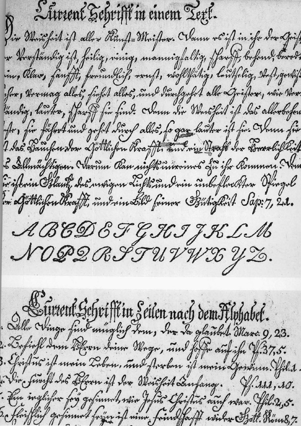
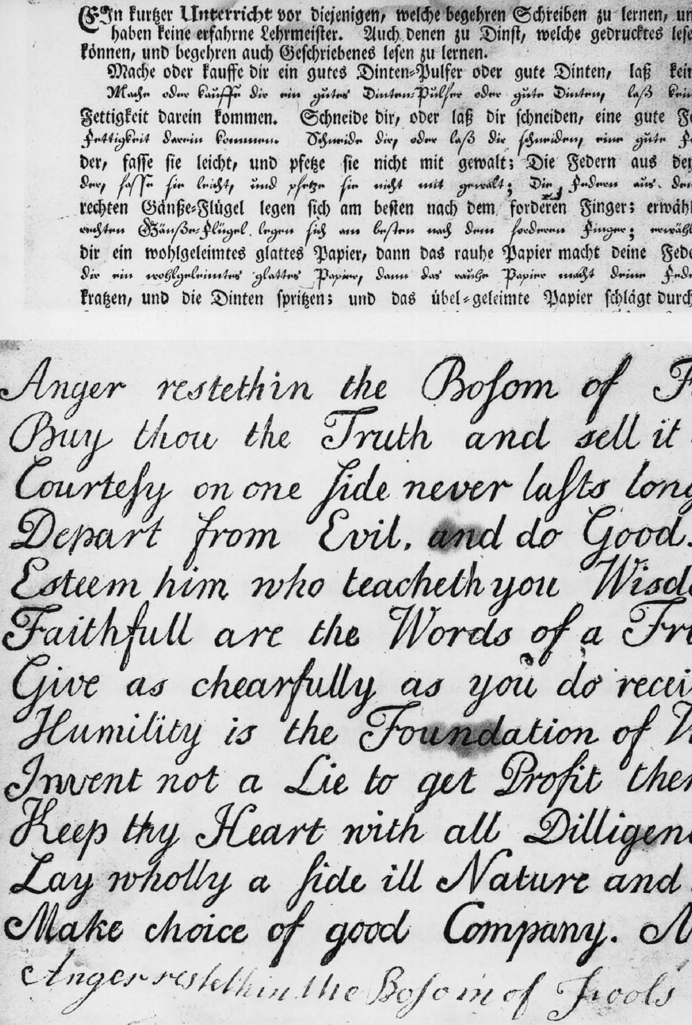
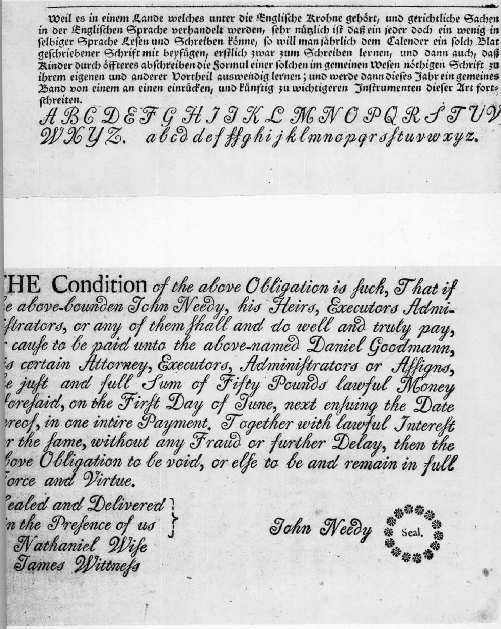
A general self-instructor, pursuing further the popular vein explored by G. D., was brought out at London as early as 1683, containing practical directions for handwriting and engraved copies. The Young Man’s Companion by an English schoolmaster, William Mather, is a prime instance of a type of literature which was to become widely and impressively influential in the American colonies.265 With successive editions the mixed italic style presented by Mather gave way to the smoother “copperplate” round hand of the eighteenth century, written with a nib cut to provide thicks and thins through pressure, and at a greater slant. George Washington went to school largely to Mather’s manual. From his copy of the 1727 edition he wrung a formidable amount of learning. No one can deny that he made full use of the engraved copies of round hand he found there in forming his own admirable chirographic style. During the process he made fair transcriptions in his writing books of a lot of sage rules; these, piously preserved and attributed to the father of his country, have brought him a quite undeserved reputation for precocious priggery.
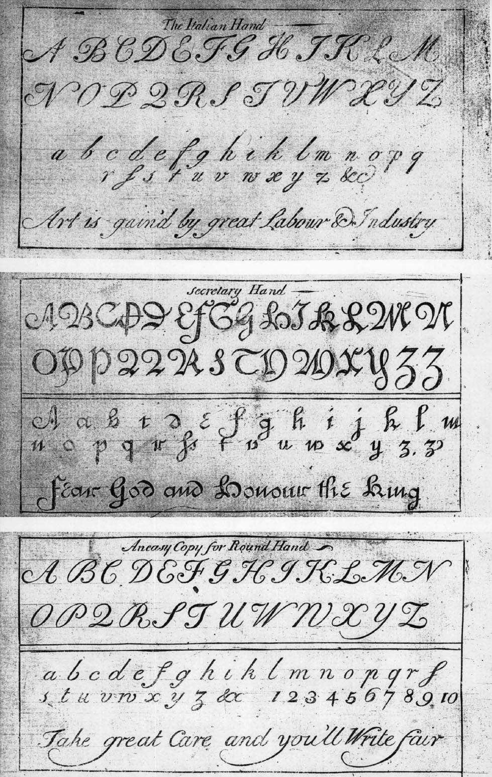
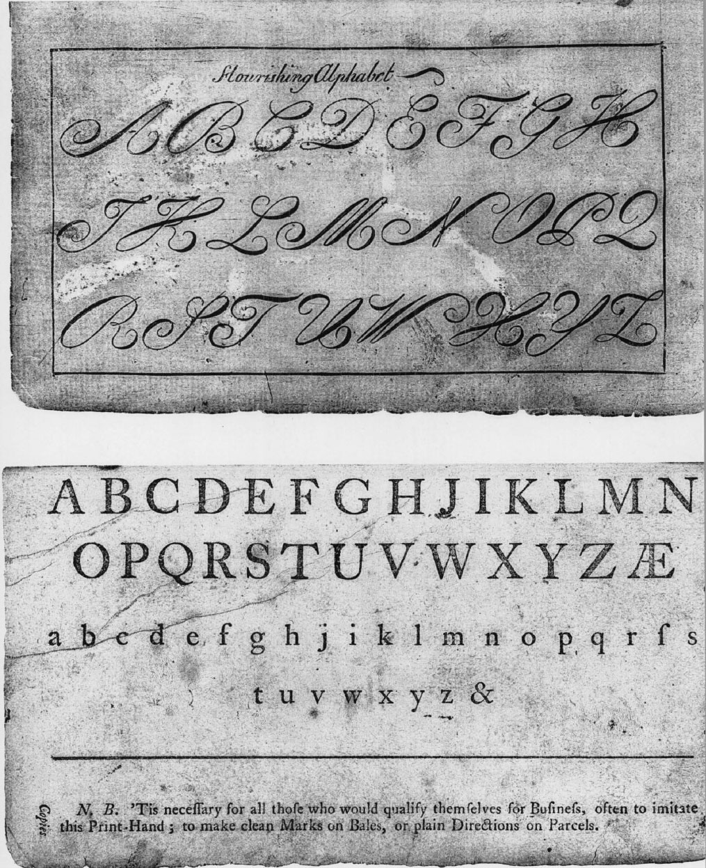
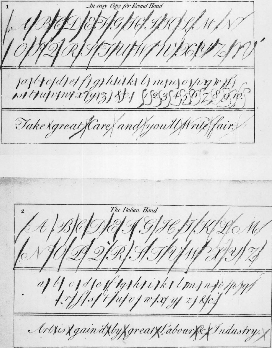
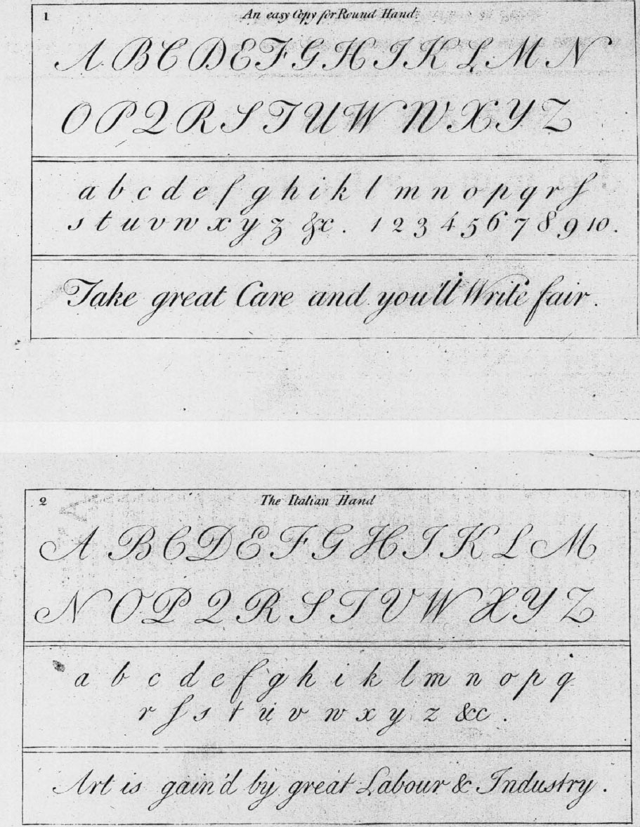
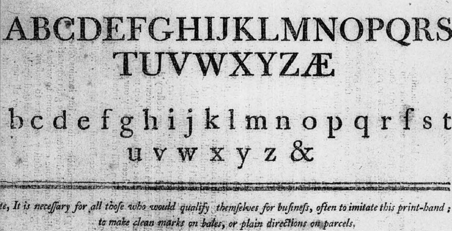
It is the colonial adaptation of another popular vade mecum of the same kind which holds first place in the bibliography of American copybooks. In 1748 Franklin and Hall published at Philadelphia The American Instructor: or, Young Man’s Best Companion, containing as the generous title goes on to detail, spelling, reading, writing and arithmetick; instructions to write variety of hands, with copies both in prose and verse, &c, by George Fisher, accomptant. This work had been known in London editions for many years, but the plates are original productions, especially the one titled “An easy Copy for Round Hand” which Benjamin Franklin himself, as already noticed, wrote out for the engraver. Besides the round hand they illustrate “The Italian Hand,” a decorative “Flourishing Alphabet” of capitals and a modified gothic “Secretary Hand.” Four lines of Caslon’s recent type designs are displayed on another page under the legend “Print Hand.” The Directions to Beginners and other textual material pertaining to writing follows the English model for the most part, occupying twenty-nine pages in the volume of nearly four hundred. However, at the very end of the book is another native and characteristically Franklinesque contribution to the subject:
An Explanation of Mr. J. B.’s Twelve Cyphers
By practising which, the young Writer may more speedily acquire a perfect Idea of the Proportions of the Roundhand Letters, and their Relations to each other, than by any other Method yet known.
These Twelve Cyphers are contrived, to let the Writer see, by inverting them, whether he has given his Letters their true Form. He must make Allowances for the Dots, and also for the beginning and ending Turns of n or u, being alike in this Example, the common Rule being to make the beginning Turns sharper, and then the Explanation of the Cyphers will be as follows:
No illustration of these combinations is provided, so that anyone playing the game has to turn back to the round hand plate and draw them for himself, remembering to make allowances for the dots and turns when they fail to come out just right. The Mr. J. B. was undoubtedly Joseph Breintnal, the scrivener, who had been first to join Franklin in the Junto and was associated with him in various business matters. He had died two years before and the “Explanation” would be appreciated among Philadelphians as a fitting tribute to one “ingenious in many little trifles” by his great friend.266
After the two Franklin and Hall editions, the Instructors brought out in New York and Philadelphia were generally content to reprint the old-country issues of the work even though Franklin had pointed out that in the British importation “there were many Things of little or no Use in these Parts of the World.” Some slight attention to current events is revealed by the change of a line of copy in the Burlington, New Jersey, edition of 1775 from “Fear God and Honour the King” to “Want is the Scorn of ev’ry wealthy Fool.” There are, in all, seventeen entries in the American bibliography of the durable Fisher compilation, the final one being dated 1833.
The self-instructor naturalized in mid-eighteenth-century Philadelphia had a prompt echo in Christopher Saur’s Pennsylvania German almanac published at nearby Germantown. The Hoch-Deutsch Americantsche Calender for the year 1754 issuing from his press contained four pages of woodcut copies illustrating gothic running hand in the German style and a couple of lines of round hand script (plates x and xi). In the Calender for 1756 the handwriting section is still limited to four pages but one of them now contains a “brief instruction” to the learner, in German (plate xiia) and there are twelve lines of rather roughly cut but virile large round hand alphabetical sentences in English (plate xiib). His humble effort is directed, says the publisher in the conciliatory tone already made familiar by G. D., to “those who are able to read print and wish to learn to read handwriting too.” There is no occasion for the slightest professional jealousy for he intends the present modest contribution “for children or persons who wish to learn to write just a little.” The Calender carried forward its limited program of handwriting instruction until publication was dropped with the number for 1778, when the publisher got into hot water with the patriots and had his property confiscated.
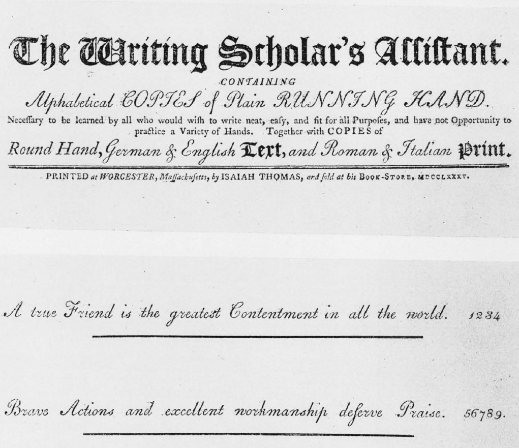
Apart from the young man’s companion type of general self-educator which includes some attention to penmanship, there is evidence in the sixties of a stirring ambition to produce American copybooks. Two works were announced for publication at Philadelphia in 1763 and the following year. The first was A New Set of Copies by William Thorne. The second was The Writing Master’s Assistant. It is almost certain that neither of them ever saw the light, although their titles have been matter-of-factly (and injudiciously, as I believe) included in various roundups of native calligraphic books. The earliest American copybook per se is The Writing Scholar’s Assistant (plate xiv) published at Worcester in 1785 by Isaiah Thomas. It is related to his edition of Fisher’s Instructor of the same year, making use of the same pair of engraved plates (plate vi). The purpose announced is to engender a “plain running hand, necessary to be learned by all who would wish to write neat, easy, and fit for all Purposes, and have not Opportunity to practice a Variety of Hands,” though round hand, German and English text, and Roman and Italian print are illustrated too. The copies are for the most part printed from script types, an economical way of representing handwriting which the Saur Calender introduced into penmanship instruction for both gothic and italic hands. The writing master James Hodder had, for that matter, in his pioneer arithmetic book published at Boston in 1719, employed lines of the curlicue script type at the Franklin press, probably with a similar pedagogical end in view.
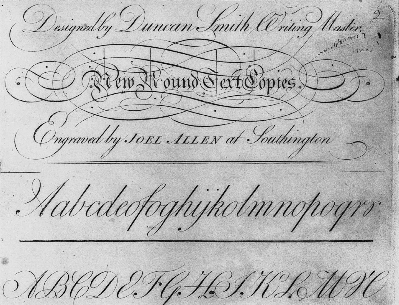
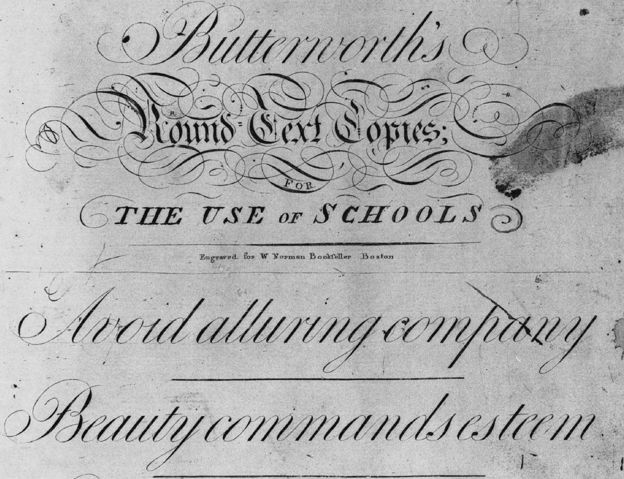
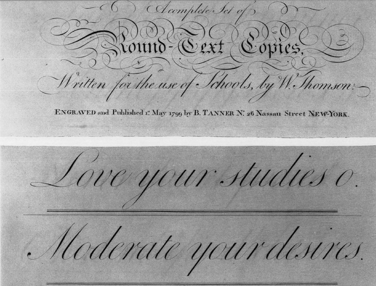
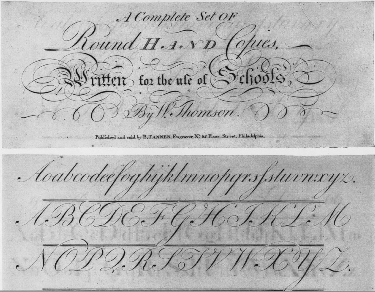
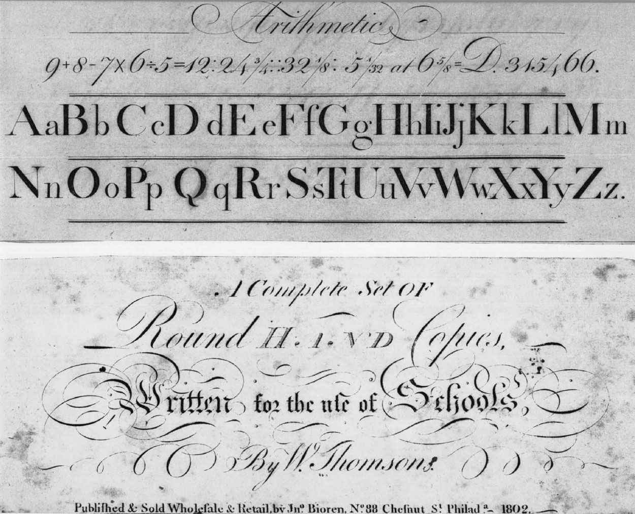
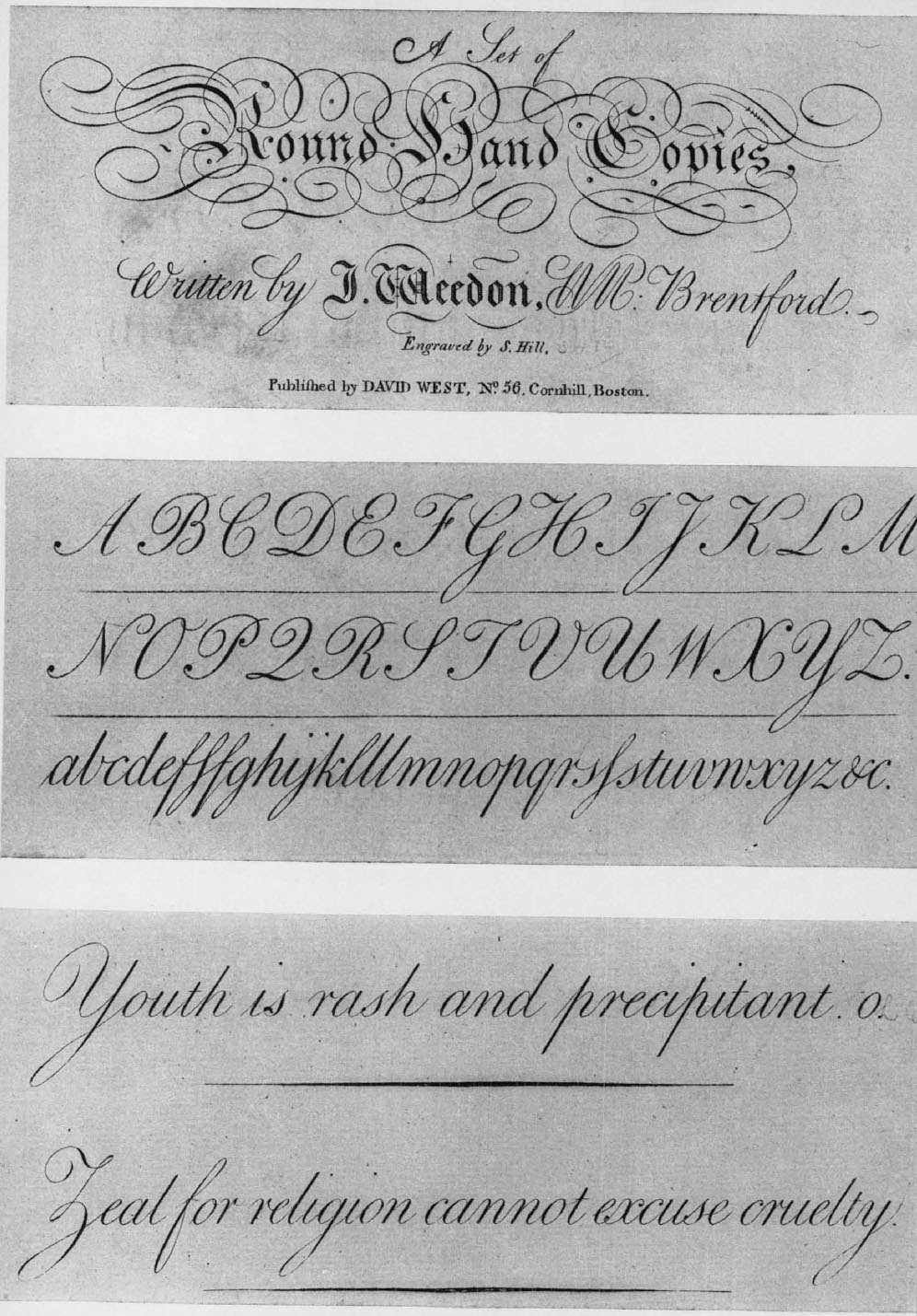
The rest of the copybooks published in the eighteenth century are, generally speaking, respectful colonial copies of British metropolitan prototypes. In a number of cases they proclaim old-country authorship: Duncan Smith, Butterworth, William Thomson, William Darton, J. Weedon. These well-known masters of London, Brentford, and so forth, have their identity preserved by the American publisher no doubt to enhance the value and appeal of his offering. In other instances the engravers on this side depended on imported copybooks without making any gesture of acknowledgment. However, the rules of paternity may not always be quite so simple as that. For example, there is the Philadelphia edition of Thomson’s Alphabetical Set of Large Text Words issued seventeen years before the first London appearance, according to the Heal bibliography. There is just a possibility that some of the American editions were authorized. Might not a British writing master coming to this country (as William Milns did, unknown to his biographer267) have even supervised the re-engraving and republishing of his work? Yes, but we know of none. Anyway, there is abundant evidence that imported British copybooks were in common use, along with the home-produced ones, in American schools right through the century and beyond, a persistent challenge to the Yankee patriot and inspiration to the Yankee pirate.
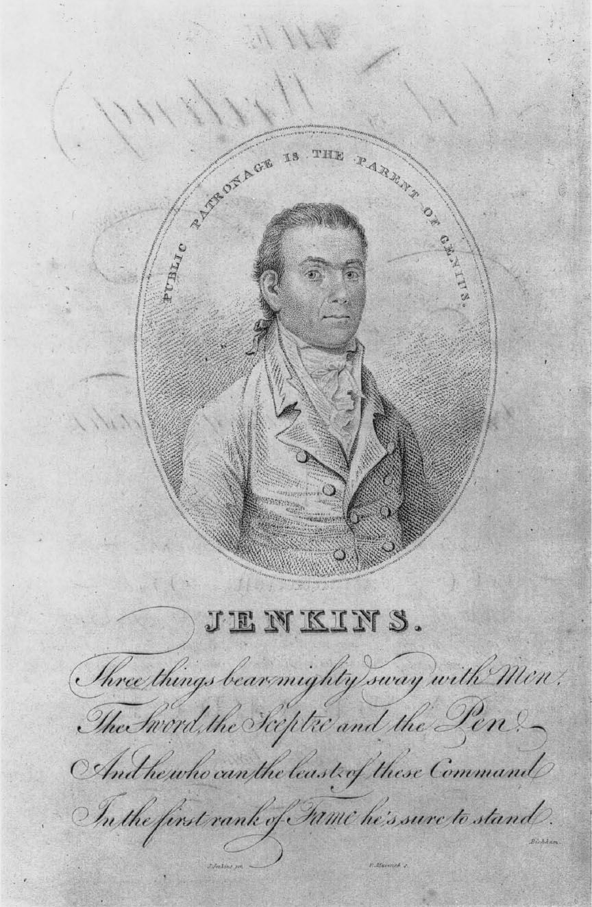
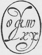
The most substantial and original native contribution to the literature of our subject is John Jenkins’ The Art of Writing. The peripatetic author was born in the year 1755 or thereabout, made his general headquarters at Boston and died at Wilmington, Delaware, in October, 1822.268 His first publication, a thirty-two-page pamphlet in small quarto with four plates of engraved copies and a frontispiece (plate xix), came out at Boston in 1791 over the Thomas & Andrews imprint. His lifelong belief in a strong backing was immediately evidenced by five pages of recommendations by the most literary and respectable characters of the country from John Hancock to John Adams, including several who, like Timothy Dwight, had taken their turn as writing masters. A new edition of this Book I was published at Cambridge in 1813 “under the patronage of the Legislature of Massachusetts, of the American Academy of Arts and Sciences, and of many gentlemen of distinguished literary talents”; in one of the two issues of the second edition the recommendations are extended to occupy twenty-eight pages. Now the engraved frontispiece is a portrait of the author overarched by the words “Public patronage is the parent of genius” (plate xx). A “third edition” (but having the same Cambridge title page in a different state) of Book I was printed at Elizabethtown, New Jersey, in 1816.
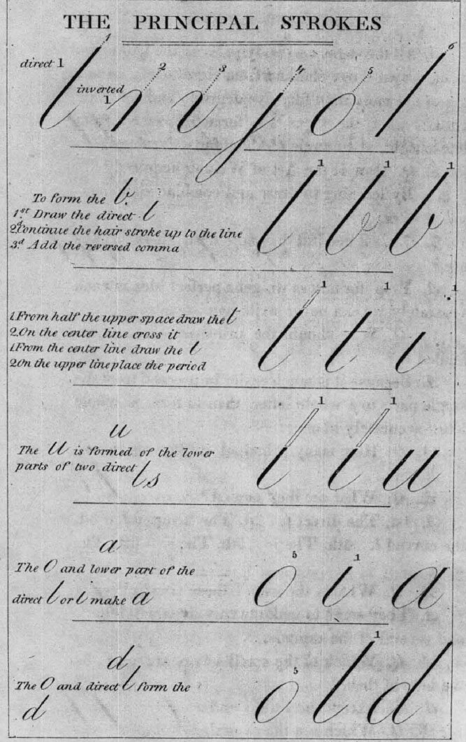
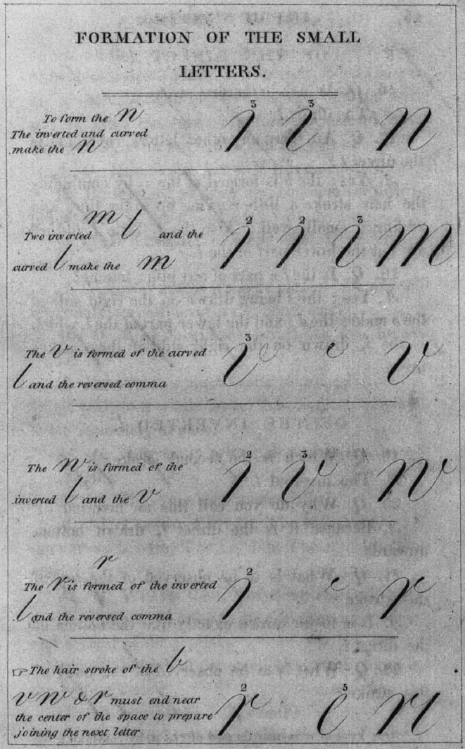
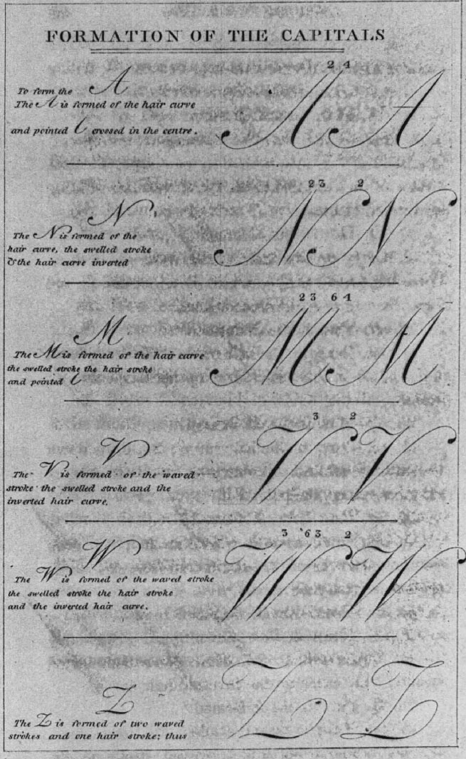
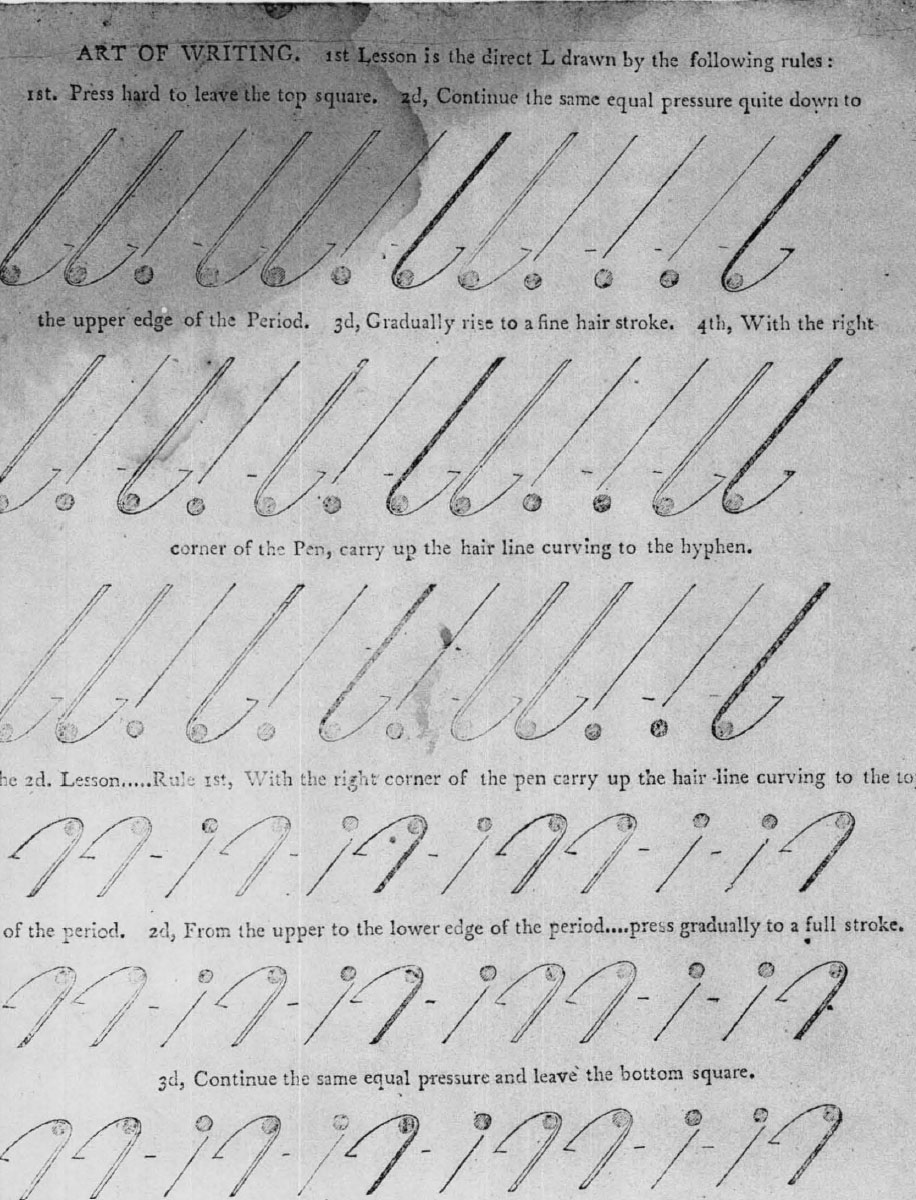
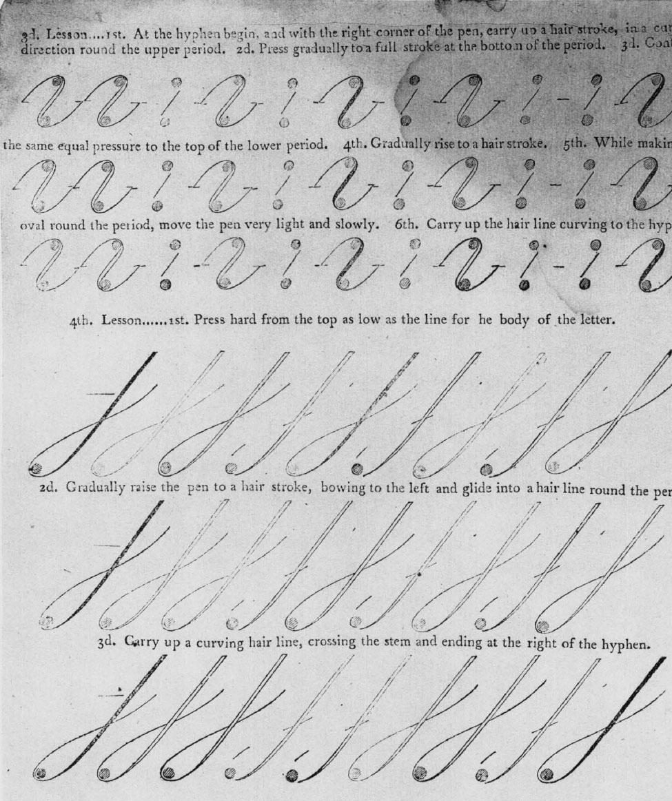
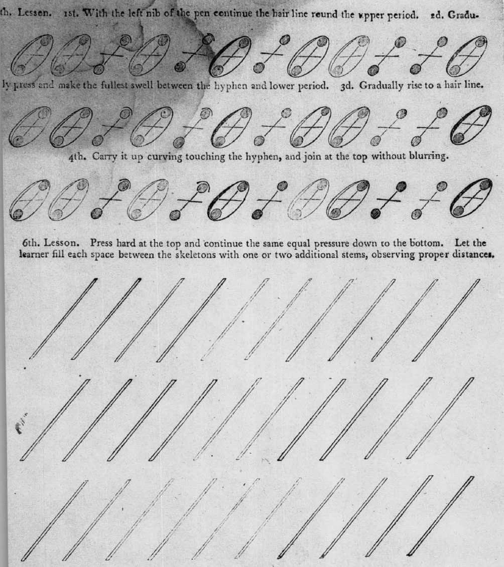
The heart of Jenkins’ system, promulgated by The Art of Writing, is the dissection of round hand letters and the analysis of their interchange able parts, so that practically the whole alphabet can be formed out of half a dozen principal strokes. His invention, i.e., his formulation of the basic strokes and procedures whereby the learner methodically progresses to a standard performance of writing, came out of circumstances the author candidly describes in the preface of 1813:
At an early period of life, he was invited to enter upon the useful employment of teaching a country school; but having been taught the art of writing in the very imperfect manner common in his childhood, more than forty years ago, without system or rule, he was mortified at the thought of furnishing his pupils with the very defective models of his own pen, for their improvement in so elegant an art.
From his early youth he had been highly gratified by examining beautiful specimens of penmanship, and felt a strong desire to imitate them; but had, after frequent attempts, for years despaired of ever obtaining a handsome hand—much less did he think himself capable of teaching others to excel in the art, within a far shorter period than usual.
At first he procured well written copies for the use of his pupils; but he soon felt the truth of an observation made by some of his employers, that a teacher ought to be capable of instructing his pupils without a borrowed hand. This intimation at once inspired him with a renewed desire, not only of his own improvement, but that of his pupils also, in the art in which he felt himself so very deficient.
Taking his cue from the beneficial results obtained by drilling his pupils at first on the component parts of letters, and reflecting that “as writing is in some measure a mechanical art, it should be mechanically taught,” Jenkins gradually worked out a system:
After several different dissections and arrangements, both of the capitals and small letters, he was highly gratified to find, from this critical investigation, that nearly the whole alphabet was composed of six principal strokes or lines. These he arranged, named, and numbered, as in his first book, and they are the proper foundation of the whole work.
The engineer’s approach by John Jenkins was new and he drew fresh inspiration from his time and place, but in the search for a method of making the alphabet tractable to a childish hand he was the unconscious successor to an age-old ambition. In more than two and a half centuries of printed copybooks before Jenkins are recorded many attempts in the direction he was taking toward system—a word the English writing masters who taught bookkeeping and mathematics began applying to penmanship early in the eighteenth century. The very first manual (which the devotees of the Italian cancellaresca still regard as the best), Arrighi Vicentino’s Operina, Rome, 1522, began by introducing the learner to two little strokes with one or the other of which he is to start every letter, then proceeds to a classification of letters according to similarity so that in mastering one he commands a group. G. B. Palatino’s Libro nuovo, 1540, opened “with an appeal to mathematics,” as the authority on the history of the chancery italic hand says, “and proceeds to reduce the chancery alphabet to a rigid system of straight lines. . . .”269 It remained for Ferdinando Ruano to make this alphabet subservient to a geometrical grid, although in the north Albrecht Dürer was so far lost to the Renaissance rage for formula that he had published a method for constructing gothic minuscules as well as a set of the long-suffering Roman capitals.270 We have already observed that the mid-seventeenth-century English author G. D. counsels “beginning with the easiest letters, so as the making of one may helpe to make another” and illustrates in a table the strokes making up letters of the running secretary. His contemporary, the highly professional engraver and writing master Edward Cocker, reports about this time that in teaching the italic style of writing “masters, first, for the most part, inform their Schollars by a Characteristick Alphabetical Figure, comprehending most of the twenty-four letters.”271 Such a monogrammatic combination showing the elements of the Italian hand appears in Cocker’s Penna Volans of 1661. The kinship of these figures to Mr. J. B.’s Twelve Cyphers272 a century later is quite apparent. Cocker continues,
After the knowledge whereof they make the letters singly; first, the Minnum, or small i . . . an exact Oval . . . those two being perfectly learned, the better half of their business is accomplished; after which, they proceed to their making of u, n, m, r, and t; . . . and when they can completely command those short-bodied letters, the small 1 is diligendy practised. . . .
This author comes nearer still to Jenkins’ system when he sets forth as copies, in England’s Penman, 1668, the strokes between turns, or “breaks,” of letters, analyzing the forms so as to show the order and direction of their component strokes. The legend for one of these plates has a familiar sound: “The Breakes of Italian Letters, in order, as they helpe one to the making of another.” Elsewhere he says this hand “wholly depends on the Eye-charming Form of an oval.” For the English round hand at the beginning of the eighteenth century Charles Snell made i, o, u, h, and y the “leading letters” to one or two of which all the rest are related. Another writing master of the period is perhaps nearest of kin historically to John Jenkins; compare, for instance:
The Principal Things to be aim’d at in order to write any Hand well, are these Two. First, to get an exact Notion, or Idea of a good Letter, which may be done by a frequent and nice Observation of a Correct Copy. The Other is, To get such a Command of Hand, as to be able to express, with the Pen, that Idea upon the Paper, which is attain’d by constant and careful Practice after good Examples. . . .
John Clark, Writing Improv’d, 1714
. . . two things are absolutely necessary to be attended to, that any one may soon become master of this art. The first is, to get a perfect idea of each principal stroke well impressed on the mind. The second is, to acquire the right motion of the fingers, or pressure of the pen, in order to draw these strokes upon the paper. . . .
John Jenkins, 1791
Snell, whose feuds with Clark were the scandal of their time, at the same period brought out The Standard Rules of the Round and Round-Text Hands, with geometrical diagrams and precise instructions for forming every letter. He deserves to stand with his antagonist as spiritual godfather to the American System for the round hand. Clark was careful to point out, too, that “this Hand is compos’d of an Oval and Streight Line” and that “the Fundamental Letters are, l, o, n, j” This is really getting warm!
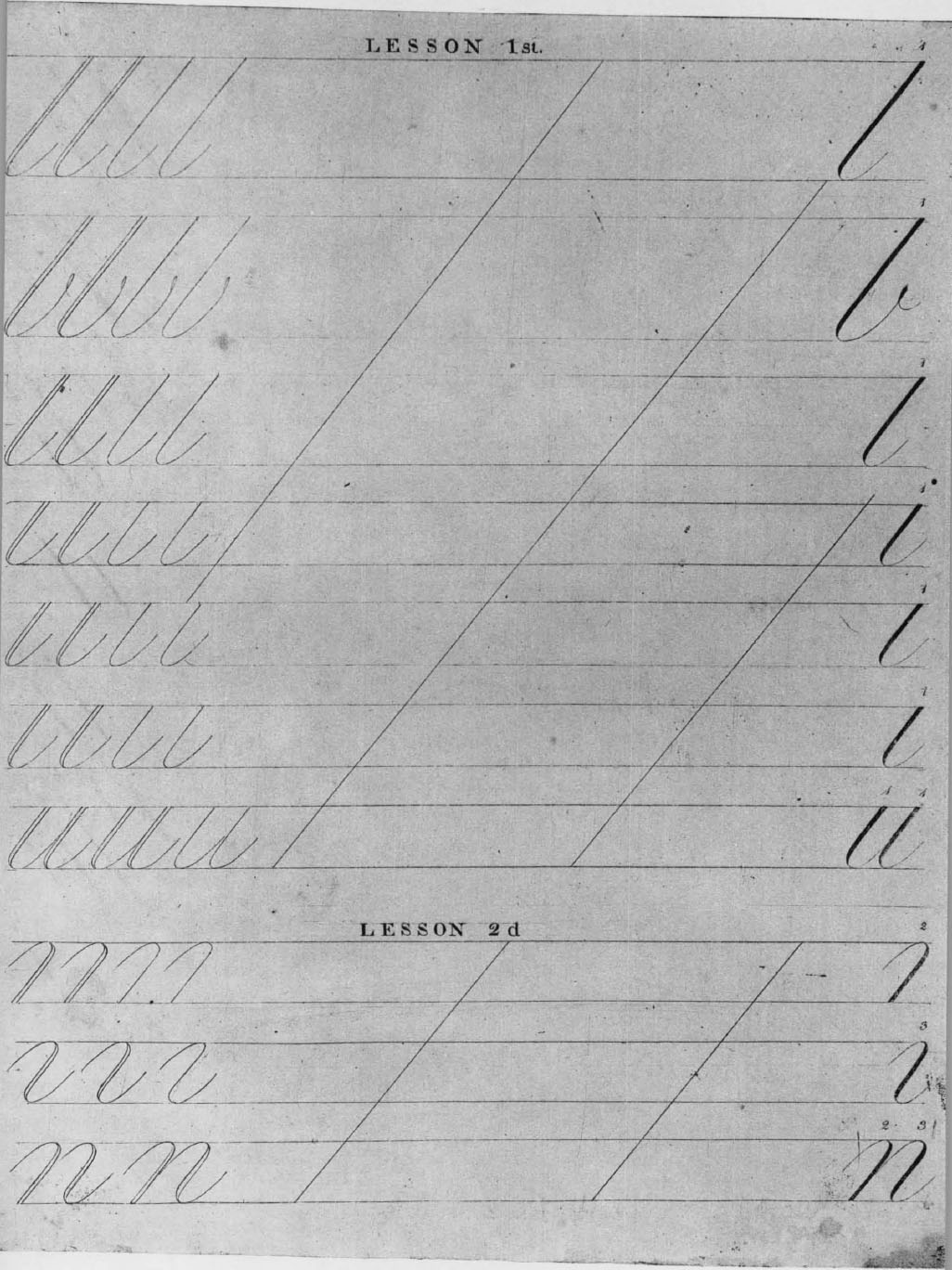
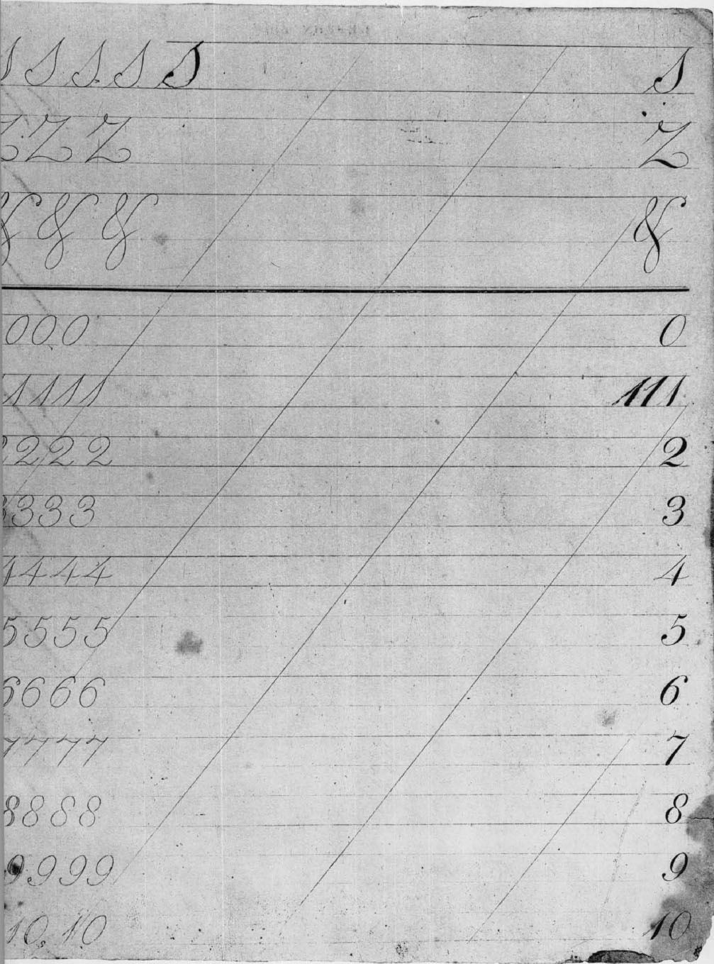
The significant difference is that the old writing master’s primary emphasis is upon giving the learner an exact idea of the correctly formed letters, while the ingenious Yankee’s is to impress upon his mind an exact idea of the principal strokes. The systematist admits that the six strokes will not do quite everything required for the twenty-six letters. He has trouble with s and k, for example; and in the first publication he conveniently forgets entirely to include z, “the unnecessary letter.” But if Jenkins ever feels his system is a strait-jacket he is ready to accept the slight pinch now and then for the sake of fairly decent average performance. He manages to have the engraved copies show little if any compromise with the good, conventional round hand of standard copybooks. (For his letters in embryonic examples see plates xxi, xxii, and xxiv; for continuous script see plate xix.) The easy running hand into which all the practice on pothooks and hangers is intended to mature may be represented by the lines below the portrait (plate xx). Neither in this nor in the more ladylike style seen in the specimen writing piece (plate xxiii) does Jenkins display any inclination to push a good thing too far.
Penmen bred in the traditional way took no stock in the Jenkins system. Such contrivances (like those diverting and mildly instructive Twelve Cyphers of Breintnal “explained” by Franklin) were taken with a grain of salt by professionals of the old school. Ambrose Serle, whose Art of Writing, London, 1776, boasted a “New Mathematical Projection on Copper Plate, shewing . . . exact Rules for the true forming every Letter, with their Proportion and Dependence on each other,” waved all that nonsense aside when he came to discussing round hand. “I shall not treat of this Geometrically,” he explains, “because whatever Speculation may derive from it, Use receives nothing. It does not contribute to a masterly Execution of any just Proportions, but it often cramps and perplexes the Hand and Idea of the Writer.” A competent representative for American professionals was the well-known schoolmaster and copybook author Caleb Bingham, sometime instructor in the North Writing School, Boston (plate nd). He treated Jenkins kindly but had no use for his system. His former apprentice William Bentley Fowle, a good calligraphic hand himself and an educationist of parts, recalled also that “Jenkins was no writer”; he expressed skepticism of any system for the purpose. Fowle’s namesake uncle, another old schoolmaster and constantly vigilant critic, had this to say in his journal:
Mr. Jenkins with me about his practice of Penmanship. I signed a recommendation. This man hit upon some expedients. . . & many years ago published his first part which fell into obscurity. . . . The plan amounts to this, shall we use simple strokes first or combine them for use at once. The combination being from fancy & the ease of the stroke being its beauty, an early combination will not be very unnatural to such as practice but do not study the art. . . . (Salem, 19 October 1808)273
The Reverend Dr. Bentley, as is evident in a number of places, had a poor opinion of John Jenkins. He had told off the systematic penmanship started by Jenkins in an earlier entry too. He believed that the good talents of a teacher and aptitude in the pupil are what produce results in learning to write,
In which attainment, forms, positions, figures may be comparatively good but are the least part of the help to make a good writer. In writing different languages the same positions of the body & fingers are not proper. The same instruments are endorsed & yet the Persian with his reed will excel all the world. (7 September 1804)274
There it is, the professional view held through the ages. Diligent practice under excellent instruction can help, but the art really belongs to those who have a naturally light hand.275 Vive la plume!
Jenkins had said in Book I that the work was to be completed in seven books. The 1791 preface described them as follows: “Five of the remaining six are proper Writing Books, with Copperplate Copies each proceeding by regular steps from the first Principles to Joining Hand Copies; and gradually proceeding from a large Round Hand, to an easy Running Hand, all of which are preparatory to the seventh and last Book, which is a collection of Writing Pieces, Promissory Notes, Orders, Receipts, Bills of Exchange, &c.” This promise was carried out only in part. As the bibliography hereinafter shows in detail, there is only one copy each known of books Second and Third as evidence to prove that they were issued—the last in 1817 at New Haven—and none thereafter. Both are combination copy- and writing books wherein the pupil first traces over printed outlines of strokes and then forms them himself in accordance with accompanying directions (plates xxv-xxix). In Book Second the copies were cut on wood so that the instructions set in type could be printed at the same time, but they did not pass muster. Copperplate engraving was called for.276 Jenkins was able to respond with Book Third but that effort evidently finished his publishing. Considering that these booklets could be used but once, Jenkins’ system needed above all a process like lithography—which had not quite come to America. Copperplate engraving was not economically feasible.
The title page of the last publication says nothing about “patronage of the American Academy of Arts and Sciences and the Legislature of Massachusetts.” However, the college presidents and other leading literary characters are there in force with their recommendations (given in better faith, it is hoped, than Dr. Bentley’s).
Among them is the faithful Noah Webster whose name had helped support the launching of the first Jenkins publication twenty-six years earlier. It was indeed, as the author of The Art of Writing acknowledged specifically in a footnote, Webster’s “easy, concise, and systematic” Grammatical Institute of the English Language, 1783, which inspired his “plain and easy system.” The Boston firm of Thomas & Andrews had acquired publication rights to Webster’s popular work the year before they brought out Jenkins’. The promotional campaigns for the two, involving reports by the foremost academies and kind words from great men, are closely similar. Also parallel are the aims of the authors in methodizing their respective educational fields, Webster to provide “an easy standard of pronunciation” and Jenkins a “sure and easy guide to penmanship” so that even “persons without the aid of a teacher might write a neat and legible hand.” Their most ardent wish, in Webster’s words, was, each in his own department, to diffuse a uniform system throughout the new nation.
The Jenkins system was nevertheless the product of an independent and deliberate re-examination of the whole business of teaching hand writing. The analogy between systematic penmanship and standardized pronunciation was kept within reasonable bounds by continuous observation and first-hand experimentation. What elements Jenkins may have derived from professional books or writing masters—compare, for example, his emphasis on dry-pen tracing of skeleton forms with old G. D.’s directions277—were well digested and restated authoritatively in American terms. Certainly there is New World grandeur in his vision of thousands upon thousands of school children throughout the land all starting with his direct el and progressing stroke by stroke and lesson by lesson to the completion of book seven. At the same time, though, he holds out this system as the perfected self-instructor for private families and individuals—for everyone believing the copybook scripture “Your hand’s your fortune if you well can write.” And it is just here that he overreached himself. The Jenkins system, he flatly declared, “is so contrived, that young gentlemen and ladies, who have not been under advantages to learn to write, may immediately become, not only their own instructors, but instructors of others.” In other words, he claimed for his system the power to create writing masters without any other apprenticeship than to a book. This was utter heresy, and Jenkins had only himself to thank for opening the gates to a crowd of self-anointed professors of penmanship.
For, whether or not Jenkins realized the implications of his method for the “immediate” creation of writing masters, the suggestion was quickly taken up. The rest of his life is filled with the author’s outcries growing ever more strident and querulous against pilferers and plagiarists. One of the earliest to batten on the system was an able and energetic neighbor of Dr. Bentley, Henry Dean of Salem, who presently compiled a quarto Analytical Guide to the Art of Penmanship, 1804, that put the Jenkins publications in the shade. Another was the picaresque character Allison (alias Abel) Wrifford; in after years he told how the Jenkins book “fell into the writer’s hands when a youth, upon the Green Mountains of Vermont” and, though he disclaims receiving any practical advantage from it, apparently this was how the call came, to invest him with the authority of a writing master. When Wrifford first published A New Plan of Writing Copies in 1810, unlike Dean he credited John Jenkins as source of the elementary principles; but he repented of this weakness almost at once for in the new edition a couple of years later all such acknowledgment disappeared. John Jenkins was still insisting that “writing is a fine art, and is to be acquired only by imitation” but his system had in effect made anyone and everyone keeper of the standard. He had been proud to adopt the title of writing master but before the middle of the nineteenth century the eager exploiters of what he had started were making the name of writing master a term of contempt.
A NOTE ON THE BIBLIOGRAPHY AND ILLUSTRATIONS
The bibliography aims to describe every edition and variant of all American publications on handwriting by authors working before the end of the eighteenth century. The works are grouped under the names of their authors (or responsible printers, publishers, engravers) in the order of their earliest American publication on the subject. Within these groups the work belonging to each author is entered chronologically by title according to the date of the first edition known. In group attributions the names joined by hyphens indicate a British author and American engraver; Butterworth, Thomson, Darton and Weedon were British writing masters.
In the transcriptions of title pages, italics stand for either script or italicized matter in the original. Differences of size in capital letters of such matter are ignored (since italic small capitals are not part of a regular font). The forms of f (long s) have not been brought over into transcriptions. Brackets and the like with page numbers are not mentioned. Flourishing as accompaniment to gothic scripts can be assumed as a rule, but it has not usually been noted in the transcription.
The term “copy” may mean—as is most proper—a graphic model in manuscript or print; but it is also used to mean an improving sentence simply set forth in type, often by the pageful, for the learner to copy in a style shown elsewhere. “Large letters” and “small letters” commonly signify majuscules and minuscules. “Alphabetical sentences” are “sets” in which the initial letters run from A to Z except for the omission of J and U. “Rule” signifies the simply linear, tapering or ornamental marks used by engravers and printers to define groups of material (not to be confused with “line,” which is reserved for textual matter).
The first location symbol after each entry identifies the copy described.
All illustrations are reproduced in the size of the originals, except for the manuscript plates, I and II and figures in the text, which are shown two-thirds actual size.
With the exception of the last two, which are at Dartmouth, all the manuscripts represented by plates I and II are in the collections of the Massachusetts Historical Society. The line illustrations on pages 2 and 3 are from the only known copy of Beauchesne and Baildon’s 1570 edition, in the Plimpton library at Columbia University. The figure at page 29 is from a copy of Cocker’s Penna Volans, 1661, in the Victoria and Albert Museum, through the courtesy of Arthur Wheen, keeper of the library.
KEY TO LOCATION SYMBOLS
|
CSmH |
Henry E. Huntington Library, San Marino, California |
|
CtHi |
Connecticut Historical Society, Hartford, Connecticut |
|
CtY |
Yale University, New Haven, Connecticut |
|
DeWI |
Wilmington Institute Free Library, Wilmington, Delaware |
|
DLC |
Library of Congress, Washington, District of Columbia |
|
ICHi |
Chicago Historical Society, Chicago, Illinois |
|
ICN |
The Newberry Library, Chicago, Illinois |
|
ICU |
University of Chicago, Chicago, Illinois |
|
MB |
Boston Public Library, Boston, Massachusetts |
|
MBAt |
The Boston Athenæum, Boston, Massachusetts |
|
MH |
Harvard University, Cambridge, Massachusetts |
|
MHi |
Massachusetts Historical Society, Boston, Massachusetts |
|
MSaE |
Essex Institute, Salem, Massachusetts |
|
MWA |
American Antiquarian Society, Worcester, Massachusetts |
|
MiU |
University of Michigan, Ann Arbor, Michigan |
|
MiU-C |
University of Michigan, William L. Clements Library |
|
MnU |
University of Minnesota, Minneapolis, Minnesota |
|
NHi |
New-York Historical Society, New York, New York |
|
NN |
New York Public Library, New York, New York |
|
NNC |
Columbia University, New York, New York |
|
NcD |
Duke University, Durham, North Carolina |
|
NhD |
Dartmouth College, Hanover, New Hampshire |
|
PHi |
Historical Society of Pennsylvania, Philadelphia, Pennsylvania |
|
PP |
Free Library of Philadelphia, Philadelphia, Pennsylvania |
|
PPAmP |
American Philosophical Society, Philadelphia, Pennsylvania |
|
PPFrankI |
Franklin Institute, Philadelphia, Pennsylvania |
|
PPL |
Library Company of Philadelphia, Philadelphia, Pennsylvania |
|
PPL-R |
Library Company of Philadelphia, Ridgway Branch |
|
PPLT |
Lutheran Theological Seminary, Philadelphia, Pennsylvania |
|
PU |
University of Pennsylvania, Philadelphia, Pennsylvania |
|
RPJCB |
John Carter Brown Library, Providence, Rhode Island |
|
TxU |
University of Texas, Austin, Texas |
|
WHi |
State Historical Society, Madison, Wisconsin |
|
WU |
University of Wisconsin, Madison, Wisconsin |
|
Private Collections |
|
|
*MSC |
Marian S. Carson |
|
*PH |
Philip Hofer |
|
*RN |
Author’s collection |
George Fisher
AMERICAN INSTRUCTOR
[instruction relating to writing in] The American | INSTRUCTOR: | OR, | Young Man’s Best Companion. | CONTAINING, | Spelling, Reading, Writing, and Arithmetick, | in an easier Way than any yet published; and how to qua- | lify any Person for Business, without the Help of a Master. | Instructions to write Variety of Hands, with Copies | both in Prose and Verse. How to write Letters on Bu- | siness or Friendship. Forms of Indentures, Bonds, Bills | of Sale, Receipts, Wills, Leases, Releases, &c. | Also Merchants Accompts, and a short and easy Me- | thod of Shop and Book-keeping; with a Description of the several | American Colonies. | Together with the Carpenter’s Plain and Exact Rule: Shew-| ing how to measure Carpenters, Joyners, Sawyers, Bricklayers, Plai- | sterers, Plumbers, Masons, Glasiers, and Painters Work. How to | undertake each Work, and at what Price; the Rates of each Com- | modity, and the common Wages of Journeymen; with Gunter’s Line, | and Coggeshal’s Description of the Sliding-Rule. | Likewise the Practical Gauger made Easy; the Art | of Dialling, and how to erect and fix any Dial; with Instruction for | Dying, Colouring, and making Colours. | To which is added, | The Poor Planters Physician. | With Instructions for Marking on Linnen; how to Pickle | and Preserve; to make divers Sorts of Wine; and many excellent | Plaisters, and Medicines, necessary in all Families. | And also I Prudent Advice to young Tradesmen and Dealers. | The whole better adapted to these American Colonies, than | any other Book of the like Kind. | [rule] | By GEORGE FISHER, Accomptant. | [rule] | The Ninth Edition Revised and Corrected. | [double rule] | PHILADELPHIA: Printed by B. Franklin and | D. Hall, at the New-Printing-Office, in Market-Street, 1748.
19 pages, including one of copies printed from type; 4 unnumbered engraved plates on 4 leaves (in the work which collates as follows: engraved frontispiece, title leaf, iii-v +378 pages, comprising signatures A4, B-Ii6, Kk4; besides the four plates of copies there is a folding plate of geometrical figures inserted between Q and R and many illustrations in the text). 173 x 95 mm.
Page 27, introductory, ‘Directions to Beginners’. 28–30, ‘To hold the Pen’. ‘How to make a Pen’. Plate [I] ‘The Italian Hand.’ in five lines, framed: A-M, N-Z, a-q, r-z&c, Art is gain’d by great Labour & Industry. [II] ‘secretary Hand.’ in five lines, framed and divided in equal compartments by a double rule across the middle: [all gothic] A-N, O-Z, Aa-m, n-z, Fear God and Honour the King. [III] ‘An easy Copy for Round Hand’ in five lines, framed and compartmented as in the preceding plate: A-N, O-Z, a-long s, s-10, Take great Care and you’ll Write fair. [IV] ‘Flourishing Alphabet’ in three lines, framed: A-H, I-Q, R-Z. Page 31, Print-Hand in four lines printed from upper- and lower-case Caslon type: A-N, O-Æ, a-r, long s-&, with a cut-off rule and ‘N.B. ’Tis necessary for all those who would qualify themselves for Business, often to imitate this Print-Hand; to make clean Marks on Bales, or plain Directions on Parcels.’ 32–42, ‘Copies in Prose, and Clinking, in Alphabetical Order’. being sentences for pupils to write, including some ‘short Lines for Text Hand’ and ending with ‘Double Lines in Verse’. 43–45, ‘A Receipt for Black Ink’. ‘Ingredients for a Quart’. ‘How to make Red Ink’. and ‘To keep Ink from Freezing or Moulding’. Following the epistolary models and forms of address there is, on pages 54–56, an article ‘Of Secret Writing’. The last two pages, 377 and 378, contain ‘An Explanation of Mr. J. B’s Twelve Cyphers. By practising which, the young Writer may more speedily acquire a perfect Idea of the Proportions of the Roundhand Letters, and their Relations to each other, than by any other Method yet known.’ The ciphers or combination of strokes are not illustrated but only described, e.g. ‘No. 1. Is hu together, or hi separate; being inverted, it is ny together, or nj separate.’ The second is the reverse of No. 1, and so on. ‘These twelve Cyphers are contrived, to let the Writer see, by inverting them, whether he has given his Letters their true Form. He must make Allowances for the Dots, and also for the beginning and ending Turns of n or u. . .’ The initials are doubtless those of Franklin’s scrivener friend Joseph Breintnal who had died in 1746. The Newberry and New York Public report plates missing in their copies, plates iii, iv.
MWA CSmH CtY DLC DeWI ICN ICU MB MiU-C NN PHi PP PPAmP PPFrankI PPL PU
[instruction relating to writing in] The American | INSTRUCTOR: | OR, | Young Man’s Best Companion. | CONTAINING, | [7 lines as in preceding entry] | Also Merchants Accompts, and a short and easy Me- | thod of Shop and Book keeping; with a Description of the | several American Colonies. | Together with the Carpenter’s Plain and exact Rule: Shew- | ing how to measure Carpenters, Joyners, Sawyers, Bricklayers, Plaisterers, | Plumbers, Masons Glasiers, and Painters Work. How to undertake each | Work, and at what Price; the Rates of each Commodity, and the com- | mon Wages of Journeymen; with Gunter’s Line, and Coggeshal’s De- | scription of the Sliding-Rule. | Likewise the Practical Gauger made Easy; the Art of | Dialling, and how to erect and fix any Dial; with Instructions for Dying, | Colouring, and making Colours. | To which is added, | The Poor Planter’s Physician. | With Instructions for Marking on Linnen; how to Pickle and | Preserve; to make divers Sorts of Wine; and many excellent Plaisters, and | Medicines, necessary in all Families. | And also, | Prudent Advice to young Tradesmen and Dealers. | The whole better adapted to these American Colonies, than any | other Book of the like Kind. | [rule] | By GEORGE FISHER, Accomptant. | [rule] | The Tenth Edition, Revised and Corrected. | [thick-thin rule] | PHILADELPHIA : Printed by B. Franklin and | D. Hall, at the New-Printing-Office, in Market-Street, 1753.
The illustrations and text concerned with writing are as described for the preceding ‘Ninth Edition’, from which this varies only in minor details, e.g. the date appearing among sentences to be written on page 42 is 1753. The book has 384 pages and a leaf of advertisements added. The ‘Explanation of Mr. J. B’s Twelve Cyphers’ is on the two final pages.
NhD CtY DLC ICHi ICN MB MiU NHi NN PHi PPFrankI
[instruction relating to writing in] THE | American Instructor: | OR, | Young Man’s Best Companion. | containing, | Spelling, Reading, Writing and Arithmetic, in an easier | Way than any yet published; and how to qualify any Person for | Business, without the Help of a Master. | Instructions to write Variety of Hands, with Copies both in Prose and | Verse. How to write Letters on Business or Friendship. Forms of | Indentures, Bonds, Bills of Sale, Receipts, Wills, Leases, Re-| leases, &c. | Also Merchant’s Accompts, and a short and easy Method of Shop and | Book-keeping; with a Description of the several American Colonies. | Together with the Carpenter’s plain and exact Rule; shewing how to | [5 lines] | Likewise the Practical Gauger made easy; the Art of Dialing, and | [2 lines] | TO WHICH IS ADDED, | The Poor Planter’s Physician. | With Instructions for Marking on Linen; how to Pickle and Pre- | [2 lines] | And also | Prudent Advice to young Tradesmen [sic] and [sic] Dealers. | The whole better adapted to these American Colonies, than | any other Book of the like Kind. | [rule] | By GEORGE FISHER, Accomptant. | [rule] | The Fourteenth Edition, Revised and Corrected. | [rule] | NEW-YORK: | Printed and sold by H. Gaine, at the Bible and Crown, | in Hanover-Square, M,DCC,LXX.
19 pages, including one of copies printed from type (in the work which collates as follows: title leaf; [iii], iv-v, [vi], + 390 pages; comprising signatures A-Q12, R6. There are many woodcut illustrations in the text.) 161 x 97 mm.
Pages 27–45 contain a line-for-line resetting of the text matter in the preceding Franklin and Hall edition occupying the same pages; 54–56 likewise treat Of Secret Writing. The Print-Hand copies at page 31, employing different sizes of type from those of the earlier editions, have a distinctive unmatching J in the top line. The date appearing on page 42 is 1770.
NhD ICU MH MiU-C NHi
[instruction relating to writing in] THE | American Instructor: | OR, | Young Man’s Best Companion. | CONTAINING | Spelling, Reading, Writing and Arithmetic, in an | easier Way than any yet published; and how to qualify any Person | for Business, without the Help of a Master. | Instructions to write Variety of Hands, with Copies both in Prose | and Verse. How to write Letters on Business or Friendship—| Forms of Indentures, Bonds, Bills of Sale, Receipts, Wills, | Leases, Releases, &c. | Also Merchants Accompts, and a short and easy Method of Shop and | Book-keeping; with a Description of the several American Colonies. | Together with the Carpenter’s plain and exact Rule; shewing how | [5 lines] | Likewise the Practical Gauger made easy; the Art of Dialing, and | [2 lines] | To which is added, | The Poor Planter’s Physician. | [7 lines] | [rule] | By GEORGE FISHER, Accomptant. | [rule] | The Fifteenth Edition, Revised and Corrected. | [rule] | PHILADELPHIA: | Printed and sold by JOHN DUNLAP, at the Newest | Printing-Office, in Market-Street, m,dcc,lxx.
19 pages, including one of copies printed from type, as in the New York ‘Fourteenth Edition’ and apparently from the same setting. 165 x 95 mm.
MWA ICU NNC PHi RPJCB
[instruction relating to writing in] THE | INSTRUCTOR: | OR, | Young Man’s Best Companion. | CONTAINING, | Spelling, Reading, Writing, and Arithmetick, | in an easier Way than any yet published; and how to qua- | lify any Person for Business, without the Help of a Master. | Instructions to write Variety of Hands, with Co- | pies both in Prose and Verse. How to write Letters on Bu- | siness or Friendship. Forms of Indentures, Bonds, Bills of | Sale, Receipts, Wills, Leases, Releases, &c. | Also Merchants Accounts, and a short and easy | Method of Shop and Book-keeping; with a Description of the | Product, Counties and Market Towns in England and Wales. | Together with the Method of measuring | Carpenters, Joiners, Sawyers, Bricklayers, Plasterers, Plumb- | ers, Masons, Glaziers, and Painters Work. How to undertake | each Work, and at what Price; the Rates of each Commo- | dity, and the common Wages of Journeymen; with the | Description of Gunter’s Line, and Coggeshall’s Sliding Rule. | Likewise the Practical Gauger made easy; | the Art of Dialling, and how to erect and fix Dials; with | Instructions for Dying, Colouring, and making Colours; and | some General Observations for Gardening every Month in | the Year. | To which is added, | The Family’s Best Companion: | With Instructions how to Pickle and Preserve; to make divers | Sorts of Wine; and many excellent Plasters and Medicines, | necessary in all Families. | AND | A COMPENDIUM of the Sciences of | Geography and Astronomy, | CONTAINING, | A brief Description of the different Parts of the Earth, and a | Survey of the Celestial Bodies. | Also some useful Interest-Tables. | [rule] | By GEORGE FISHER, Accountant. | The Twenty-first Edition corrected and improved. | [double rule] | BURLINGTON. | Printed and sold by Isaac Collins, M.dcc.lxxv.
19 pages, including one of copies printed from type; 5 engraved plates of which the first four are numbered 1–4 and the last unnumbered. 165 x 95 mm.
Pages 28–31, ‘Directions to Beginners in Writing’, including ‘How to make a Pen’. 32, Print-hand copies from type in four lines, A-N, O-Æ, a-o, p-&. 33–42, ‘Copies in Alphabetical Order’. 43, ‘Short Lines for Text Hand’, ‘Double Lines in Verse’. 44, ‘A Receipt for making black Ink’. 45, ‘Ingredients for a Quart’, ‘How to make red Ink’. 46, ‘To keep Ink from Freezing or Moulding’, and beginning examples of familiar letters and forms of address, with ‘Of Secret Writing’ ending at page 57. The plates are inserted between pages 32 and 33:1, ‘An easy Copy for Round Hand’ in five lines, framed, divided into compartments by double rules between capitals and small letters, and small letters and copy sentence: A-N, O-Z, a-long s, s-10., Take great Care and you’ll Write fair. 2, The Italian Hand in five lines, framed and compartmented as before: A-M, N-Z, a-q, r-&c., Art is gain’d by great Labour & Industry. 3, ‘Flourishing Alphabet’ in three lines, framed: A-H, I-Q, R-Z. 4, ‘Secretary Hand’ in five lines, framed and compartmented: [gothic] A-N, O-Z, Aa-m, n-z., Want is the Scorn of ev’ry wealthy Fool. [5] is of forty-two decorative monograms. The engraved frontispiece, copied from a current English edition (as are the rest of the plates and text generally), is signed I. Thackara Sculp; on plate 4 a non-political sentiment replaces the ‘Fear God and Honour the King’ line in English and previous American Instructors. See below the reissue of this edition, Philadelphia, 1787, by Crukshank.
RPJCB PHi
[instruction relating to writing in] THE | American Instructor: | OR, | Young Man’s Best Companion: | CONTAINING, | Spelling, Reading, Writing and Arithmetick, | in an easier Way than any yet published; and how to | qualify any Person for Business, without the Help of a | Master. | Instructions to write Variety of Hands, with Copies both | in Prose and Verse. How to write Letters on Business | or Friendship. Forms of Indentures, Bonds, Bills of | Sale, Receipts, Wills, Leases, Releases, &c. | Also, Merchants Accompts, and a short and easy Method | of Shop and Book-keeping. | Together with the Carpenter’s plain and exact Rule; shew- | ing how to measure Carpenters, Joiners, Sawyers, Brick- | layers, Plaisterers, Plumbers, Masons, Glasiers, and Pain- | ters work. How to undertake each Work, and at what | Price; the Rates of each Commodity, and the common | Wages of Journeymen; with Gunter’s Line, and Cog- | geshal’s Description of the Sliding Rule. | Likewise the Practical Gauger made easy; the Art of Di- | aling, and how to erect and fix any Dial; with Instruc- | tions for Dying and Colouring, and making Colours. | TO WHICH IS ADDED, | The Poor Planter’s Physician. | With Instructions for Marking on Linnen; how to Pickle | [3 lines] | A Historical Table of Remarkable Events from the Crea- | tion of the World to the Death of Julius Cæsar. And a | short Abstract of the History of England. | ALSO, | Prudent Advice to young Tradesmen and Dealers. | The whole better adapted to these American States, than any | other Book of the like Kind. | By GEORGE FISHER, Accomptant. | [rule] | BOSTON: | Printed for John Boyle, and J. D. M’Dougall. 1779.
19 pages, including one of copies printed from type (in the work of vi + 378 pages, comprising signatures [A], B-Zz4. The illustrations include a number of engravings pasted into place in the text, as well as a folding plate and woodcuts.) 166 x 97 mm.
Pages 27–45 contain ‘Directions to Beginners’ and other text matter as cited for previous editions, the present one being generally a line-for-line resetting with occasional variations, e.g., Secona for Seconds on page 29, which is also of slightly different length. On page 42 where earlier editions have their publication dates, e.g., 1748, 1753 and 1770, this has 1760. The only pertinent illustration is of Print-Hand on page 31, arranged in four lines A-P, Q-Æ, a-q, r-&.
MiU-C CSmH MH PPL-R
[instruction relating to writing in] THE | INSTRUCTOR: | or, AMERICAN | Young Man’s Best Companion. | CONTAINING, | Spelling, Reading, Writing, and Arithmetick, | in an easier Way than any yet published; and how to qualify | any Person for Business, without the Help of a Master. | Instructions to write Variety of Hands, with Copies both in Prose and Verse. How to write Letters on Business | or Friendship. Forms of Deeds, Bonds, Bills of Sale, Powers | of Attorney, Indentures, Receipts, Wills, Leases, Releases, &c. | Also, Merchants Accounts, and a short and easy Me- | thod of Shop and Book-keeping; with a Description of the Product, | Counties and Market-Towns in England and Wales, &c. | Together with the Method of measuring Carpenters, | Joiners, Sawyers, Bricklayers, Plasterers, Plumbers, Masons, Glaziers, | and Painters Work. How to undertake such Work. With the De- | scription of Gunter’s Line, and Coggeshall’s Sliding-Rule. | Likewise, the Practical Gauger, made Easy; the | Art of Dialling, and how to erect and fix Dials; with Instructions for | Dying, Colouring, and making Colours; and some General Observations | for Gardening every Month in the Year. | TO WHICH IS ADDED, | The Family’s Best Companion: | With Instructions for Marking on Linen: How to Pickle | and Preserve: To make divers Sorts of Wine; and many excellent | Plasters, and Medicines, necessary in all Families: | And a COMPENDIUM of the | Sciences of Geography and Astronomy; | CONTAINING, | A brief Description of the different Parts of the Earth, and a Sur- | vey of the Celestial Bodies. | Also, several very useful Tables. | [rule] | By GEORGE FISHER, Accomptant. | The Thirtieth Edition, Revised, Corrected Enlarged and Improved. | [thin-thick rule] | Printed at WORCESTER, Massachusetts, by ISAIAH THOMAS, | for | I. Thomas, in Worcester; J. Boyle, E. Battelle, W. Green, | B. Larkin, and J. Condy, in Boston, mdcclxxxv. | [in brackets] Price bound 5s.
19 pages; engraved plates numbered 1–4 on 4 leaves (in a work of 384 pages with engraved frontispiece and folding geometrical plate, and with many illustrations in the text including 2 pages of woodcut alphabets and figures for marking on linen). 173 x 95 mm.
Pages 40–43, ‘Directions to Beginners in Writing’ with sections on ‘To hold the Pen’ and ‘How to make a Pen’. 44, ‘print Hand’ in four lines of copies printed from Caslon upper- and lower-case types. Plate 1, ‘An easy Copy for Round Hand’, capitals and small letters with numerals in four lines, Take great Care and you’ll Write fair. 2, ‘The Italian Hand’. A-M, N-Z, a-q, r-z&c, Art is gain’d by great Labour & Industry. Pages 45–52, ‘Copies in Alphabetical Order’. Plate 3, ‘Flourishing Alphabet’ of capitals in three lines. 4, German text. Pages 53–55, copies continued, ending with ‘Short Lines for Text Hand’ and ‘Double Lines in Verse’. 56–58, ‘A Receipt for black Ink’, ‘Ingredients for a Quart’, ‘How to make Red Ink’ and ‘To keep Ink from Freezing or Moulding’. The last line of the title in the American Antiquarian Society copy varies: [Price bound 6 s.] Plates 1 and 4 are identical with those of the same numbers in Thomas’ Writing Scholar’s Assistant published the same year. plates vi, viia.
MHi MH MWA
—————————————————— [imprint varies]. Printed at WORCESTER, Massachusetts, by ISAIAH THOMAS, | J. Boyle, E. Battelle, W. Green, | B. LARKIN, and J. CONDY, in Boston. MDCCLXXXV. | [in brackets] Price bound 5 s.
The description and contents for this are as in the foregoing, although it is a different printing and, in part at least, from a different setting.
MB CSmH RPJCB
—————————————————— The Second WORCESTER Edition, Enlarged and Improved. | [thin-thick rule] | Printed at WORCESTER, Massachusetts, | By ISAIAH THOMAS, | And Sold at his book-store, near the court-house. | mdcclxxxvi. | [in brackets]. Price bound 6 s.
In pagination and content this conforms to the Worcester edition first described.
NhD MiU-C MH MHi MWA RPJCB
[instruction relating to writing in] THE | AMERICAN INSTRUCTOR: | OR, | Young Man’s Best Companion. | CONTAINING, | Spelling, Reading, Writing, and Arithmetick, | in an easier Way than any yet published; and how to qua- | lify any Person for Business, without the Help of a | Master. | Instructions to write Variety of Hands, with Co- | pies both in Prose and Verse. How to write Letters on | Business or Friendship. Forms of Indentures, Bonds | Bills of Sale, Receipts, Wills, Leases, Releases, &c. | Also Merchants Accounts, and a short and easy | Method of Shop and Book-keeping. | Together with the Method of measuring | Carpenters, Joiners, Sawyers, Bricklayers, Plasterers, | Plumbers, Masons, Glaziers, and Painters Work. | With the Description of Gunter’s Line, and Cogge- | shall’s Sliding Rule. | Likewise the Practical Gauger made easy; | the Art of Dialling, and how to erect and fix Dials; | with Instructions for Dying, Colouring, and making Co- | lours; and some General Observations for Gardening | every Month in the Year. | With Instructions how to Pickle and Preserve; to make | divers sorts of Wine; and many excellent Plasters and | Medicines, necessary in all Families. | A COMPENDIUM of the Sciences of | Geography and Astronomy. | Also some useful Interest-Tables. | [rule] | By GEORGE FISHER, Accountant. | [rule] | With Alterations and Amendments adapted to the Use | of the Youth of the United States of America. | [double rule] | PHILADELPHIA: | Printed and Sold by JOSEPH CRUKSHANK, | in Market Street, m dcc lxxxvii.
This is a reissue, with cancel title page, of the Isaac Collins edition, Burlington, N. J., 1775, as described above. It has the same frontispiece, signed by Thackara as engraver.
MWA MiU-C PHi
[instruction relating to writing in] the | INSTRUCTOR: | or, AMERICAN | Young Man’s best Companion. | [thirty lines, textually as in the Worcester 1785 edition though with some different endings] | [rule] | By GEORGE FISHER, Accomptant. | [double rule] | Printed at WALPOLE, Newhampshire, | by ISAIAH THOMAS and DAVID CARLISLE, | For said Thomas, in Worcester, Massachusetts; said Thomas, | and Andrews, D. West and E. Larkin, jun. in Boston. | [double rule] | MDCCXCIV.
Pagination and contents follow closely those of Thomas’ Worcester 1785 edition, although there are trifling changes in setting. The print hand on page 44 is in a smaller size of type. The plates have been reworked for this edition; in the present copy they are inserted between pages 48 and 49. 173 x 98 mm.
*RN DLC ICN MB MH MHi MiU MnU MWA PU RPJCB
[instruction relating to writing in] THE | INSTRUCTOR: | OR, | YOUNG MAN’s BEST COMPANION. | CONTAINING | SPELLING, READING, WRITING and ARITHMETIC, in an | easier way than any yet published; and how to qualify any person | without the help of a master. | INSTRUCTIONS to write a variety of hands, with copies both in | prose and verse. How to write letters on business or friendship. | Forms of indentures, bonds, bills of sale, receipts, wills, leases, re- | leases, &c. | Also MERCHANTS’ ACCOMPTS, and a short and easy method of | shop and book-keeping. | Together with the method of measuring carpenters’, joiners’, saw- | yers’, bricklayers’, plaisterers’, plumbers’, masons’, glaziers’ and | painters’ work. How to undertake each work, and at what price; | the rates of each commodity; and the common wages of journey- | men: with the description of Gunter’s Line, and Coggeshall’s | Sliding-Rule. | Likewise the PRACTICAL GAUGER made easy; the art of dial- | ing, and how to erect and fix dials; with instructions for dying, | colouring and making colours; and some general observations for | gardening every month in the year. | TO WHICH ARE ADDED, | THE FAMILY’s BEST COMPANION; | AND | A COMPENDIUM of GEOGRAPHY and ASTRONOMY; | ALSO | SOME USEFUL INTEREST TABLES. | [rule] | By GEORGE FISHER, Accomptant. | [thick thin rule] | WILMINGTON: | Printed and Sold by PETER BRYNBERG. | M,DCC,XCVII.
19 pages, including one of copies printed from type. 170 x 106 mm.
Pages 29–32, ‘Directions to Beginners in Writing’, including, pp. 30–31, ‘To hold the Pen’. 31–32, How to make a pen. 33, Print-hand copies from type. 34–44, Copies in Alphabetical Order. 44, Short Lines for Text-Hand. 44–46, Double Lines in Verse. 46, A receipt for making Black Ink, Ingredients for a Quart. 46–47, How to make Red Ink. 47, To keep Ink from freezing or moulding. Familiar letters on several occasions, and on divers subjects, occupy pages 47–56, with Of Secret Writing on pages 56–57.
plate viib.
RPJCB MiU-C
[instruction relating to writing in] THE | INSTRUCTOR, | OR | AMERICAN | YOUNG MAN’s BEST COMPANION: | CONTAINING INSTRUCTIONS FOR | [12 lines in two columns separated by vertical thin-thick rule as follows] READING, | WRITING, | ARITHMETIC, | MERCHANTS’ ACCOUNTS, | MENSURATION, | GAUGING, | THE ART OF DIALLING, | DYING AND | MAKING COLOURS, | PICKLING, PRESERVING, | AND THE ART OF MAKING | SEVERAL SORTS OF WINES. | ALSO | A COMPENDIUM OF THE SCIENCES | OF | [gothic] Geography and Astronomy, | WITH SEVERAL VERY USEFUL TABLES: | TO WHICH IS ADDED | Some general observations on Gardening for every | Month in the Year, &c. &c. | [double rule] | By GEORGE FISHER, Accomptant. | [double rule] | [gothic] Philadelphia: | PRINTED AND SOLD BY JOHN BIOREN, N°.88 | CHESNUT-STREET. | [rule] | 1801.
12 pages; 4 engraved plates numbered 1–4 (in a work of 346 pages, comprising signatures [A], B-Ff, all in sixes. Page 331 and the following page contain woodcut models of capitals, small letters and figures for marking on linen.) 170 x 100 mm.
Pages 40–42, ‘Directions to Beginners in Writing’, including ‘To hold the Pen’ and ‘How to Make a Pen’ on pages 41 and 42 respectively. At the foot of page 42 and the top of the following page are print hand copies of capitals and small letters, with the usual note. Plate 1, ‘Round Hand’. 2, ‘Italian Hand’. 3, ‘Flourishing Alphabet’. 4, ‘German Text’. Page 43, following print hand copies a-t, u-& and note, has beginning of ‘Copies in Alphabetical Order’ which continue to page 50. At bottom of page 50 and on page 51 are ‘A Receipt for making Black Ink’, ‘Ingredients for a Quart’, ‘How to make Red Ink’, and ‘To keep Ink from Freezing or Moulding’.
plate viii.
MiU-C CSmH PHi PPLT
———————————————[imprint varies] . . . PHILADELPHIA: | PRINTED BY JOHN BIOREN, | For JOHN CONRAD, & Co. No. 30 Chesnut street, M. & J. CONRAD, | & Co. No, 140 Market street, BALTIMORE, and RAPINE, | CONRAD & Co. WASHINGTON CITY. | 1801.
This variant conforms to the foregoing description. The Harvard copy lacks plate 4.
MWA MH
[instruction relating to writing in] THE INSTRUCTOR, | OR | AMERICAN YOUNG MAN’S | BEST COMPANION, IMPROVED: | CONTAINING INSTRUCTIONS FOR READING, WRITING, (IN- | CLUDING THE ENGLISH GRAMMAR); ARITHMETIC, MER- | CHANTS’ ACCOUNTS, MENSURATION, GAUGING ACCORDING | TO THE MOST MODERN AND APPROVED PRACTICE, AND | THE ART OF DIALLING. | ALSO, | A COMPENDIUM OF THE SCIENCES | OF | GEOGRAPHY AND ASTRONOMY, | A SHORT DESCRIPTION OF STEAM ENGINES, AND A TABLE | OF SPECIFIC GRAVITIES OF BODIES WITH RULES | FOR ASCERTAINING THE SAME. | TO WHICH IS ADDED | THE RUDIMENTS OF DRAWING, WITH SEVERAL | VERY USEFUL TABLES, &c. | [double rule] | BY GEORGE FISHER, ACCOMPTANT. | [double rule] | [gothic] Philadelphia: | PRINTED AND SOLD BY JOHN BIOREN, | no. 88 chesnut-street. | [rule] | 1810.
9 pages; 3 engraved plates numbered 1–3 (in a work of 300 pages, comprising signatures [A], B-Bb, all in sixes. Besides instructions and two pages of woodcut model alphabets for marking on linen, this edition contains a section on drawing with four plates; there are also an engraved frontispiece, mathematical plates and many woodcut illustrations in the text.) 178 x 102 mm.
Pages 40–42, preliminary remarks and ‘Directions to Beginners in writing’, including ‘To hold the Pen’ and ‘How to make a Pen’. At the foot of page 42 is an alphabet of capitals from type; there is no lower-case or note. Plate 1, ‘Round Hand’. 2, ‘Italian Hand’. 3, ‘German Text’. The first two plates are identical with those of the same number in the 1801 edition; the third is the same as the plate numbered 4 in the earlier edition, and here it is placed to precede numbers 1 and 2. Pages 43–48, ‘Copies in Alphabetical Order’ with, on the last page, ‘A receipt for making Black Ink’, ‘Ingredients for a quart’, ‘How to make red Ink’ and ‘To keep Ink from freezing or moulding’. The number of alphabetical sentences is reduced from Bioren’s previous edition.
MH
[instruction relating to writing in] THE | INSTRUCTOR, | OR | AMERICAN YOUNG MAN’S BEST COMPANION, | IMPROVED; | [5 lines] | ALSO | A Compendium of the Sciences | OF | GEOGRAPHY AND ASTRONOMY; | [3 lines] | THE RUDIMENTS OF DRAWING, | [2 lines] | [ornament] | BY | GEORGE FISHER, | ACCOMPTANT. | [ornament] | PHILADELPHIA: | Printed and sold by John Bioren, no. 88, Chesnut-street. | 1812.
Pagination and text are as in the 1810 Bioren edition described, although there has been resetting. The plates are the same except for additional touches and ‘Page 42’ in the margin of Plate 1. 180 x 108 mm.
NcD
[instruction relating to writing in] the | YOUNG MAN’S | BEST COMPANION, | IMPROVED; | containing instructions for | READING, WRITING, (INCLUDING THE ENGLISH GRAMMAR;) | ARITHMETIC, MERCHANTS’ AND FARMERS’ ACCOUNTS; A | VARIETY OF THE MOST USEFUL AND APPROVED FORMS OF | BLANKS NOW IN USE; MENSURATION, GAUGING ACCORD- | ING TO THE MOST MODERN AND APPROVED PRACTICE; | AND THE ART OF DIALLING. | also, | A COMPENDIUM OF THE SCIENCES | of | GEOGRAPHY AND ASTRONOMY; | AND A TABLE OF SPECIFIC GRAVITIES OF BODIES, WITH | RULES FOR ASCERTAINING THE SAME. | to which is added | SEVERAL VERY USEFUL TABLES, &c. &c. | [double rule] | BY GEORGE FISHER, | ACCOMPTANT. | [double rule] | PHILADELPHIA: | PUBLISHED BY THOMAS L. BONSAL, | No. 37 Market Street. | 1833.
8 pages, including copies of roman print, and script, printed from type. 190 x 114 mm.
Page 70, ‘Of Writing’. 71, ‘Directions to Beginners in Writing’. ‘To Hold the Pen’. 72, ‘How to Make a Pen’. Marking letters, A-N, O-Z Æ, a-p, q-z æ, œ in four lines printed from type. 73, copies printed from round hand script type A-Q, R-Z, a-z&c., 1–10, Take great care and you’ll write fair. 74, six lines of copy sentences printed from the same round hand script type. 75–77, sentences in alphabetical order for copying, plate ix.
MiU
Christoph Saur, printer and publisher
HOCH-DEUTSCH AMERICANISCHE CALENDER
[four pages in] Der | Hoch-Deutsch | Americanische | Calender, | Auf das Jahr | Nach der Gnadenreichen Geburt unsers | HErrn und Heylandes JEsu Christi | 1754. | [12 lines] | Germantown: Gedruckt und zu finden bey Christoph Saur. | [thick-thin rule, 2 lines]
22 leaves without signatures or pagination including 4 pages of models for handwriting printed from woodcuts. 205 x 164 mm. Stab-stitched.
Page [1] woodcut of ship, wharf with three figures and dog, town, Mercury overhead, 1754. [2] text in German. [3] title-page. [4] introductory, signs used in calendar. [5]-[16] Januarius-December. [17] zodiacal information. [18]-[20] eclipses, notice of publications. [21]-[24] courts, &c. [25] cursive gothic small letter and capital alphabets, practice combinations, numerals and round hand Aa-z. [26] ‘Current Schrifft in einem Text’ ten lines of cursive gothic, with round hand A-Z in two lines at bottom. [27] ‘Current Schrifft in Zeilen nach dem Alphabet’ numbered 1–11. [28] continuation of alphabetically arranged sentences in cursive gothic script, arabic numerals, 12–22. [29]-[44] dialogue between Einwohner and Neukommer. The copy in the Historical Society of Pennsylvania measures 215 x 165 mm. plates x, xi.
MWA PHi
—————————————1756. . . .
4 pages devoted to handwriting, one of instruction and three of copies printed from woodcuts. 207 x 165 mm.
Page [24] ‘Ein kurtzer Unterricht vor diejenigen, welche begehren Schreiben zu lernen, und haben keine erfahrne Lehrmeister. Auch denen zu Dinst, welche gedrucktes lesen konnen, und begehren auch Geschriebenes lesen zu lernen.’ The instruction is printed in fraktur interlined word for word in small gothic script type. [25] ‘Current Schrifft in einem Text’, from the same block as the similar title in the Calender for 1754. [26] identical with the first woodcut, page [25], in the Calender for 1754. [27] twelve lines of large round hand alphabetical copies, Anger resteth in the Bosom of Fools. Aa.—Make choice of good Company. M m m m. plate xii.
NhD MWA PHi
———————————————1758. . . .
5 pages devoted to handwriting.
Page [24] as in preceding entry. [25] as on the same page of the 1754 Calender. [26] the same block headed ‘Current Schrifft in Zeilen nach dem Alphabet’ as in the Calender for 1754. [27] the same block of twelve large round hand sentences as was introduced in the Calender for 1756. [28] text printed in gothic script type, under the heading in fraktur type: ‘Noch etwas weniges vor diejenigen, welche ohne Lehrmeister schreiben lernen, und sich uben geschriebenes zu lesen.’
RPJCB
———————————————1769. . . .
Pages [23]-[26] of this issue are printed from the same blocks as the one first described. 215 x 166 mm.
MWA PHi
——————————————— 1770. . . .
Pages [24]-[26] are printed from the woodcut blocks of the issue for 1754, as in the foregoing entry. 214 x 165 mm.
MWA PHi
——————————————— 1774. . . .
Two pages are devoted to handwriting. 206 x 160 mm.
Page [22] at the foot offers in two lines round hand alphabets A-Z, a-z printed from script type, as a model for writing in English. [23] is devoted to ‘Ein gemeines Band von einem an einen’ printed, except for the fraktur heading cited, in this round hand script font with roman display words.
plate xiii.
MiU-C
Pages [22]-[26] are printed from the same fonts of script types. 214 x 164 mm.
MWA PHi
——————————————— 1777. . . .
The same pages as those of the issue for 1775 are printed from the same types. 215 x 165 mm.
The John Carter Brown copy is incomplete.
MWA PHi RPJCB
——————————————— 1778. . . .
Three pages of model legal forms printed from the same script types. 200 x 160 mm.
Page [41] contains ‘Ein Band ein jungfern kindchen zu erhalten’ in English, printed except for the fraktur heading in round hand script type with roman for emphasis. [42], [43] ‘Ein Band eine Person Lebenslang vom Taunschip frey zu halten’ is gothic secretary type with fraktur display.
MiU-C
Isaiah Thomas, printer and publisher
WRITING SCHOLAR’S ASSISTANT
[gothic] The Writing Scholar’s Assistant. | CONTAINING | Alphabetical COPIES of Plain RUNNING HAND. | Necessary to be learned by all who would wish to write neat, easy, and fit for all Purposes, and have not Opportunity to | practice a Variety of Hands. Together with COPIES of | Round Hand, German & English [gothic] Text, and Roman & Italian [gothic] Print. | [thin-thick rule] | PRINTED at WORCESTER, Massachusetts, by ISAIAH THOMAS, and sold at his Book-Store, mdcclxxxv.
24 unnumbered leaves printed on recto comprising signatures [A], B, C in 8s; 2 folding engraved plates, each measuring 112 x 165 mm., with numbers 1 and 4. 72 x 185 mm. Stab-stitched, in plain brown wrapper.
Leaf [1] title as given. Verso blank as throughout. [2] small round hand copies Aa-z&, ab-ago, printed from script type, in two lines each underscored as throughout. [3] round hand capitals from script types A-N, O-Z. [4]-[15] round hand alphabetical sentences from script types A true Friend is the greatest Contentment in all the world. 1234 . . . -. . . Zeal for the Truth should be consistent with Charity. au an ax ay az. Plate [1] ‘An easy Copy for Round Hand’ with lines A-N, O-Z, a-[long] s, s-10, Take great Care and you’ll Write fair, in three compartments, ‘1’ appears at the top of the first copy at left; verso blank. Plate [11] (has been tipped on to 14v so that it actually precedes the other plate in this copy) ‘German Text’ with gothic lines A-M, N-Z, a-m, n-z., Fear God and Honour your Country, in three compartments as before. ‘4’ appears similarly above and left of the first line. Leaf [16] English Text a-[round] r, [long] s-z&. [17] (Old English) A-O, P-Z. [18] (Old English) Beauty is at best a fading flower., Content alone is true Happiness. [19] Roman Print. a-s, t-z&. [20] A-P, Q-Z. [21] Honour thy Father and Mother., Modesty has engaging Charms. [22] Italian Print. a-r, [long]s-z&. [23] A-N, O-Z. [24] Eternal happiness awaits the Good., Religion is a sure guide to happiness. On the cover is written ‘Daniel Olivers Copies . . .’ The engraved plates are not present in the American Antiquarian Society copy. The two engraved plates are identical with those of the same numbers in The Instructor published by Thomas in 1785 and later. plate xiv.
*PH MH MWA
Miles Beach & Isaac Sanford, engravers and publishers
NEW SET OF ROUND HAND WRITING COPIES
[gothic] A New Set | OF | Round Hand Writing Copies: | Engrav’d, Printed and Sold by Beach & Sanford; | Ten rods South of the Bridge Hartford. 1786.
Engraved title, 7 unnumbered engraved plates on recto of 8 leaves. 73 x 207 mm. Stab-stitched.
Plate [1] title as given. [2] round hand alphabets. Alphabetical copy sentences in various sizes of round hand: [3] three lines underscored with thick-thin and other rules as throughout, Approve not of him . . . Be slow in chusing . . . Conceal your wants . . . . [4] four lines, Deride not Infirmities . . . -Great receipts render. . . . [5] six lines, Hold your Pen . . . -. . . Letters should be smooth and clean. [6] four lines, On present Time. . . -Riches serve. . . . [7] four lines, Set Bounds. . . -Valour and Greatness. . . [8] four sentences, Would you be rich. . . -Zeal without Knowledge . . . , 1–0. The copies facing have been written on the blank verso of each leaf so that copies on the fragmentary plates, [2], [3], [6], and the torn parts of [4] and [8] can be completed. The leaves are loose and uncovered.
Among practice strokes and scribbling, ‘Miles Beach Hartford 1789 1790 James Ward Miles Book’. plate xv.
*MSC
Joseph Callender, engraver
ROUND TEXT COPIES
[gothic] Round TEXT [gothic] Copies | Engraved by Callender | Massachusetts: Publish’d by Isaiah Thomas, Printer, Bookseller, Stationer, & Binder, Worcester, 1787.
Engraved title, 15 unnumbered engraved plates, on 16 leaves, recto. 69 x 192 mm. Stab-stitched, in plain blue-grey wrappers.
Plates: [1] title as given. [2] round text capitals in two lines, A-M, N-Z, each line heavily underscored and the page divided horizontally by a light rule (the style used throughout). [3] the small letters of round text following an initial capital A, Aa-z on first line, small letters of German text on second, and the third devoted to numerals. [4] German text capitals A-Z in two lines. [5]-[16] contain copies, two to a page, Avoid bad company -Zealously pursue virtue in round text, with more numerals on the last. The watermark includes ‘J: Hessels’ and ‘pro patria’. plate xvi.
MWA ICN
Samuel Hill, engraver
COMPLETE SET OF ROUND HAND COPIES
A complete Set of | [gothic] Round Hand Copies | In Single Lines, For the Use of Schools. | Engraved by S. Hill | Printed for & Sold by THOMAS & ANDREWS, at Faust’s Statue, Nọ45, Newbury Street, | & DAVID WEST, Nọ 36, Marlborough Street, BOSTON. MDCCXC. | [double rule]
Engraved title, 15 unnumbered engraved plates on recto of 16 leaves. 72 x 180 mm. Stab-stitched, in plain blue-grey wrapper.
Plates: [1] title as given. [2] German text copies, underscored and also separated by light rules, as throughout, in three lines, A-M, N-Z, a-z. [3] print hand A-Z, a-z&, numerals. [4] round hand A-N, N-Z, a-z&c. [5]-[16] round hand sentences alphabetically arranged, two on each plate, According to your pains will be your gains.—Zeal in a just Cause merits Applause.Z. Watermark, within oval, Andover. PLATE XVII.
MWA
Duncan Smith—Joel Allen
NEW ROUND TEXT COPIES
Designed by Duncan Smith Writing Master, | [gothic] New Round Text Copies. | Engraved by JOEL ALLEN at Southington | [thick-thin tapered rule] | [two lines of copies]
Engraved title, 7 engraved plates of which the last six are numbered 3–8, on the recto of 8 leaves. 205 x 240 mm. Stab-stitched, in plain wrapper.
Plate [1] title as given, round text alphabets Aa-r and A-N each underlined by heavy rules, as throughout. [2] continuation, s-z and O-Z, numerals. 3, alphabetical sentences, Avoid alluring company—Decency is much admired. 4, Emulation seldom fails,—Humility adds to beauty. 5, Innocence procures love—Modesty is much praised. 6, Nothing dearer than time —Quit obnoxious company. 7, Reputation is valuable—Virtue commands honor. 8, Wisdom’s ever respected—Zealously pursue traffick. ‘October 23, 1791’ is written inside the front cover. plate xviii.
CtY
John Jenkins
ART OF WRITING: BOOK I
the | ART of WRITING, | reduced to a | PLAIN and EASY SYSTEM. | On a PLAN entirely NEW. | [ornamental rule] | IN SEVEN BOOKS. | [ornamental rule] | [rule] | BY JOHN JENKINS, writing master. | [rule] | BOOK I. | Containing a plain, easy and familiar Introduction to the Art. | [within plain rules: three-line quotation from Moore] | [within square brackets] Published according to Act of Congress. | [double rule] | PRINTED in BOSTON, | by ISAIAH THOMAS and EBENEZER T. ANDREWS, | At FAUST’s STATUE, No. 45, Newbury Street. | [double rule] | mdccxci.
1 plate on recto of 1 leaf; 32 pages comprising signatures [A], B, B [sic], D, in fours, paged [1]-[3], 4–8, [9], 10–32; 4 leaves containing 4 unnumbered engraved plates signed J. Allen scṭ. 196 x 160 mm. Stab-stitched, in plain grey wrapper.
Engraved frontispiece, hand and pen with writing book at top center above couplet ‘’Tis to the Pen and Press. . . all we know.’, tapered rule, two stanzas of verse, ‘Ye American youths . . .’ and ‘Ye sprightly Fair . . .’ Page [1] title as given. [2] dedication ‘To the Young Masters and Misses, Throughout the United States . . .’ [3] preface, dated Boston, August 29, 1791. 4-8, recommendations. [9], dropped title with wood-engraved T & A ornament. 10–32, principal strokes, with forty-five wood-engraved illustrations, dialogue on formation of small letters, formation of capitals, classing scholars, position for sitting to write, directions for holding pen, use of dry pen, to make a pen. Plate [I] capitals, the six strokes (body stroke, hair curve, swelled stroke, unnamed l-like stroke, the oval, hair stroke) and their application to P, R, B, S, L, J, H, K, F, D. [II] small letters, six principal strokes (direct l, inverted l, curved l, j, O, stem) and their combinations to form a, d (by strokes 5 and 1), g (5 and 4), q (5 and 6), n, m, h, p. [III] long s and y, r, u, v, w, c, k, x, b, t, s, z. [IV] capitals concluded. Written on back cover is ‘Nathan Allen’s 1807,’ and inside, ‘C. Stark. Pembroke Jan. 16—1820.’ plate xix.
NhD Grolier Club ICN MB MBAt MHi MWA NHi NN RPJCB
THE | Art of Writing, | Reduced | [stipple and line angel with banderole containing] To a plain and easy SYSTEM, on a plan entirely new, | in seven books | BY | John Jenkins, Writing Master. | Revised enlarged & improved. | [gothic] Book 1. | Containing a plain easy and familiar | [gothic] Introduction, | Which may be considered as a GRAMMAR to the ART. | [thick-thin rule] | Writing is the Key to Arts &c. | [tapered rule] | CAMBRIDGE, | Printed for the Author.
2 leaves, engraved frontispiece and engraved title; xx + 68 + [4] pages comprising signatures [1]4, 24, 32, 4–124; 10 unnumbered engraved plates on 10 leaves. Sewn, in brown marbled paper boards, morocco spine. 217 x 130 mm.
Engraved frontispiece, half-length stipple portrait with motto ‘Public patronage is the parent of genius’ in oval, faintly signed ‘Leney sc.’ and captioned ‘Jenkins’, four lines verse from Bickham ‘Three things bear mighty . . .’ ‘J. Jenkins scr.’ and ‘P. Maverick sc.’ Engraved title as given. Page [i] copyright entry July 6, 1813, Massachusetts, ‘N.B. The copy right of this work, in the District of Maine and in the states of Newhampshire and Vermont, is vested, by the author, in Daniel Merrill, A.M.’, imprint ‘Andover, Printed by Flagg & Gould, 1813’. [ii] blank, [iii] ‘To Gentlemen & Ladies, Instructors of Youth, and to the Young Masters and Misses throughout the United States . . .’ [iv] blank. [v] Preface, continuing on vi, vii, and viii (misnumbered viii, ix, and x) to xi. [xii]-xv, recommendations. [xvi] address to instructors. [xvii]-xx, address to parents and guardians. [1]-68, the principal strokes illustrated with wood-engravings, larger and bolder than those of the 1791 edition and somewhat revised, dialogue on writing with each of the six principal strokes in turn, of classing scholars, position for sitting to write, holding the pen, exercise of the pen, proportion of letters, slope, joining the letters, formation of capitals, a chapter with dialogues related to the 2nd, 3rd, 4th, and 5th books, explaining use of characters, i.e., period, hyphen, dash, &c., movement of pen illustrated with figures, observations on pressure and rise of pen, use of the dry pen and dialogue thereon, to make a pen, to make writing an amusement, exercises for writing in single lines and verse, verses signed Bickham. [69]-[72] statement to the people of the commonwealth, signed by Rev. Ephraim Ward et al., reviewing the grounds upon which the legislature has furnished them with this book; and an appeal for patrons, for Jenkins signed by the Rev. Ebenezer Fitch et al. Plate [1] facing page 15, the principal strokes and application to form b, t, u, a, d. [2] facing page 16, formation of the small letters n, m, v, w, r. [3] facing page 18, long s, y, g, q, z, s. [4] facing page 20, c, e, x, h, p, k. [5] facing page 24, stipple engraving in oval of young girl sitting to write signed ‘T. Gimbrede Sc.’, six lines of round hand script in three sizes signed ‘J. Jenkins scr.’. [6] facing page 32, joining and distance, classes 1st-15th, signed ‘A. Reed scrṭ et scṭ according to the Author’s directions’. [7] facing page 37, formation of the capitals P, R, B, S, L. [8] facing page 38, I, J, H, K, T & F, D, U & V. [9] facing page 39, formation of the capitals A, N, M, V, W, Z. [10] facing page 40, C & E, X, G, Q, Y. plates xx, xxi, xxii, xxiii, xxiv.
NhD ICN ICU MB MH NN *PH RPJCB
———————————————[another issue]
Pages xlviii + 68 + 4, comprising signatures [1], 2–15 in fours; engraved frontispiece and title, 2 facing plates tipped on to pages [ii] and [iii], 10 unnumbered engraved plates, on 14 leaves. 240 x 143 mm. In grey paper-covered boards, uncut.
Page [i] ‘Art of Writing’, half-title, [ii] blank. Engraved frontispiece and engraved title as in preceding entry. Page [iii] copyright notice and imprint as before except that there is no ‘N.B.’. [v] dedication as before, [vii] preface, continuing viii-xiii. [xiv] blank. [xv], xvi-xlviii, recommendations, with many more added, and addresses to teachers and parents as before. [1], 2–68, text as before. The four unnumbered pages at the end contain the same statement and candid appeal. The plates are the same as in the preceding entry. The PU copy lacks the frontispiece and has only eight plates.
NhD CtY DLC Grolier Club ICN MB MH MHi MnU MWA
NN NNC PU TxU WHi WU
———————————————[‘third edition’]
The title plate has been reworked in several places and ‘E. Shepherd Scr.’ added at foot. Engraved frontispiece, engraved title; pages [i]-[iii], iv-xix, [20], 21–80 comprising signatures [1], 2–10, in fours; 10 unnumbered engraved plates. In brown paper-covered boards, printed front and back covers, morocco gilt spine. 218 x 125 mm.
Engraved frontispiece as before. Engraved title as revised. Pages: [i] dedication as before, [ii] copyright as before with imprint ‘(Third Edition) -Elizabethtown, N.J., Printed by J. & E. Sanderson, 1816.’ [iii], iv-viii, preface as before. ix-xiv, recommendations, including two dated in 1816. [xv]-xvi, address to patrons signed by Jenkins at Elizabethtown Sept. 26, 1816. [xvii]-xix, address to parents. [20]-76, text as before except that a few of the wood-engraved copies on the first few pages which duplicate copies on the plates are eliminated, and the exercises for writing in single lines and verse are eliminated. 77–80, statements as in preceding entry. Plates as before. Front cover: JENKINS’ | SURE AND EASY GUIDE | TO | PENMANSHIP I [double rule] | [followed by 30 lines, signed by the Rev. William Andrews and seven others] the whole page surrounded by an ornamental border. Back cover: 29 lines, recommendation dated New-York, Sept. 19th, 1816 signed by the Rev. Samuel Whelpley and two others. And a six-line testimonial by Rev. James Richards, Newark, Sept. 23d, 1816. The page is enclosed by a border like that on the front cover.
NhD CtY DLC Grolier Club MH MWA NHi NNC
RECOMMENDATIONS
[running title] RECOMMENDATIONS [Of Jenkins’s Art of Penmanship]
4°: [A]4–1 B2 (or B4–2?). Five leaves only, printed on both sides, without numbering. 205 x 160 mm. Stab-stitched, uncovered.
Page [1] is headed DISSERTATION | on the | ART OF WRITING. | [thick-thin rule], followed by 33 lines of text beginning ‘AT a period when so much . . .’ and signed Perez Fobes, l. l. d. a. a. s. and Simeon Doggett, a.m., Preceptor of Bristol Academy. Raynham, County of Bristol. [2] is headed RECOMMENDATIONS | Of Jenkins’s Art of Penmanship and all succeeding pages have the running-title RECOMMENDATIONS. The recommendations begin with those by Robinson and Smith, Clinton, Johnson, Weldmen, and Tracy, with dates and places as printed in The Art of Writing, 1813. [3] Similarly, Rush and St. Clair, Perez Fobes and five others at Raynham, 1791, and James Morris of Litchfield, 1800. [4] Amzi Lewis, North Salem, 1793. Matthias Cazier, scribe, for the Litchfield South Association, 1800, with five more concurring signers. Asa Chapman of Newtown, Connecticut, 1807. [5] Jonathan, Jun. and James S. Dwight, Springfield, 1808. Jonathan Maxcy, Providence, 1792. Josiah Ogden Hoofman, New York, 1798. [6] William Payne, Edward Shepard, Peter Hawes, New York, 1791. William Edwards and four others, Northampton, 1808. Samuel Danforth and four others, Boston, 1791. [7] John Hancock and thirty-seven others dated Boston, 1791. [8] John Hooker, Thomas Dwight, and Bezaleel Howard, all dated Springfield, 1808. [9] Daniel Huntington, Litchfield, 1807. William Towner, Williamstown, 1807. [10] Charles Bulfinch, Boston, 1791. J. S. Buckminster and Charles Lowell, Boston, 1808. Thaddeus M. Harris, Dorchester, 1808. Thirteen more names signed to a general statement. The paper is watermarked ‘C Burbank | 1804’.
*PH ICN MWA
CANDID APPEAL
the | ART OF WRITING, | reduced to a plain and easy | SYSTEM, | On a Plan entirely New. | [ornamental rule] | “Writing is the Key to the Arts and Sciences.” | Moore. | [thick-thin rule] | “’Tis to the Pen and Press we Mortals owe, | All we believe and almost all we know.” | Pope. | [thick-thin rule] | printed at Worcester, | by goulding and stow I [dotted rule] | 1809.
12 pages. 183 x 110 mm. Stab-stitched, uncovered.
Page [1] title, as given, verso blank. [3] ‘A Candid Appeal to the friends and patrons of the useful arts’, beginning ‘IT it [sic] is well known in New-England, that from the year one thousand seven hundred and eighty nine, to the present day, John Jenkins has professed extraordinary skill in teaching the Art of Penmanship . . .’ 4, 5, names of ‘the most eminent literary characters’ who inspected and unanimously recommended his first book. 6, 7, ‘The Author was at this time ignorant of the great expense of copperplate engravings, and had not fully contemplated and anticipated the many great difficulties attending the introduction of an entirely new System. . . . a feeble constitution . . . pecuniary resources were but scanty . . . prevented him from publishing his other six Books . . .’ with twenty-six names of those who signed testimonials. 8–12, with the exception of a few liberal rewards the author has received little compensation for a system whereby the public may save millions of dollars. He ‘has lately met with great losses, through misplaced confidence, and is now at the advanced age of fifty-three years, with a family dependent on him for support . . .’, hopes that the appeal he and others have made to the legislature will not be in vain. Signed by the Rev. Ebenezer Fitch, d.d., President of Williamstown College and twenty seven others. Dated February 20, 1809. The Harvard copy has been trimmed to 174 x 95 mm. Its opening sentence varies: ‘IT is well known . . .’
ICN MH MWA NNC
AN APPEAL
[caption title] AN APPEAL | TO HIS EXCELLENCY THE GOVERNOR, HIS HONOR THE | LIEUTENANT-GOVERNOR, THE HONORABLE COUNCIL, | THE HONORABLE SENATE, AND TO EACH MEMBER OF | THE HOUSE OF REPRESENTATIVES, IN GENERAL | COURT ASSEMBLED.
8 pages. 240 x 140 mm.
[1] caption title as given, followed by an appeal in behalf of Jenkins, ‘the persevering and laborious individual, who has long been a candidate for the munificence of the Legislature . . .’, signed ‘A Friend to Economy in Education. Boston, January 1812.’ 2–3, address To the Honorable, the Members of the General Court of Massachusetts, in Boston assembled’, dated February 12, 1811 and signed by ten men: Zedekiah Sanger—Rev. J. Huntington. Also three paragraphs signed by sixteen: Rev. Perez Lincoln—Rev. James Flint. 4–6, extract from ‘piece written by two highly respectable Congregational Ministers . . .’, signed Artibus Amici and dated November 26, 1812. Also ‘extract of a letter from the Rev. Mr. Homer’ dated Newton, January 26, 1814. 7, conclusion of letter signed Jonathan Homer and addressed to His Honor, William Phillips, Esq. Also beginning of letter dated Harvard College, February 18, 1814. 8, conclusion of letter, signed S. Willard, with postscript.
MH
JENKINS’S SYSTEM: BOOK II
[Cover title, headed by wood-engraved quill pen and banderole with first two words of title, followed by flourished second line as given] JENKINS’S SYSTEM | OF [gothic] Writing | Designed for Private Families, Schools, and Academies. | [tapered rule] | BOOK SECOND, | containing the six principal strokes, | With easy and minute Directions to assist Teacher and Pupil. | The whole being reduced to Seven Lessons, and published under the Patronage of the American | Academy of Arts and Sciences and the Legislature of Massachusetts. | [tapered rule] | RULES to be very particularly observed by the Pupil. | [15 lines text].
4-page cover wrapper; 8 unsigned, unpaged leaves of wood-engraved copies and text printed on both sides. 193 x 168 mm. Sewn, in blue-grey wrapper.
Front cover, title as given, with rules: ‘1. Place your book exactly square before the right shoulder. 2. Let your left arm form a square on the writing table, and lean wholly on your left elbow. 3. Turn your hand so far to the left, that your pen may range over your right shoulder—that both nibs may bear equally on the paper, which will prevent spotting. 4. Begin with using your dry Pen, and critically observe the gradual rise and pressure of the Pen in forming the oval turns in the direct, inverted, and curved els. 5. Move your Pen very steady, and leave no displeasing roughness on the edges of your letters. 6. Never dip your Pen in ink deeper than its shoulders, as this, with care, will prevent blotting your book. 7. The most obedient and careful Pupils will doubtless be first chosen, as Ushers, to superintend the rest of the class. 8. He who is obedient and diligent, critically views his Copy, uses his dry pen often, will soon write a fair hand,—highly please his Teacher and Parents, and will also benefit, honour, and please himself. *** Strive to excel in elegant Penmanship.’ Verso blank. Leaves: [1]r, six lines of outline and occasional fully black copies. ‘Art of Writing. 1st Lesson is the direct L drawn by the following rules: 1st. Press hard to leave the top square. 2d, Continue the same equal pressure quite down to the upper edge of the Period. 3d, Gradually rise to a fine hair stroke. 4th, With the right corner of the Pen, carry up the hair line curving to the hyphen. The 2d. Lesson . . . Rule 1st, With the right corner of the pen carry up the hair line curving to the top of the period. 2d, From the upper to the lower edge of the period . . . press gradually to a full stroke. 3d, Continue the same equal pressure and leave the bottom square.’ [1]v, six lines of similar copies (curved l and j) with rules: ‘3d. Lesson . . . 1st. At the hyphen begin, and with the right corner of the pen, carry up a hair stroke, in a curving direction round the upper period. 2d. Press gradually to a full stroke at the bottom of the period. 3d. Continue the same equal pressure to the top of the lower period. 4th. Gradually rise to a hair stroke. 5th. While making the oval round the period, move the pen very light and slowly. 6th. Carry up the hair line curving to the hyphen. 4th. Lesson . . . 1st. Press hard from the top as low as the line for [t]he body of the letter. 2d. Gradually raise the pen to a hair stroke, bowing to the left and glide into a hair line round the period. 3d. Carry up a curving hair line, crossing the stem and ending at the right of the hyphen.’ [2], [3] and [4] repeat [1], [5]r, six lines of copies, the first three of the O, the last three of the stem, with rules: ‘5th. Lesson. 1st. With the left nib of the pen continue the hair line round the upper period. 2d. Gradually press and make the fullest swell between the hyphen and lower period. 3d. Gradually rise to a hair line. 4th. Carry it up curving touching the hyphen, and join at the top without blurring. 6th. Lesson. Press hard at the top and continue the same equal pressure down to the bottom. Let the learner fill each space between the skeletons with one or two additional stems, observing proper distances.’ [5]v, ‘Recapitulation of the First Principles. Let the Pupil rule the lines at the top and bottom, and fill the spaces at a proper distance. Also, rule lines parallel with the direct el at the righthand, the two J’s, &c.’ Below in columns at left and right of the page are wood-engraved copies of the six principal strokes. Inside back cover blank, outside: ‘Report of the Committee on Mr. Jenkins’s claims to an improved System of Writing. Cambridge, Sept. 2, 1814. The Committee, appointed by the American Academy of Arts and Sciences, upon the application of Mr. John Jenkins to examine the merits of his System of Writing . . .’ signed by Sidney Willard, Charles Stearns and Loammi Baldwin. The same report, but dated Cambridge, Sept. 2, 1811, was printed in the Cambridge edition of the Art of Writing. Following it is a statement recommending Jenkins’s System and encouraging its publication signed by the Rev. Daniel Huntington et al., which likewise appeared in the enlarged Cambridge edition. plates xxv, xxvi, xxvii.
MSaE
JENKINS’ SYSTEM: BOOK III
[Cover title] JENKINS’ | SYSTEM OF WRITING, | designed for | Private Families, Schools and Academies. | [ornamental rule] | [gothic] Book Third. | In which the principal Strokes are arranged in proper | order, and are to be drawn separately by the Pupil, | so that by acquiring a clear and distinct idea of each | part, he may be enabled the sooner to form the whole | letters accurately. | THE WHOLE BEING REDUCED TO SIX LESSONS. | [ornamental rule] | NEW-HAVEN, [within brackets] Conn. 1817
Cover wrapper 2 leaves, of which 2 pages are printed; 7 leaves (the first being torn out), each with engraved unnumbered plates on both sides. 207 x 168 mm. Sewn, in brown wrapper.
Front cover, title as given, verso blank. The unsigned and unnumbered leaves have engraved plates on both sides, each with copies at right numbered according to stroke and analysis of the same copy in outline at left, also ruling and diagonal guide lines. Leaf [1] torn out in this copy. [2]r ‘Lesson 3d’ (stem, numbered 6 but not named), 3 (curved l), combination of foregoing 6–3 in h and p, 6 and indented curved l combined to form k. [2]v ‘Lesson 4th’, allowing ⅞″ for 4 (j), j inverted and j with bottom turned, and ⅜ as before for curved l, 3–4 combined in y, s, z. [3]r ‘Lesson 5th’ 5 (c, e, inverted c, direct c again), 5–5 combined as x, 5 (o), 5–1 (a), 5 (o), these ten copies all between lines ¾″ apart as in Lesson 3. [3]v ‘Lesson 6th’d, o, j, g, o, l, q, z, &. [4]r ‘Lesson 6th con.’ s, z, &, [heavy dividing rule] 0–10 between lines ¼″ apart. [4]v ll, il, li, it, ti, lu, ul, z, &. [5]r ‘Lesson 1st’ 1 (l), (b), l (shortened), i, l-l (u), 2, 3, 2–3 (n). [5]v ‘Lesson 2d’ 2, 3, 2–2–3 (m), 2, 3, 3, (v), 2–3 (w), 2, (reversed ’), 2 (r). [5]-[8] repeat the plates in the first half of the book. Inside back cover blank, outside: Recommendations. Hon. Asa Chapman, late principal of North-Salem Academy, Newtown, Conn., December 18, 1816. Jonathan W. Edwards, Esq. Hartford, May 12, 1810. A general statement is signed by Hon. W. S. Johnson, Rev. T. Dwight, President J. Dale of Yale, N. Webster, Rev. N. Taylor, Rev. H. Croswell, Rev. S. Merwin, President J. T. Kirtland of ‘Cambridge College.’ plates xxviii, xxix.
CtY
Abel Buell & James Rivington, engravers and publishers
SEQUEL OF ARTS AND SCIENCES
THE | [gothic] Sequel | of | [double cartouche with captions LIMNING AND ENGRAVING] | Arts | and | [gothic] Sciences. [8 double rules spaced for writing in copies flanked by two cartouches at each side, large cartouche at foot with scenes at left and right] | PRINTED for & SOLD by the PROPRIETORS A. B and J. R in NEW-HAVEN
Engraved broadside. 415 x 332 mm.
Engraved title heading as given. The four small cartouches contain views appropriate to the respective captions: Printing. HAT,MAKING Mechanicks GLASS GRINDING. The two views at the bottom are of Husbandry and Botany, and the large cartouche at the center contains in manuscript: Mr Kinne’s School, NORWICH, Matthew Talcott 2nds Piece, 1793. The pupil has filled in copies between the rules with display lines in roman print and seven gothic hands, finishing with Vive La Plume. The engravings have been touched with color. A.B. and J.R. have been identified by Thompson Harlow, director of the Connecticut Historical Society.
CtHi NHi
George Gottfried Otterbein
LESEBUCH FÜR DEUTSCHE SCHULKINDER
[part VIII of] Lesebuch | für | Deutsche Schulkinder. | Herausgegeben | von | Georg-Gottfried Otterbein, | Diener des göttlichen Worts zu Duisburg am Rhein. | [ornament] | Mit Veränderungen und Zusätzen, | sum Gebrauch Nord-Americanischer Schulen. | [ornament] | Philadelphia, 1795. | Gedruckt und verlegt bey Carl Cist. [all gothic except date, framed by border of type ornaments]
[2] + XII + 221 pages. 168 x 103 mm.
Page [1] title as given. [2] ‘No. 104. District of Pennsylvania . . . on the fifteenth Day of July in the twentieth Year of the Independence of the United States of America, Charles Cist, of the said District, hath deposited . . .’ [I], II-IV, ‘Vorrede’ signed Georg Gottfried Otterbein. [V], VI-VII, ‘Vorbericht zur ersten Amerikanischen Ausgabe’ signed by Carl Gotthold Reichel. [VIII] blank. [IX], X-XII, ‘Inhalt’. The text of the book follows, of which only part VIII, ‘Briefe’, pages 175–183 are concerned with handwriting. These pages, printed in ‘round hand’ script type, offer model letters to parents from sons &c.
*MSC
Butterworth
BUTTERWORTH’S ROUND TEXT COPIES
Butterworth’s | [gothic] Round-Text Copies | For | THE USE OF SCHOOLS | [tapered rule] | Engraved for W Norman Bookseller Boston
Engraved title, 4 unnumbered engraved plates on recto of 5 leaves. 182 x 240 mm. Stab-stitched, in plain blue wrappers.
Plate [1] upper half contains title, lower has copies, each underscored, beginning Avoid alluring company and two more lines. [2] Decency is much admired—Innocence . . . , two groups of three lines being separated, as throughout, by a light horizontal rule in the middle. [3] Knowledge Princes . . . [4] Quit . . . [5] top, concluding copies—Zealously pursue virtue and, bottom, principal strokes: stem, short direct l, indirect l, and O, all unnamed but similar to the Jenkins system, small letters a-z, capitals A-Z. The paper is watermarked J Honig & Zoonen. ‘J. Little’ and ‘William Little’ with the date 1808 and ‘Newbury, County of Essex’ are written on the covers. plate xxx.
MWA
NEW SET OF COPIES
New Set of | COPIES | Cornhill Square between Nọ 58 & 59 Cornhill Re Pubḍ 1819. by T.Swan R.P.&CWilliams Boston. | [gothic] Butterworth and Son | H. Morse Sc. | [first line of copy]
Engraved title, 8 unnumbered engraved plates on recto of 9 leaves. 70 x 183 mm. Stab-stitched (loose), in plain blue wrapper.
Plate [1] below title as given, one line copy, underscored: minu chump hyminuhy. [1]-[9] Acquire good manners. . . .-. . . . Zealously write large & small, minu, chump and hyminuhy, each underscored by thin-thick line and in three sizes. NNC’s second set of plates is mounted on cover paper, lacks title leaf.
NNC
BUTTERWORTHS ROUND HAND COPIES
[gothic] Butterworths | Round Hand Copies. | Morse Sculpt. | [at top of plate] Re Published by T.Swan, R.P.& CWilliams | Boston and Cornhill Square. | (between Nọ 58 & 59 Cornhill) | [rule, two lines of copies]
Engraved title, 5 unnumbered engraved plates on recto of 6 leaves. 75 x 170 mm. Stab-stitched, in plain blue wrapper.
Plate [1] following engraved title and rule, Abstain from vicious habits. | Benevolence gains esteem. [2]-[6] Commend virtuous conduct. . . . - . . .Zealously write hyminuhy. in pairs separated by an interrupted rule and with underscore above and below each group.
NNC
Jeremiah Paul
COLLECTION OF COPIES FOR WRITING
a | Collection | of | COPIES FOR WRITING, | Alphabetically Arranged. | [double rule] |. . . . . . To rear the tender thought, | And teach the young idea how to shoot. | Thomson. | [double rule] | PHILADELPHIA: | printed by budd & bartram, | no. 58, north second street. | [thick-thin rule] | 1798. | [within square brackets] Copy right secured according to Law.
54 pages comprising signatures [A]6, B-D6, F-G2. 141 x 85 mm. Stab stitched, in marbled blue wrapper.
Page [1] title as given. [2] blank. [3] dedication to instructors of youth and parents, signed Jeremiah Paul and dated Philadelphia, 7th Mo. 12th 1798. [4] ‘directions for holding the pen and sitting to write’. [5] droptitle, sentences to be written, ‘Avoid idleness—Attend to good advice.’ 6, ‘Abundance often proves a snare’—‘Acting in a passion is like putting to sea in a storm’. 7, conclusion of A sentences, beginning of Bs, ‘Be obedient’—‘Be content with a competency’. 8–36, similarly, through Z, ‘end’. [37] Appendix, forms of receipts, bills, &c. 38–45, continuation of business forms, including examples of penal bill and bonds. [46] Arithmetical tables, numeration. 47–48, addition and subtraction table, multiplication, English money. 49–50, lacking in this copy. 51–54, tables of weight and measure, time and motion. Note at end signed J.P. and dated Philadelphia 2d Mo. 25th, 1799, No. 35, S. 4th. Street. The final leaf (blank?) is missing in this copy, as is also the front cover. There is a label pasted on flyleaf, ‘W.W. Austin, Richmond, Ind.’ and inside the back cover is written ‘The author, J.P. was my Mother’s father. W.W. Austin.’
*MSC
William Thomson
COMPLETE SET OF ROUND TEXT COPIES
A complete Set of | [gothic] Round-Text Copies, | Written for the use of Schools, by W. Thomson. | Engraved and Published 1sṭ May 1799 by B. Tanner Nọ 26 Nassau Street New-York.
Engraved title, 14 unnumbered engraved plates on recto of 15 leaves. 79 x 208 mm. Stab-stitched, in plain grey-blue wrapper.
Engraved title as given. Plate [1] round text small letters Aa-o, Mm-z in two lines, each underscored by a thin-thick rule and the page divided by a horizontal rule as throughout. [2] A-M, N-Z. [3]-[14] alphabetical sentences Art improves nature, Be always diligent.—Your time improve., Zealously avoid evil. ‘Tanner sc.’appears at the foot of plates [2], [5], [8], [11], [14]. plate xxxi.
*MSC
A complete Set of | [gothic] Round Text Copies, | Written for the Use of Schools, by W. Thomson. | Published & Sold Wholesale & Retail by Jnọ Bioren Nọ 88 Chesnut Sṭ Philạ 1808.
Engraved title, 14 unnumbered engraved plates on recto of 15 leaves. 75 x 226 mm. Stab-stitched, in plain blue-grey wrapper.
Engraved title, signed ‘I. Draper sc.’, as given. Plate [1] round text small letters Aa-oo, Mm-z, in two lines, each underscored by a heavy rule, as throughout. [2] A-M, N-Z. [3]-[14] alphabetical sentences, Art improves nature. Be always diligent.—Your time improve. Zealously avoid evil.
ICN
COMPLETE SET OF ROUND HAND COPIES
A Complete Set OF | Round Hand Copies, | [gothic] Written for the use of Schools | By W. Thomson. | Published and sold by B. TANNER, Engraver, Nọ 92 Race Street, Philadelphia.
Engraved title, 11 unnumbered engraved plates on recto of 12 leaves. 78 x 208 mm. Stab-stitched, in plain grey-blue wrapper.
Engraved title as given. Plate [1] copies Aa-z, A-M, N-Z, each line underscored, as throughout, by thin-thick rule. [2] Arithmetic, numerals and arithmetical signs, print hand Aa-Mm, Nn-Zz. [3] numerals with 1799 at middle, Aa-Mm, Nn-Zz italic alphabets. [4]-[11] large round hand alphabetical sentences Action generally promotes Health—Zeuxis acquired fame by his ingenuity. plates xxxii, xxxiiia.
*MSC NhD
Engraved title, 11 unnumbered engraved plates on recto of 12 leaves. 78 x 208 mm. Stab-stitched, in plain blue-grey wrapper.
Contents as in foregoing entry, except that plates [2] and [3] are transposed in order. ‘Elizabeth G. Pingree’ and ‘Elisabeth G. Pingrys Copies a present From the giver New rowley Massachusetts’ written inside covers. plate xxxiiib.
CtY
ALPHABETICAL SET OF LARGE TEXT WORDS
[gothic] Thomson’s | Alphabetical set of | [gothic] Large Text Words | Written for the improvement of Youth | Philadelphia | Pub & Sold wholesale & Retail by Jno. Bioren Nọ 88 Chesnut Sṭ 1803.
Engraved title, 13 unnumbered engraved plates on recto of 14 leaves. 120 x 210 mm. Stab-stitched, in plain grey wrapper, red spine.
Plate [1] engraved title as given. [2] a-m, n-yz. [3]-[14] Almondbury . . . —Yarmouth. . . . The bottom half of the last plate has been cut away. Each plate has two large text names in two lines separated by light rules.
NhD
–––––––––––––––––––––––––––Pubd & Sold wholesale & Retail by G. W. Mentz & Son, Nọ 53 N. Third St. Philadạ
Engraved title, 13 unnumbered engraved plates on recto of 14 leaves. 121 x 212 mm. Rebound, without wrapper. All the plates are present, including the final copy line Zampango. There is no date of publication in this issue.
NNC
William Darton—Thomas Wightman
ALPHABETICAL COPIES
[gothic] Alphabetical Copies, | in | Round Text, | Wightman Sculpt | Written for the use of Schools by W Darton. | Sold by Elam Bliss Nọ 8. State Street.
Engraved title, 12 unnumbered engraved plates on recto of 13 leaves. 68 x 195 mm. Stab-stitched, in plain blue-grey wrapper.
Plate [1] engraved title as given. [2]-[13] round text alphabetical sentences Attend to instruction, Beauty soon fades—Youth require care, Zeno praised virtue, two lines on each plate with a thin-thick rule under each. Inside the front cover is written ‘Sally Sargents Liber’.
ICN
Abner Reed
ROUND HAND COPIES
[within flourished swan] A NEW, PLAIN & EASY SET | of | Round Hand Copies | for the | USE of SCHOOLS. | Written, Engraved and Printed by Abner Reed, S.M. | E. Windsor Sept. 1800.
Engraved title, 8 unnumbered engraved plates on recto of 9 leaves. 79 x 190 mm. Stab-stitched, in plain blue-grey wrappers.
Plate [1] title as given. [2]-[9] large round hand alphabetical sentences, three lines to each plate separated by rules, Accuse not maliciously, Busily improve time, Commend humanity—Xerxes was ambitious, Yesterdays never return, Zealously combat vice. The paper is watermarked 1797. ‘Thomas Moore’s’ is written inside front cover. plate xxxiv.
*MSC
MODERN AND APPROVED FORMS
[tapered rule] | Modern and approved Forms | of | [gothic] Notes, Orders, Receipts, Bills of Exchange, &c. &c. | Being easy Examples & useful Exercises | in a | [gothic] Plain, Round, Running Hand. | Most suitable for Schools. | [rule] | HARTFORD: Written, Engraved and Published, by ABNER REED; Nov. 1ṣt 1806. | [thin-thick rule]
Engraved title, 8 unnumbered engraved plates on recto of 9 leaves. 73 x 195 mm. Stab-stitched, in blue-grey wrappers (of which the front cover has been torn away in the copy described).
Plate [1] title as given, the upper gothic line being Old English and the lower German Text, the whole embellished by flourishing. [2] promissory note dated Troy, Apr. 10th 1808, signed Philip Ventureall. [3] note by Richard Needmore. [4] receipt by William Bunning. [5] order by Benjamin Hummug. [6] Liverpool, 19th February 1807. . . Isaac Ludlow letter. [7] bill to Mr. Philo Smith receipted by Nathan Whiting. [8] No. 100 Exch . . . . Thomas Killiman. [9] Miss Worthington’s Compliments . . . , and Miss Trumbull returns her most respectful Compliments . . . The Columbia copy has only seven plates. plate xxxv.
MWA NNC
J. Weedon—Samuel Hill
SET OF ROUND HAND COPIES
A Set of | [gothic] Round Hand Copies, | Written by [gothic] J. Weedon, WM: Brentford. | Engraved by S. Hill. | Published by DAVID WEST, Nọ 56, Cornhill, Boston.
Engraved title, 15 unnumbered engraved plates on recto of 16 leaves. 66 x 182 mm. Stab-stitched, in plain blue-grey wrappers.
Plate [1] title, as given. [2] German text capitals A-Z in two lines, a-z in the third line, separated by horizontal rules. [3] Roman print A-Z, large script figures, Roman print a-z&, with rules as before. [4] large round hand A-M, N-Z, a-&c, with rules as before. [5]-[16] round hand sentences in alphabetical order, two to each page, with a tapered rule under each line of copy, Avoid disputes as much as possible.—Zeal for religion cannot excuse cruelty. ‘Maria C. Ricker’? ‘Newton’, ‘1840’. On leaf [10] is a truncated watermark TC. The Dartmouth copy lacks plates [5]-[16]. plate xxxvi.
MWA NhD
plate number
III Fisher, American Instructor, 1748: Italian hand. Secretary hand. Round hand.
IV (continued) Flourishing alphabet. Print hand.
V Fisher, Instructor, 1775: Round hand. Italian hand.
VI Fisher, Instructor, 1785: Round hand. Italian hand.
VII (continued) a. Print hand. b. Fisher, Instructor, 1797: Print hand.
VIII Fisher, Instructor, 1801: Round hand. Italian hand.
IX Fisher, Young Man’s Best Companion, 1833: Round hand script (type).
X Saur, Calender for 1754: German cursive and English round hand (woodcut).
XIII Saur, Calender for 1774: Round hand alphabets. Form in round hand. (Both type.)
XIV Thomas, Writing Scholar’s Assistant, 1785: Title. Round hand (type).
XV Beach & Sanford, New Set of Round Hand Writing Copies, 1786: Title. Copy lines.
XVII Hill, Complete Set of Round Hand Copies, 1790: Title. Round hand copies.
XVIII Smith-Allen, New Round Text Copies: Title and round text alphabets.
XIX Jenkins, Art of Writing, 1791: Frontispiece.
XX Jenkins, Art of Writing, c. 1813: Frontispiece.
XXI (continued) Principal strokes.
XXII (continued) Formation of the small letters.
XXIII (continued) Display piece with Gimbrede stipple engraving.
XXIV (continued) Formation of the capitals.
XXV Jenkins, Book II: First and second lessons.
XXVI (continued) Third and fourth lessons.
XXVII (continued) Fifth and sixth lessons.
XXVIII Jenkins, Book III, 1817: Lessons first and second.
XXIX (continued) Continuation of the sixth lesson.
XXX Butterworth-Norman, Round Text Copies: Title and two round text sentences.
XXXI Thomson-Tanner, Complete Set of Round Text Copies, 1799: Title. Round text copies.
XXXII Thomson-Tanner, Complete Set of Round Hand Copies: Title. Round hand alphabets.
XXXIII (continued) a. Arithmetic and Roman print, b. Title, with variant imprint and date 1802.
XXXIV Reed, Round Hand Copies, 1800: Title. Three lines of large round hand copies.
XXXV Reed, Modern and Approved Forms, 1806: Title. Receipted bill. Social notes.
XXXVI Weedon-Hill, Set of Round Hand Copies: Title. Alphabets. Two lines of copies.
figures in text
The same, showing a version of italic cursive or cancellaresca.
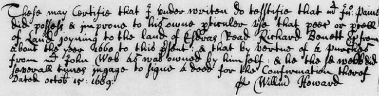
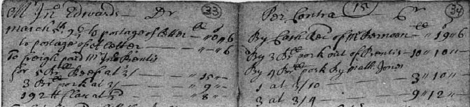
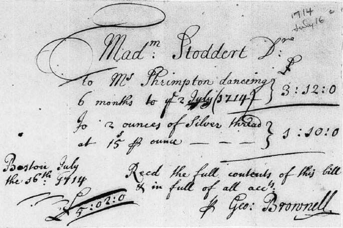
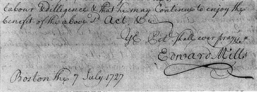
EDWARD MILLS (p.8f.)